For my FMP I have decided to use Adobe Lightroom to edit my photos, this is because I have used this software slightly in the previous project but I am still unfamiliar with the software for the most part. There are lots of different photo editing software out there but the reason I have decided to use Lightroom this is the software that is downloaded on the college macs. Also, because this software is very popular for editing photos, this software is the most popular editing software out there, For my research, I have decided to look at the different tools that are included in Lightroom to see what they do and how they change the images.
Temperature And Tint Bar

The first two slider bars that are shown on Lightroom are the Temp slider which is short for temperature and the Tint tool. The temperature tool is self-explanatory, when you slide the bar to the left the image gets bluer and when you slide the bar to the right the image gets more orange and yellow. The blue temperature is used to give the image more of a cold feel and the orange is used to make the image look more worm, that’s why the slider is named Temperature.
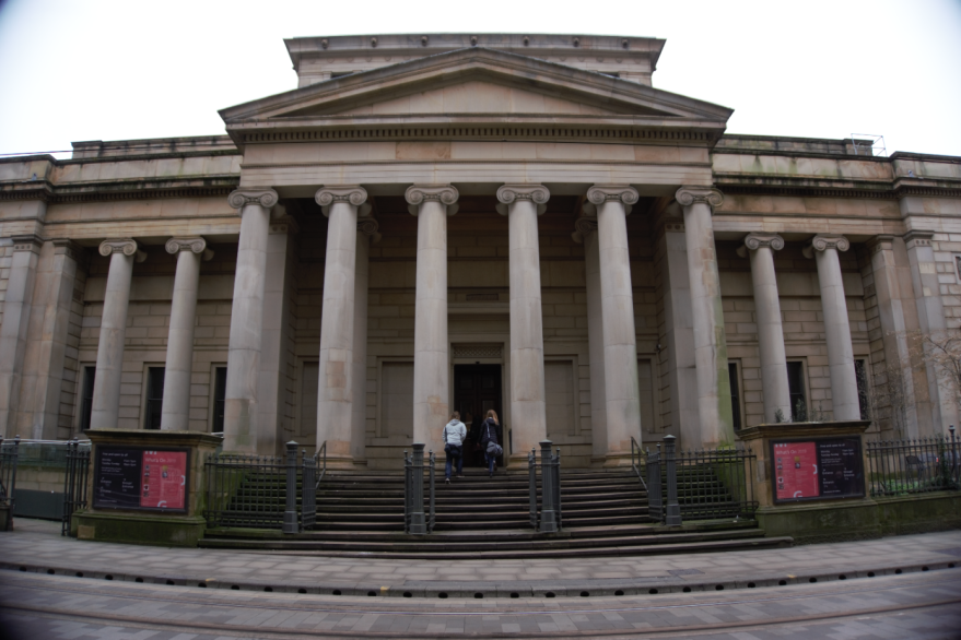
The next tool is the tint tool, this tool basically gives the image a tint to it, this tool gives you the ability to give the image any color tint that you want. I don’t think that I will be using this slider because I have no need for it. The picture above shows what it looks like when the temperature is blue and when there is a green tint added. This is not the style that I am going for, this reminds me of more pop art. I might use the temperature tool to make my images colder.
Exposure And Contrast Bar
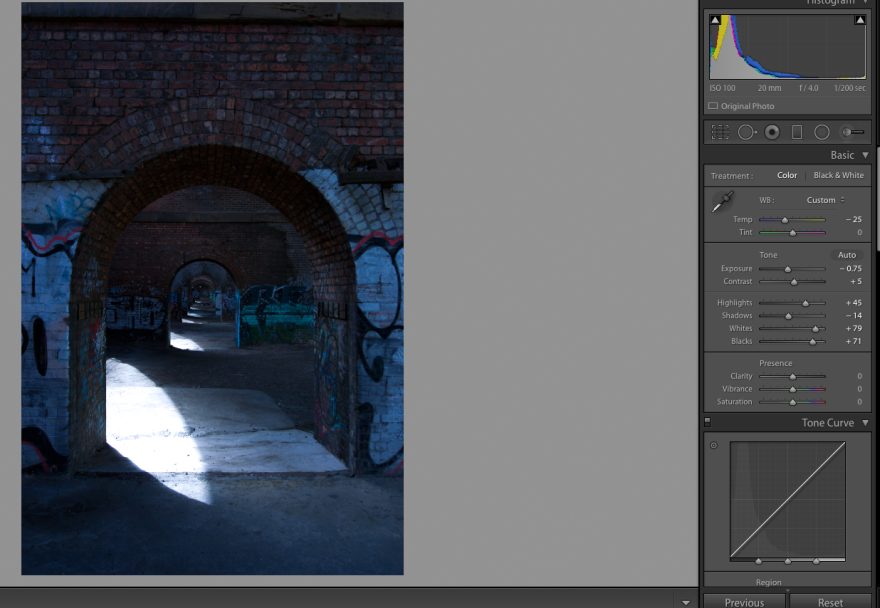
The next two tools that I am looking at is the exposure and the contrast tool. The exposure tool changes to exposure of the image, the exposure is basically the amount of light thats on the images. The further you go to the left of the bar to more darker and underexposed the shots get and the further to the right you go down the bar the brighter and overexposed the image gets. For my urban photography, I am likely to have my exposure a bit to the left so the image is darker but not underexposed. This tool is very important because if you shot something that is underexposed or overexposed you can correct it and still get a good image. The contrast tool, when slid to the right the darker mid-tones are made darker and the lighter mid-tones are made lighter, this increases and makes the contrast more visible. When the bar is to the left the darker and lighter mid-tones are made more neutral so there isn’t much contrast between the dark and light part of the images.
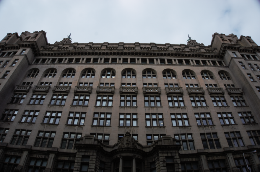
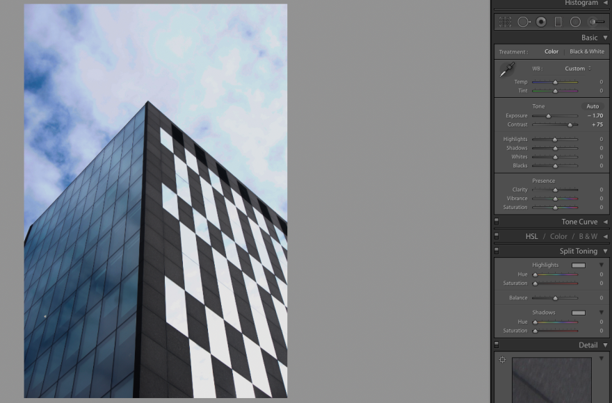
This image shown above shown what it looks like when the Exposure is -1.70 and the contrast is +75. The exposure that I have chosen has made the darker than the original image, the contrast that I have chosen had made the dark and lighter mid-tones more apparent and more vivid.
Highlights And Shadows Bar
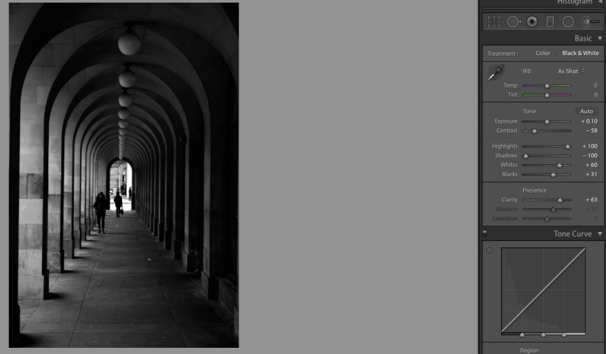
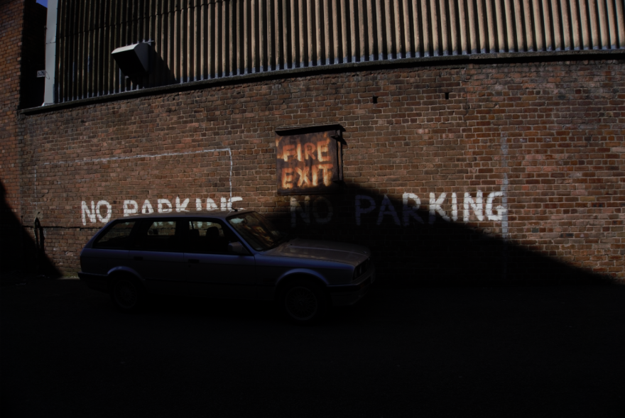
After this, I looked at the Highlights and shadows tools. When the highlights tool is slid to the left of the bar, this shows the maximum detail in the lightest parts of the image. On this image, the lightest part is the clouds in the sky and also the windows on the right side of the window which are reflecting the sky. When the bar is to the left, the detail in the brightest part of the image is washed away.
The shadows tool does the opposite of the highlights tool, the shadows tool focuses on the darker part of the image. When the shadows tool is slid to the left, the detail shown in the darker areas of the image is made less visible and darker. When the bar is slid to the right, the detail in the darker areas of the image is made more visible but brighter
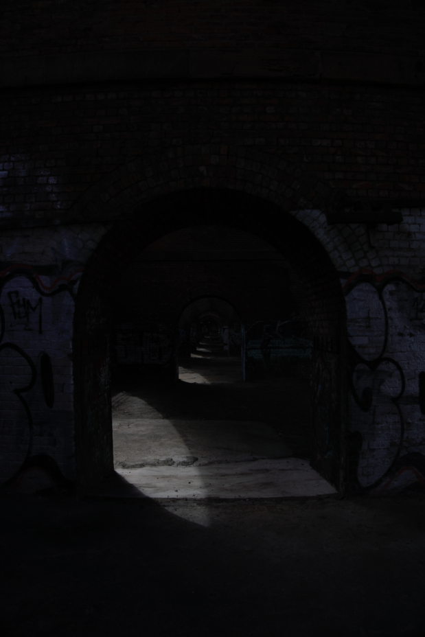
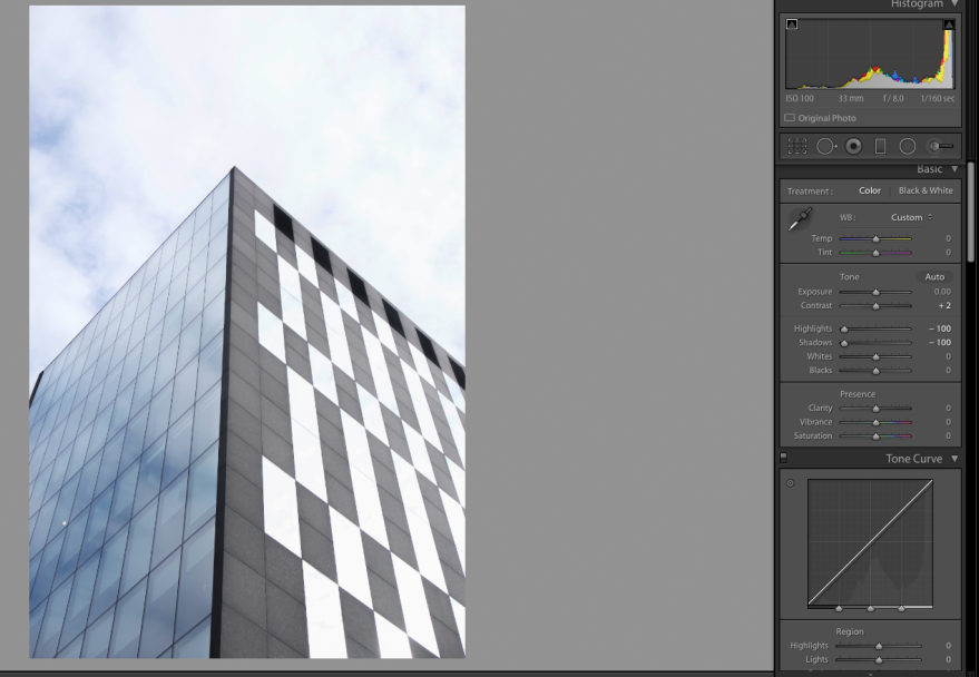
The image above shows an image which has the highlights tool and the shadows tool slid to the left. This image shows the maximum detail in the darker part of the image and also the lighter part. When I slid the highlights tool to the right some of the blue seen through the cloud wasn’t visible,
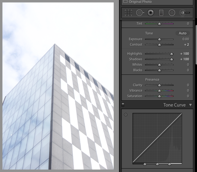
This image shows when both bars are slid to the right, looking at the sky, you can see that the blue that is on the other image is less visible because the detail has been taken out of the lighter parts. Also, the reflections of the clouds and the blue sky are not visible on the windows because the detail has been washed out and been made into one solid color. The dark granite on the building is the darkest part of this image you can see the color of the buildings has gone, the dark granite has been washed out and lightened getting rid of the detail.
Whites And Blacks Bar
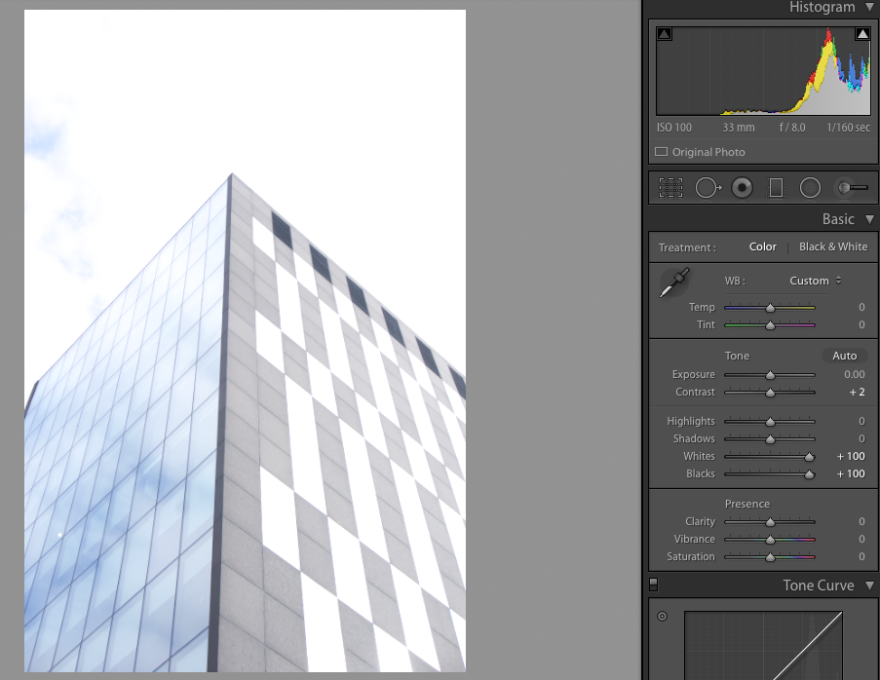
The whites bar when to the left, the white parts of the image are made less vivid and made darker. This tool would be useful if you had an image where the whites were blown out, this tool would bring down the intensity and the brightness of the whites. When the bar is to the right, the whites are made more intense and are blown out. This would be used if you wanted to make the whites brighter and more intense. The difference between this tool and the highlights bar is that this tool changes all the whites while the highlights bar only changes the brightest areas of the image.
The blacks bar changes the blacks that are in the image. When the bar is to the left, the blacks are made darker and more intense. This would be used if on your image the black areas are bright and you want them to look darker. When you slide the bar to the right, the blacks get less intense and more washed out to a lighter grayer color. This would be used if an image has intense blacks where you couldn’t make out the detail. The difference between this bar and the shadows bar is that the shadows bar only focuses on the darkest areas of the image and the blacks bar changes all of the black on the image.
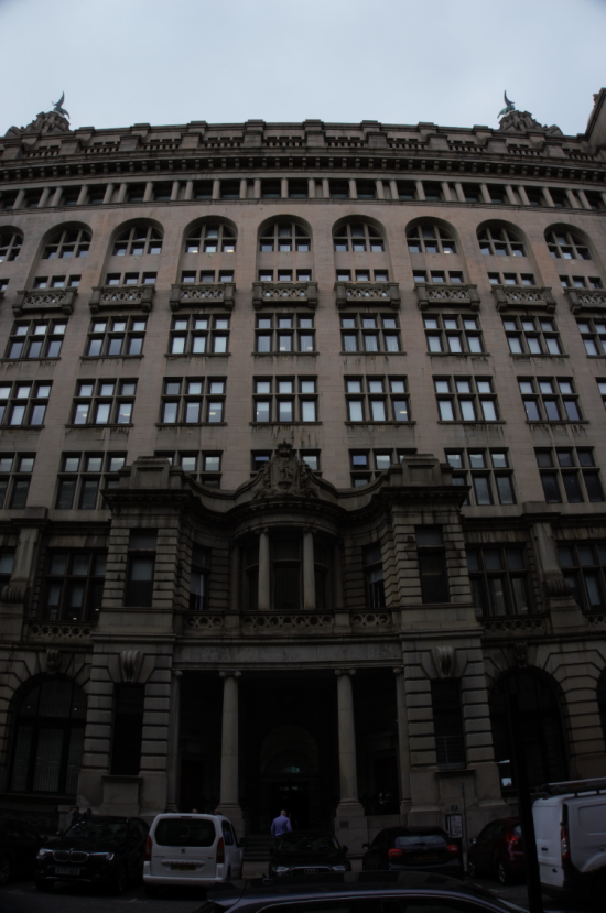
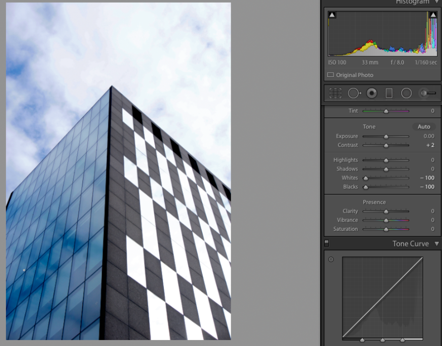
The image above shows an image that has the whites and blacks bar slid to the right. Because I have slid the bar to the right on the whites bar, means that the whites have been toned down and less intense, as a result of this you can no see the blue in the sky. The blacks bar has also been slid to the right, this means that the blacks are more intense and darker.
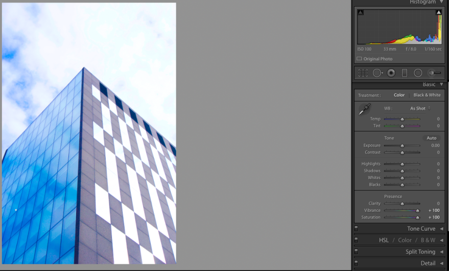
On the image above I have made it so the whites and the blacks bar are both to the right. When you look a the sky you can see that there is hardly any blue visible, this is because I have made the whites more intense by sliding into the right. Looking at the darker point of the building you can see that they have been washed out to a grey dull color.
Clarity Bar
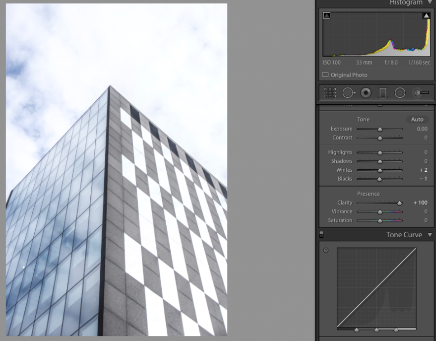
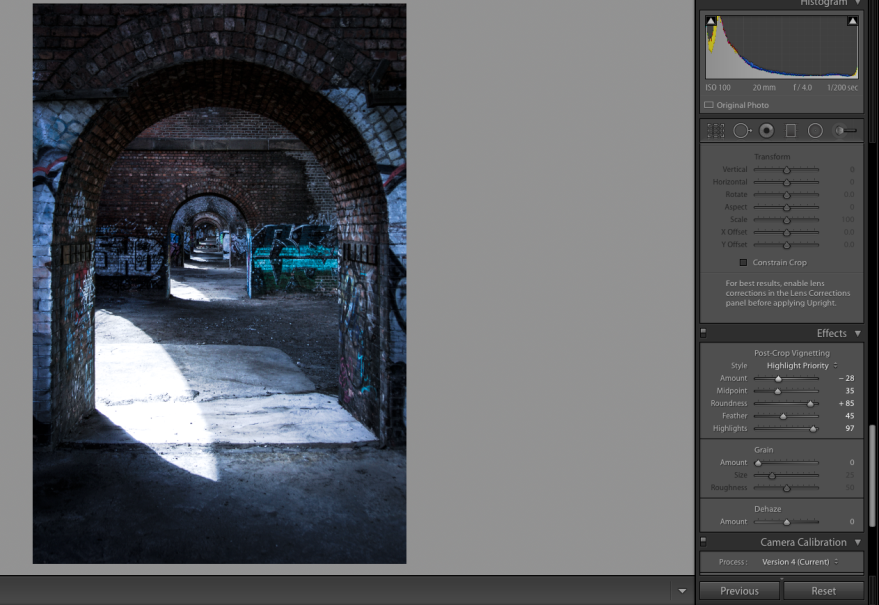
The contrast bar basically ‘increases the contrast in the middle regions without affecting the black and whites’. The clarity gives the outlines more of a dark grayer. When the clarity bar is slid to the right, this brings out more detail and also makes it look rougher. This would be used for an image that shows some kind of decay, this would make the image look rougher and that would help in showing the decay.
Kelsh, N. (2019). What Does the Clarity Slider Do? – How To Photograph Your Life. [online] How To Photograph Your Life. Available at: https://www.howtophotographyourlife.com/what-does-the-clarity-slider-do/ [Accessed 29 Apr. 2019].
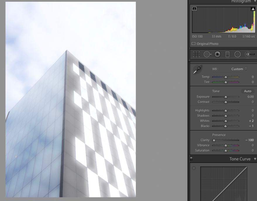
This is the image above shows what it looks like when the clarity is at its least. This building lacks detail because of the lack of clarity. The clarity has decreased the middle tones. This would be used for portraits where they are trying to not focus on the infection of the model. The most popular example would be portraits of women, the less clarity makes the skin look more smooth and gets rid of the detail in the skin.
For an example of clarity in use, I downloaded a stock portrait to show how clarity is used in portrait because you can’t really see the extent and the proper use for this tool.
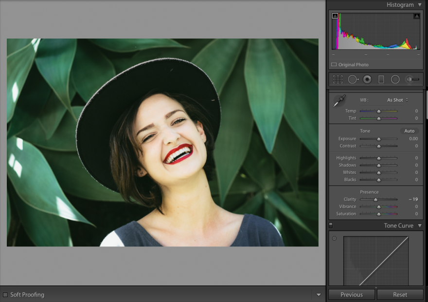
I have changed the clarity on this image too -19 which is just below the standard form. You can see that the skin looks more smooth which make the image look more flattering.
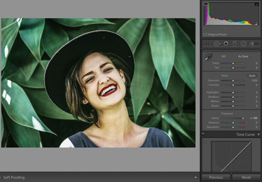
On this image, you can see that I have turned the clarity to +100 which is the max, You can see that there is much more detail visible but this isn’t always good. You can see more of her freckles and the change of tone in her skin.
Pexels.com. (2019). Woman Smiling In Front Of Green Plants · Free Stock Photo. [online] Available at: https://www.pexels.com/photo/woman-smiling-in-front-of-green-plants-2156416/ [Accessed 29 Apr. 2019].
Vibrance And Saturation Tool
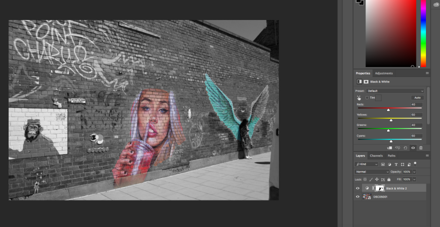
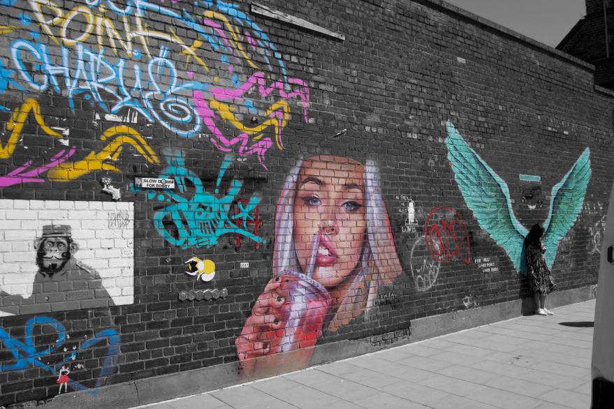
Basically, the Vibrance bar changes the intensity of the colors that less saturated and leaves the colors that are already well-saturated. When you slide the bar to the right to color become more saturated and more intense, this is because it is saturating the less saturated colors. When you drag the vibrance bar to the left it takes the saturation out of all of the colors making the image black and white.
The saturation tool is similar to the virbrance tool but this tool changes the saturation of all the colors on the image not just the more muted colors. When you drag the bar to the right it saturates all of the colors making it more intense and vibrant. When you drag the bar to the right it takes the saturation out of all of the colors and leaves the image black and white.
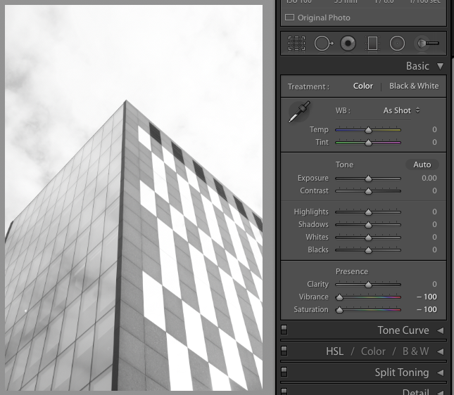
On this image, I have decreased the Vibrance and the saturation to the smallest amount. You can see that this has taken all of the colors out of the image making it black and white. This would be used to transform an already colored image into and black and white image. I am going to use this while editing my photos because I want some of my images to be black and white so I will take the color out by decreasing the vibrance and the saturation.
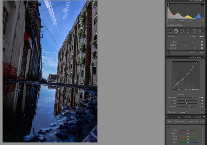
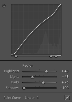
Tone Curve
A tone curve is a tool in Lightroom that allows you to change the highlights, lights, darks, and shadows. This tool is very helpful but it can also be complicated. It shows the insight of how it changes the image. At the top, left corners are the lightest area and the bottom right in the darkest. The dotted line in the middle represents the normal edit, above the line makes the image lighter and anything below the line makes the image darker. This tool is used to get a certain specific look that you wouldn’t able to achieve with the scroll bars. The bottom of the line shows the shadows, next to that is the darks, then lights and finally the highlights.
Digital Photography School. (2019). How to Make Color Adjustments Using Tone Curves in Lightroom. [online] Available at: https://digital-photography-school.com/make-color-adjustments-using-tone-curves-lightroom/ [Accessed 29 Apr. 2019].
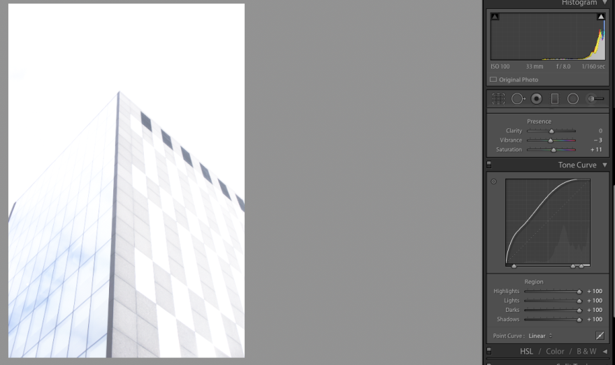
This image shows what it looks like when the line is closest to the top left corner, you can see that it is blown out and overexposed. To correct this I would need the get the line closer to the dotted line.
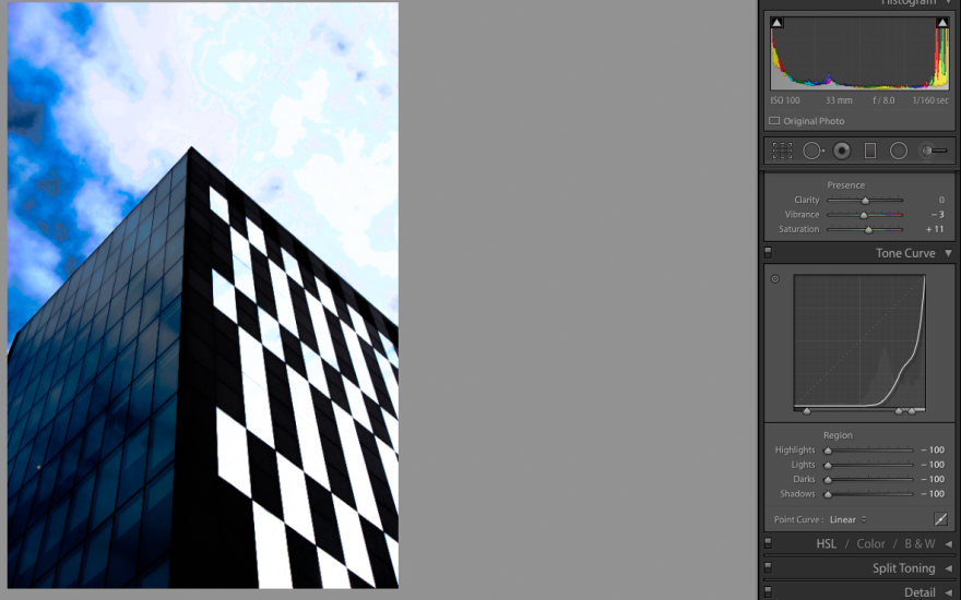
This image shows a photo that has the tone curve to the bottom right corner. You can see that this photo is underexposed, this is because the darks and the shadows have been intensified to much beyond recognition of any detail in the color.
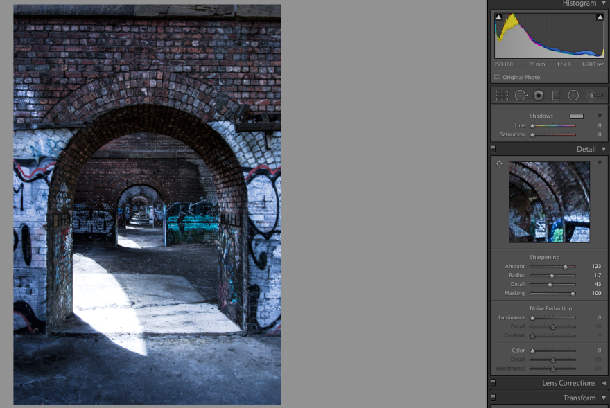
Sharpening
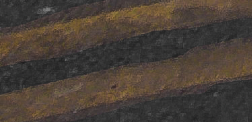
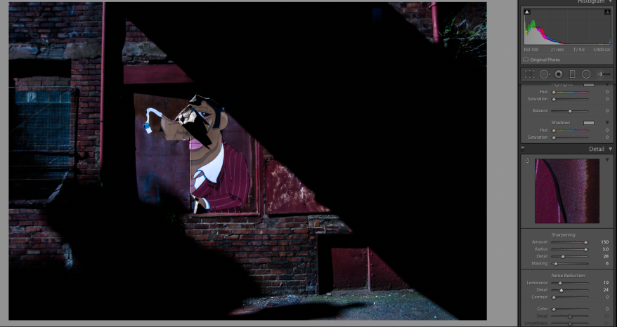
The sharpening tool basically adds and emphasizes the detail in the image. You might not be able to see the detail from a distance but when you get up close you can see how important it is to the image. The sharpening tool is split into four different sections, this is better than just getting one option because there are four parts, it gives you maximum personalization of the detail in your image.
The first slider focuses on the amount. The amount is the amount of sharpening you want on your image. When you drag the bar to the right you get the maximum amount of sharpening, this isn’t always positive because the higher amount you have the more noise that will be visible on the image.
The next slider is the radius. The radius basically changes the radius of the sharpening. When you drag the bar to the left the smaller the radius is sharpening around the edges, the default radius is 1 pixel around the edges but going more to the left will give you a smaller radius than 1 pixel. This will give you a less vivid and intense sharpening. When you slide the bar to the right the bigger the radius gets, this will make the sharpening around the edges thicker and more visible.
The third slider focuses on the detail of the sharpening. If you drag the bar to the left, only the large and main edges will be sharp and detailed. When you move towards the right of the bar more and more edges are more detailed.
The last slider is the masking slider. The masking slider is able to mask out areas that should not be sharpened leaving the other area sharpened. When you add a mask over the image on the area where you don’t want to sharpen, you then change the settings and it will not change what’s included in the mask.
Mansurov, N. (2019). How to Properly Sharpen Images in Lightroom. [online] Photography Life. Available at: https://photographylife.com/how-to-properly-sharpen-images-in-lightroom [Accessed 29 Apr. 2019].
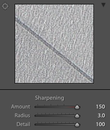
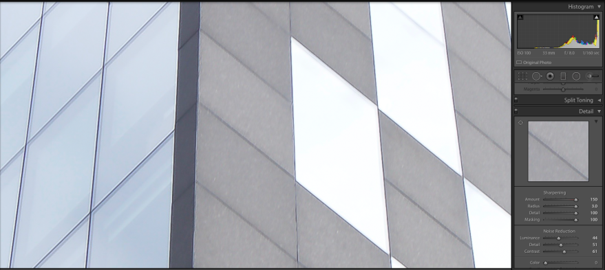
Looking at the image above you can see what it looks like when the amount, radius and detail at the maximum amount. The amount is why there are lots of individuals strands of sharpening, the radius resulted in making them big, while the detail made the smallest lines detailed.
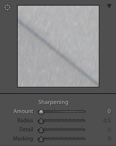
Looking at this image you can see what it looks like when the sharpening is taken out of the image. It looks kind of blurry because there is no detail in the different part of the texture, its all treated as one color, there isn’t any detail.
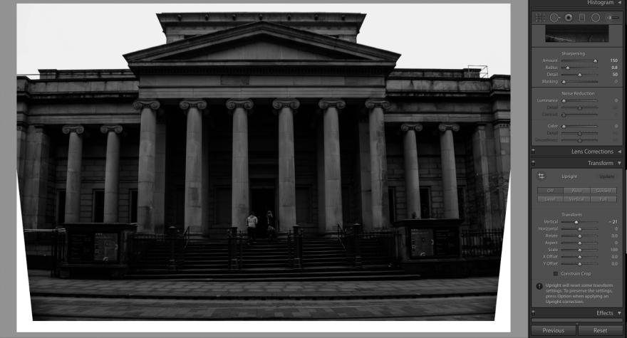
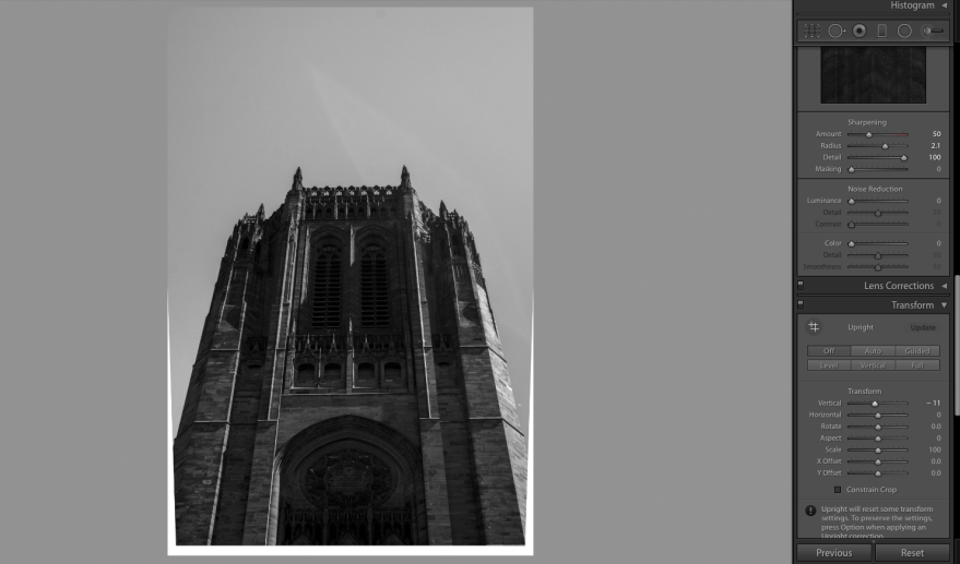
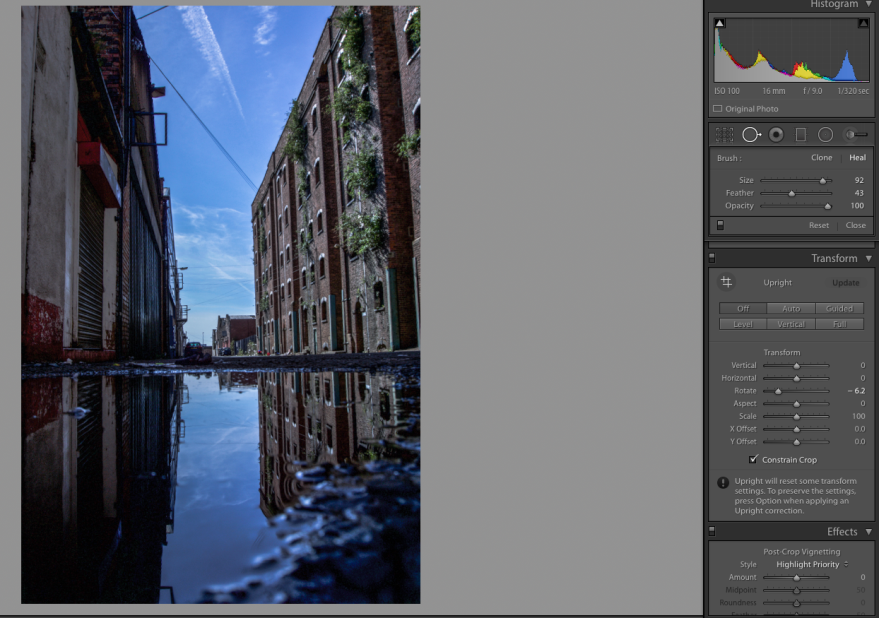
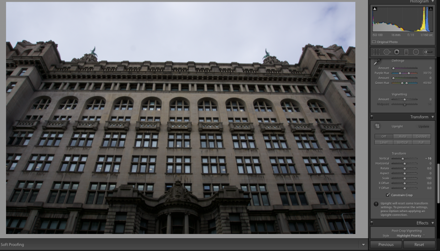
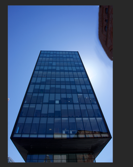
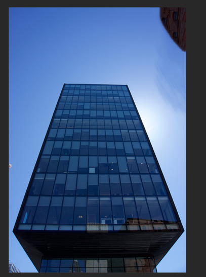
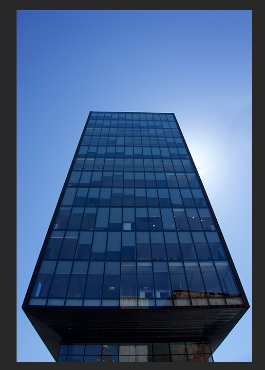
Transform
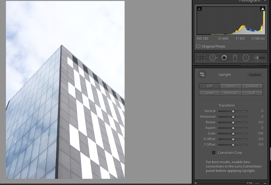
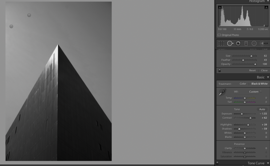
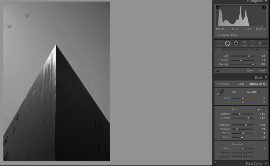
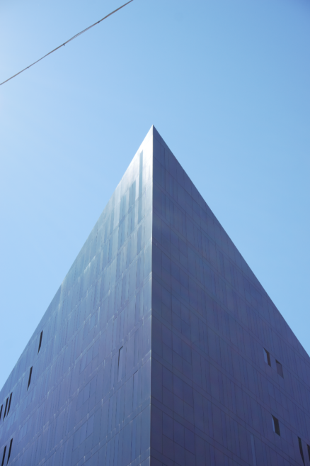
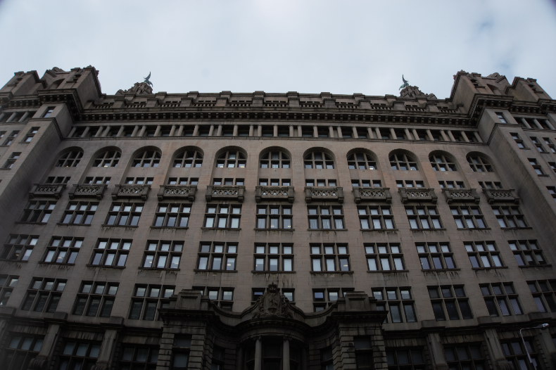
The transform tool is very helpful and is very powerful is changing the whole entire look of your image, especially in architecture photography. This tool allows you to change the perspective of the shot, in many different ways. You can change this by sliding the bar, vertical, horizontal, rotate, aspect, scale, X Offset, and Y Offset.
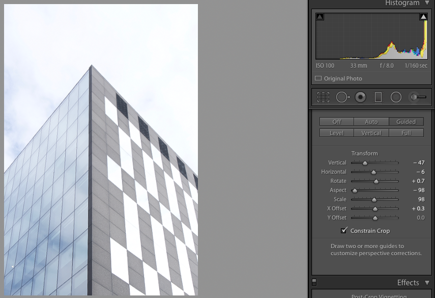
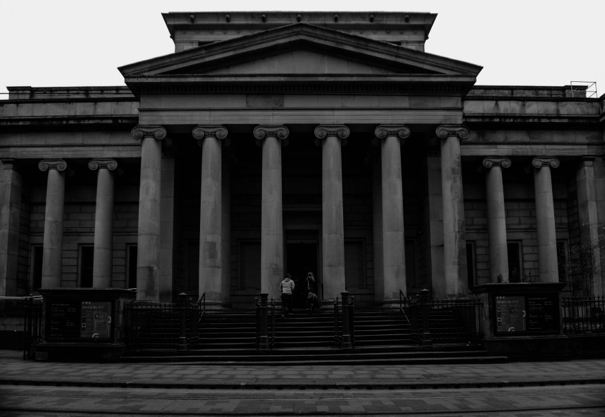
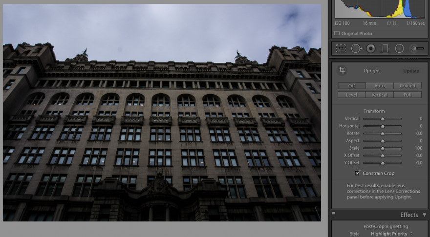
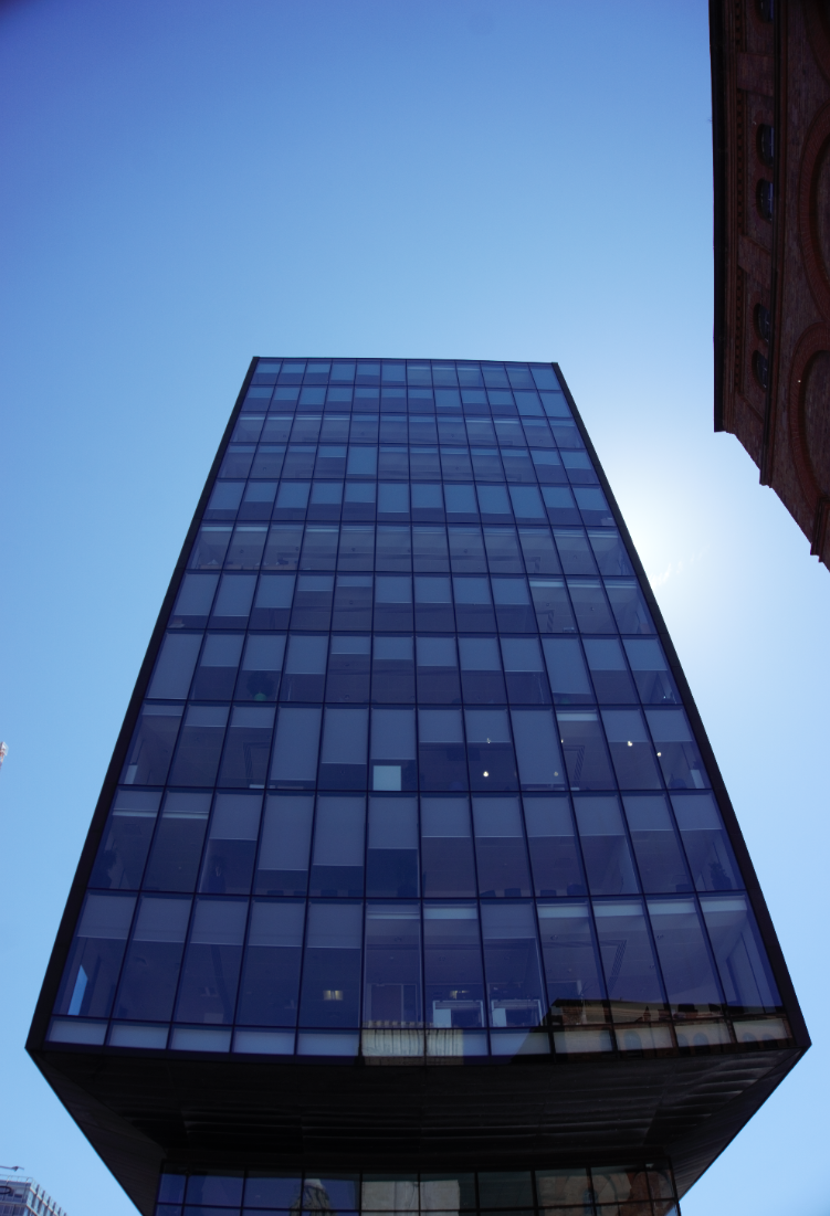
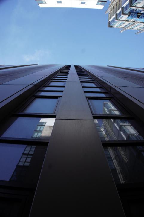
Looking at this image you can see that I have rotated the image so the building is straight up. Sometimes in architecture photography, when you look back on the photos, the buildings look like they are falling over. This is because of the perspective and the angle I was shooting the building at. Looking at the first photo of the building you can see that it looks like it is moving away from the shot but looking at the second image you can see that it is straight. When you correct the perspective, it does crop the image a bit because is basically zooming into the image a bit when correcting the perspective.
Digital Photography School. (2019). Why are my Buildings Falling Over? A Short Guide to Perspective Distortion and Correction in Photography. [online] Available at: https://digital-photography-school.com/why-are-my-buildings-falling-over-a-short-guide-to-perspective-distortion-and-correction-in-photography/ [Accessed 29 Apr 2019].