Final Reflection and Evaluation

When I first started this project I wanted to do photography as my area of media for my final major project. The reason I knew I wanted to do photography from the start was because I am interested in photography and I have always found my self enjoying photography throughout the last couple of years. So throughout this project I wanted to develop my photography skills and my knowledge of presenting and getting exposure so I can use this knowledge that I have learned to help get a career in photography some time in the future. At the start I knew that I wanted to do two different themes of photography, themes are the different areas in photography. Before I decided what two themes I wanted to do, I considered six different themes in photography. These themes include Landscape, Fashion, Urban, Portrait, Astrophotography and architecture photography. I considered themes different themes because I was interested in all of them. I actually chose to research portrait photography in my last project because I was interested in this theme of photography. I wanted to produce 30 professional looking photos and photos that reflect there photography theme. I also wanted to present my photos on the most relevant areas, like socials medias, websites,competitions, and gallery’s.

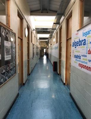
The two themes that I decided to do was urban and architecture photography, I also wanted to do these two photography as well, but what actually made me choose these two themes of photography was my target audience. I asked my target audience what two themes they would like me to produce and they picked urban and architecture. At the start I didn’t know who my target audience was but I know I wanted to focus on the demographic of the places I present my work on, this is because this is the majority of the people who will be viewing my photos. I was knew a couple of ways of presenting my work like on social media, websites,competitions, and gallery’s, but I didn’t know where the best and the most efficient area was. Before I started doing my research I wasn’t very informed about the ways of getting detailed feedback on my photos, I knew that I could use questionnaires. From my previous project I have used questionnaires to gather feedback and I know that it isn’t very detailed and helpful for proper feedback, so I needed to research different way to gather feedback. Also at the start, I needed to do some research in finding out the elements of urban and architecture photography so I can apply that to my photos.

At the start of the project I didn’t know my project, but I knew that I wanted my target audience to be the people who where the most popular demographic for areas I was presenting my work, and also other photographer pro and amateur . After I found where I wanted to present my work to, I looked at the most popular and the majority of people who where using these areas. Because I Instagram and Flickr to present my work to, I looked into the most popular ages for these social media, I also chose a website but the people who visit my website will be the people who visit my social medias. From my research on the demographic of these two social medias I found that the most popular age range on Instagram was 20-24 and for Flickr it was 35-39. I also did some research on the gender of the people who where using these two different social medias, for Instagram is was nearly 50/50 with the amount of males and females. With Flickr, it is more male dominated with about 63% male and 37% female. I also did some research into the genders of photographers, because I wanted to reach them as well and I found that it is more male dominated but it’s getting closer to 50/50 every year. So I concluded that my target audience was 18-40 males and females, I decided to do stretch this age range from 20-24 and 25-39 because the people in between these age ranges also take up a big proportion of the people who use these demographics.  I decided to go down to 18 and up to 40 because I a lot of people at these ages use these social medias. I chose female and males because on Instagram it is close to 50/50 so they are apart of my target audience.

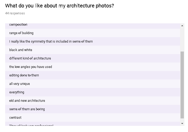
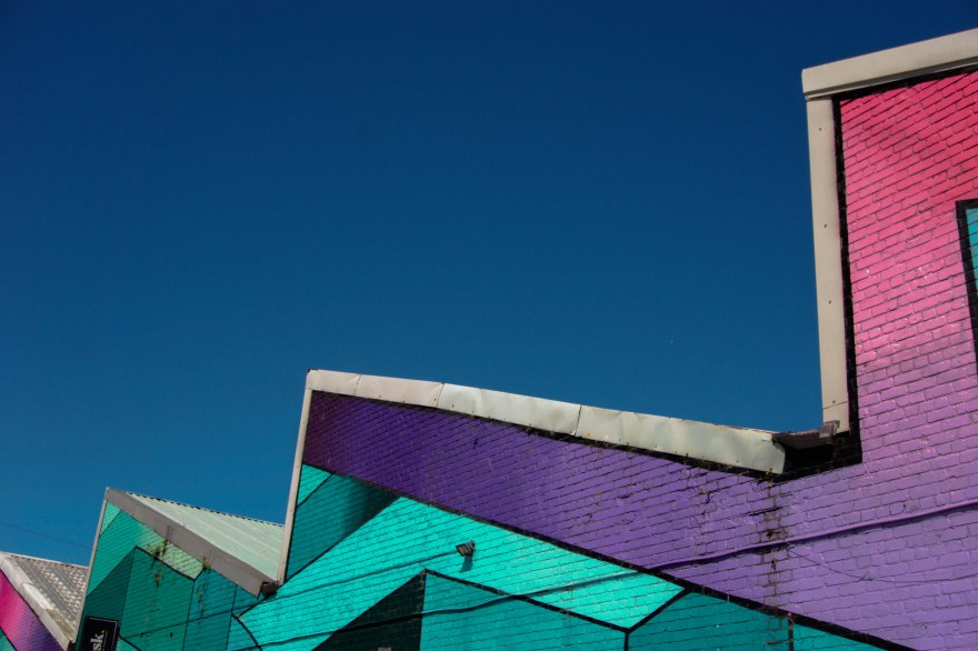
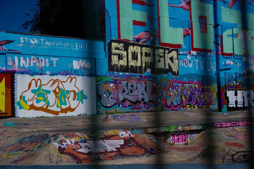
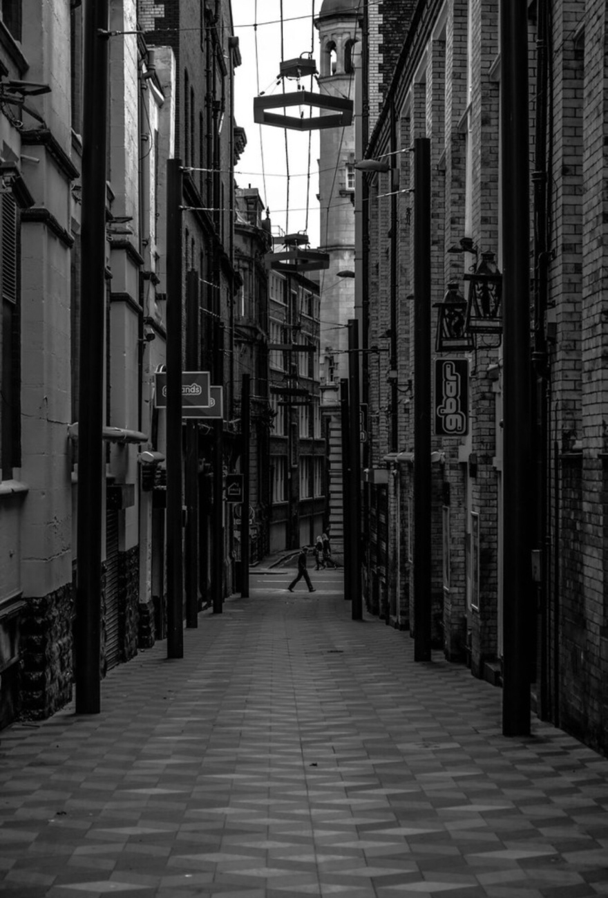
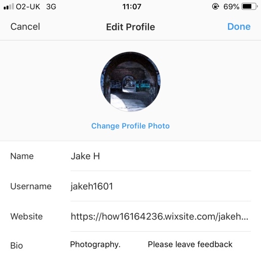
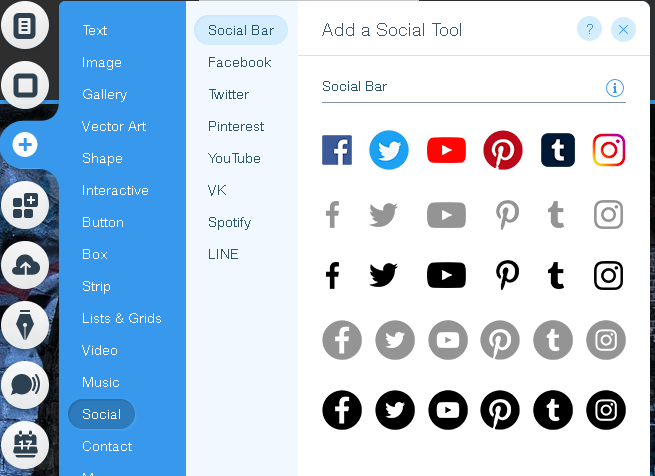
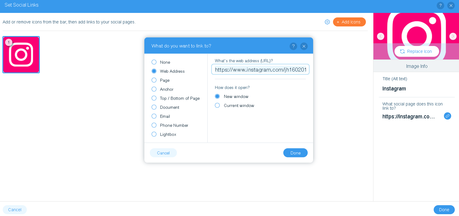
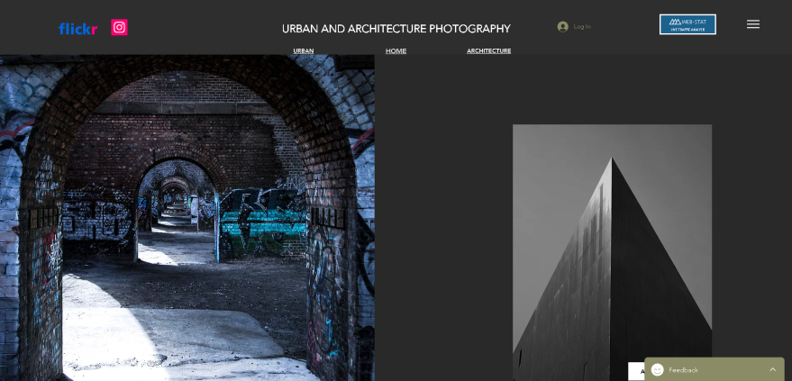
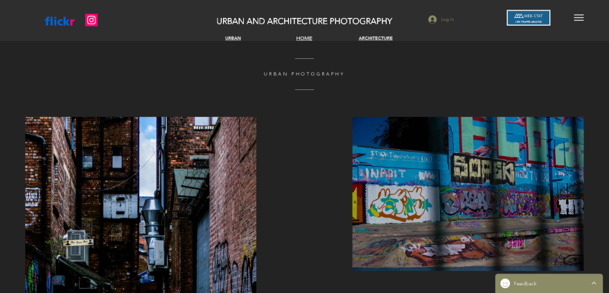
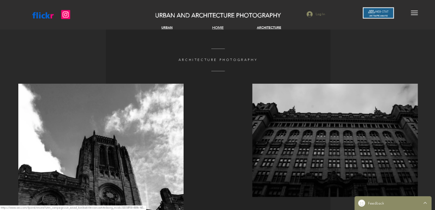
For my research I did some on the different ways of presenting my work, for this research I found lots of different ways I could potentiality present my work. These different areas included social media, like Facebook, Twitter, Instagram, from my research I found the best social media platform to present my photos on which was Instagram, this was because this website was focused on photographs as the main way of communication and is used by photographers. I also looked at professional social media/photo sharing platforms and I found platforms like Flickr and Smug Mug. I decided to choose Flickr as another way of presenting my work, because I found it the best platforms because of the popularity of this social media. I also looked at gallery’s as a potential way of presenting my work and competitions.  Some important primary research that I did was about what people associate with the two themes that I was doing which is urban and architecture, this is important primary research because I know what my target audience associate with that specific themes. For the urban theme a couple of responses that I got where talking about dark colours, bright colours, urban locations, alleyways, graffiti, and more. I then used this feedback I used it when I was finding locations and editing. For the architecture theme, my target audience associated things like, black and white, modern, old, minimalism, contrast, small and tall building, and more. With this information I  went onto use it when finding architecture, choosing techniques and editing my photos. Another important part of primary research that I gathered was about presenting at a gallery, I asked my target audience if they think that a website or gallery is the best way of presenting my photos. From this I found that my target audience would prefer and think that a website is a better way of presenting my work, after this question I asked if they would ever go to a photography gallery and from the results I found that they wound’t go, so why would I present my work there.

Another important piece of research that I did was about the camera settings. From this research I learned about shutter speed, ISO, Aperture and the two different file formats you can shoot in. This information helped me because when I went on my final shoots, I knew what camera setting to use for the right environments. For all of my shots, I shot in ISO 100 because from the research I learned that the lowest ISO gives your images the highest quality. I learned what Aperture to use for certain environment like sunny, slight overcast, overcast and heavy overcast. To get myself more familiar and informed about my two themes, architecture and urban, I decided to do some research into a couple of photographers that focus on urban or architecture or both, because for my research I found that sometimes urban and architecture photography can cross over. This helped me understand what the theme included and how they are edited.

Some important primary research that I did was about my architecture photography. I asked my target audience some of the architecture they would want me to shoot, this helped me because I found what buildings my target audience wanted to shoot.


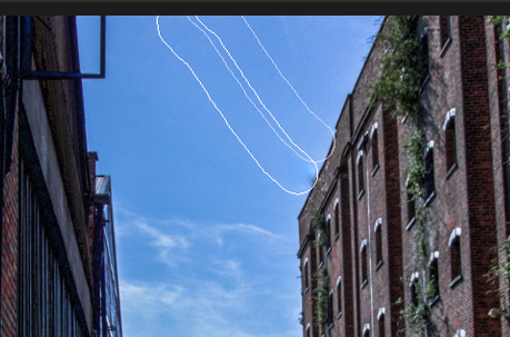
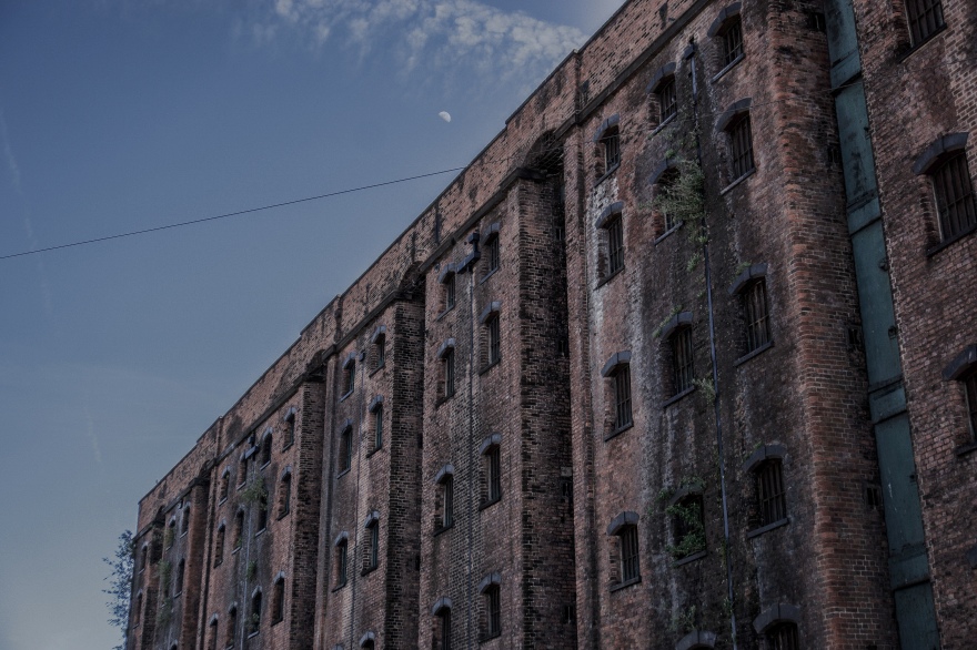
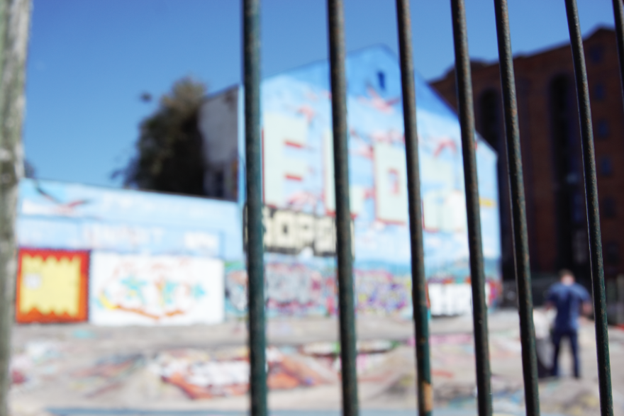
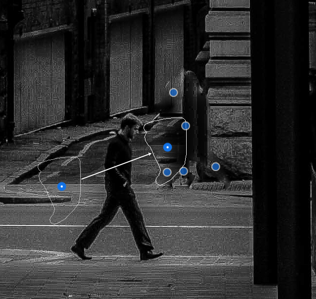
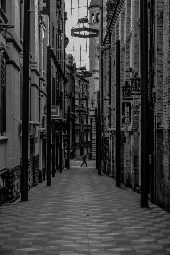
One of the theories that I looked at was the semiotic theory, this theory is about the that there are signs in different medias that indicate and make people think of something that it relates to. I asked my target audience what they associate with both of my themes, the things that they suggest are symbols that reflect the themes. For my urban photography, for most of the shots I decided to find locations that where deserted so know one was around, I also wanted areas that looked like they are abandoned and know one looks or takes care of them what so ever. For some of my urban photos, I also used the editing to try and portray this feeling in my photos. I tried to make the photos look more deserted by making them more darker and bringing increasing the sharpness and some times the clarity to get more of a rugged and decay feel to them.

ygkkg.PNG

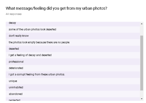
Looking at these results that I got from the question ‘What message/feeling did you get from my urban photos?’ that I sent to my target audience, I can see that I have been successful with doing this and applying in to my work. A lot of the people noticed I was going for a decay, uninhabited, and abandoned feel.


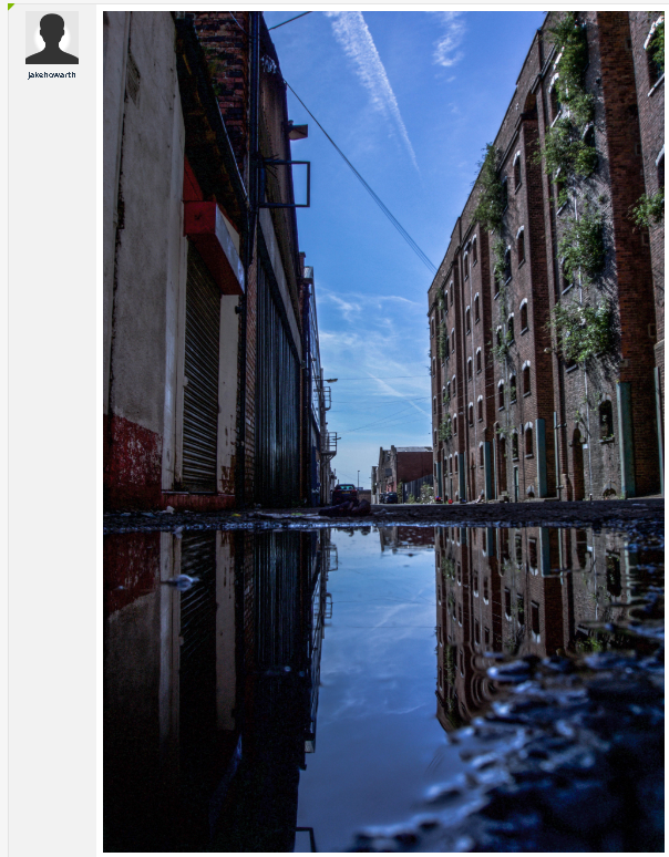
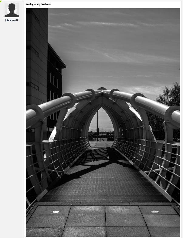
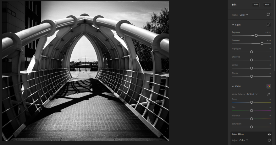
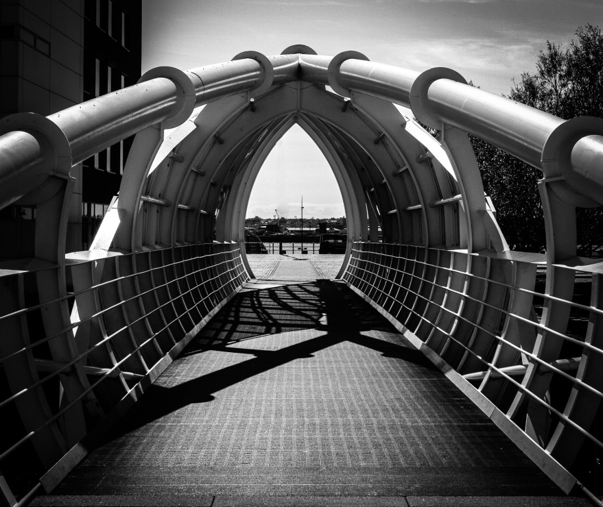
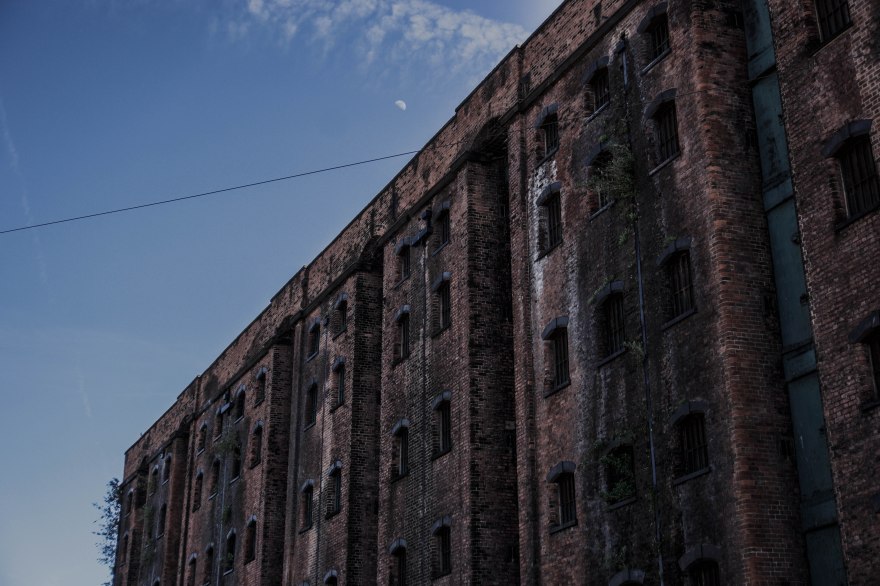
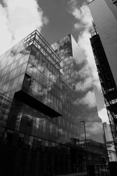
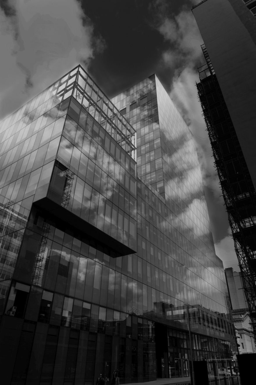
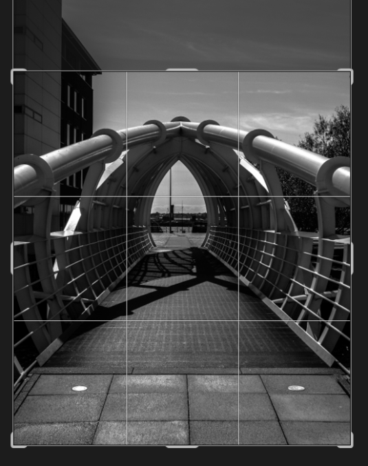
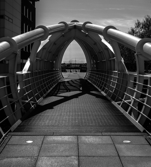
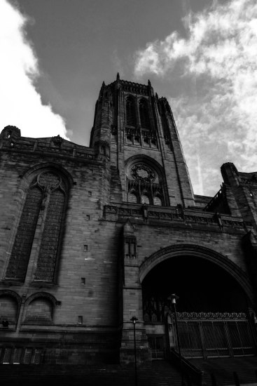
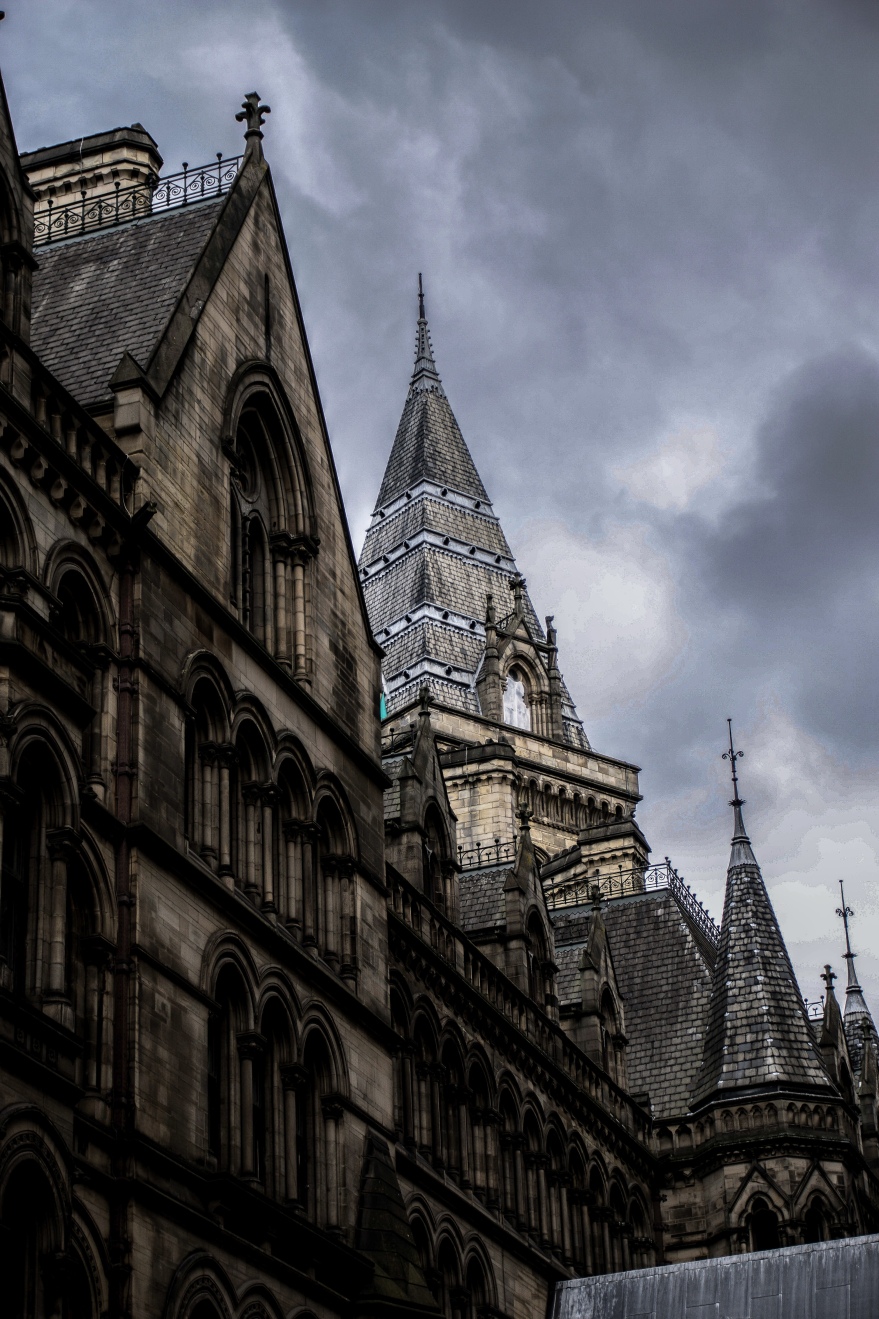
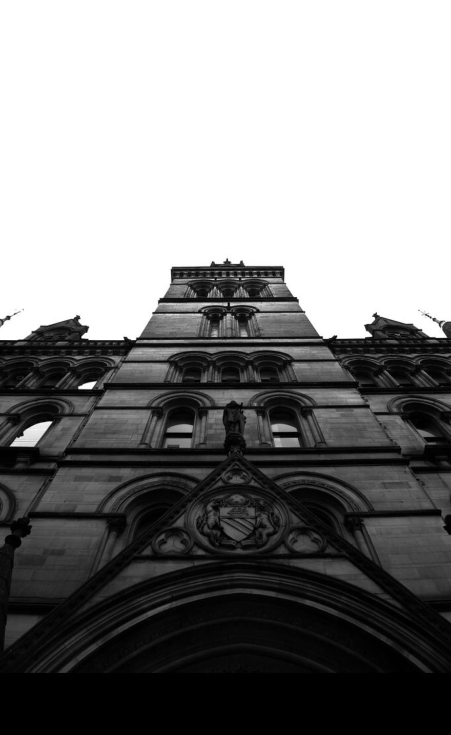
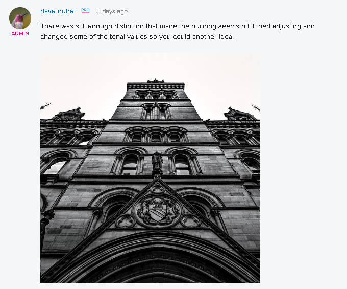
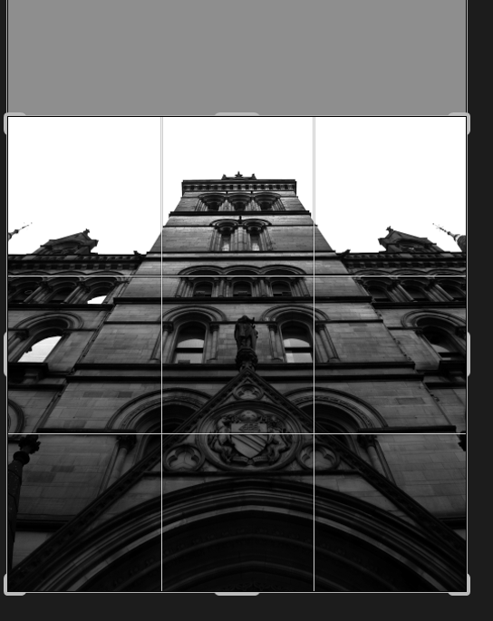
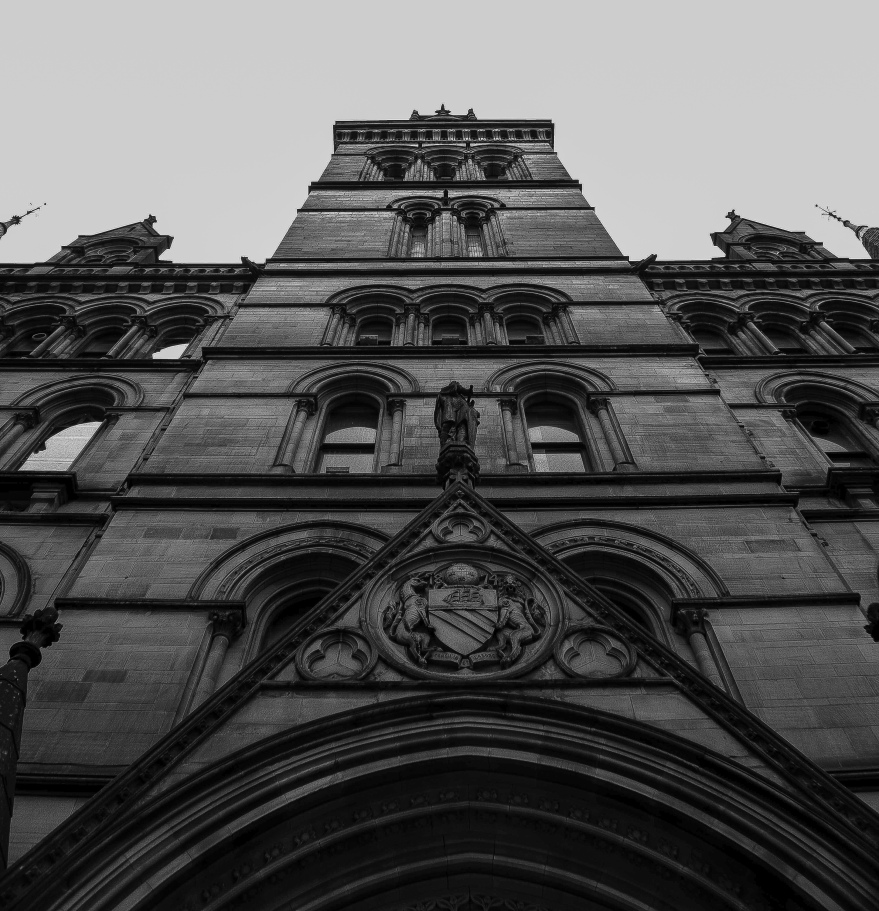
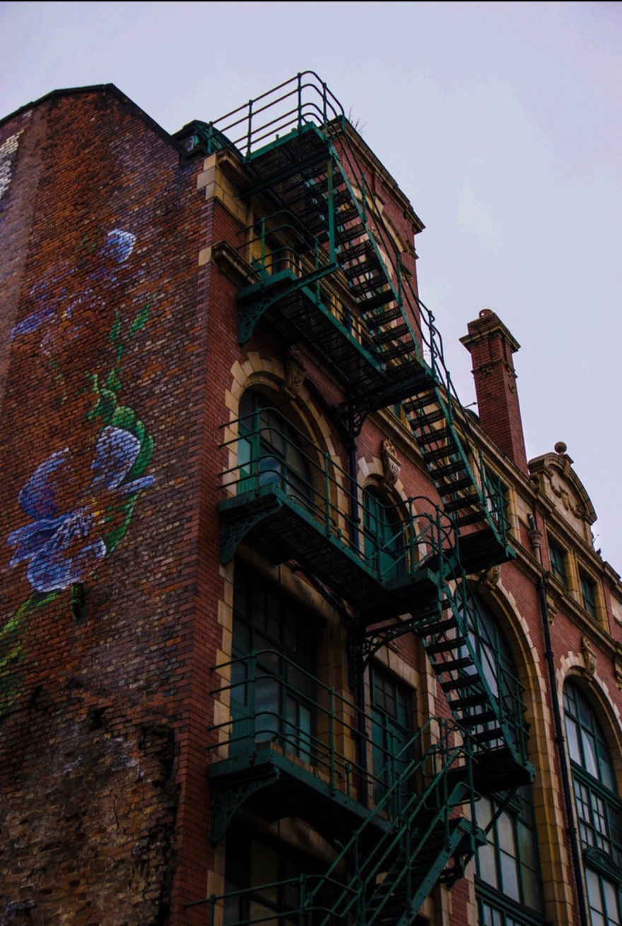
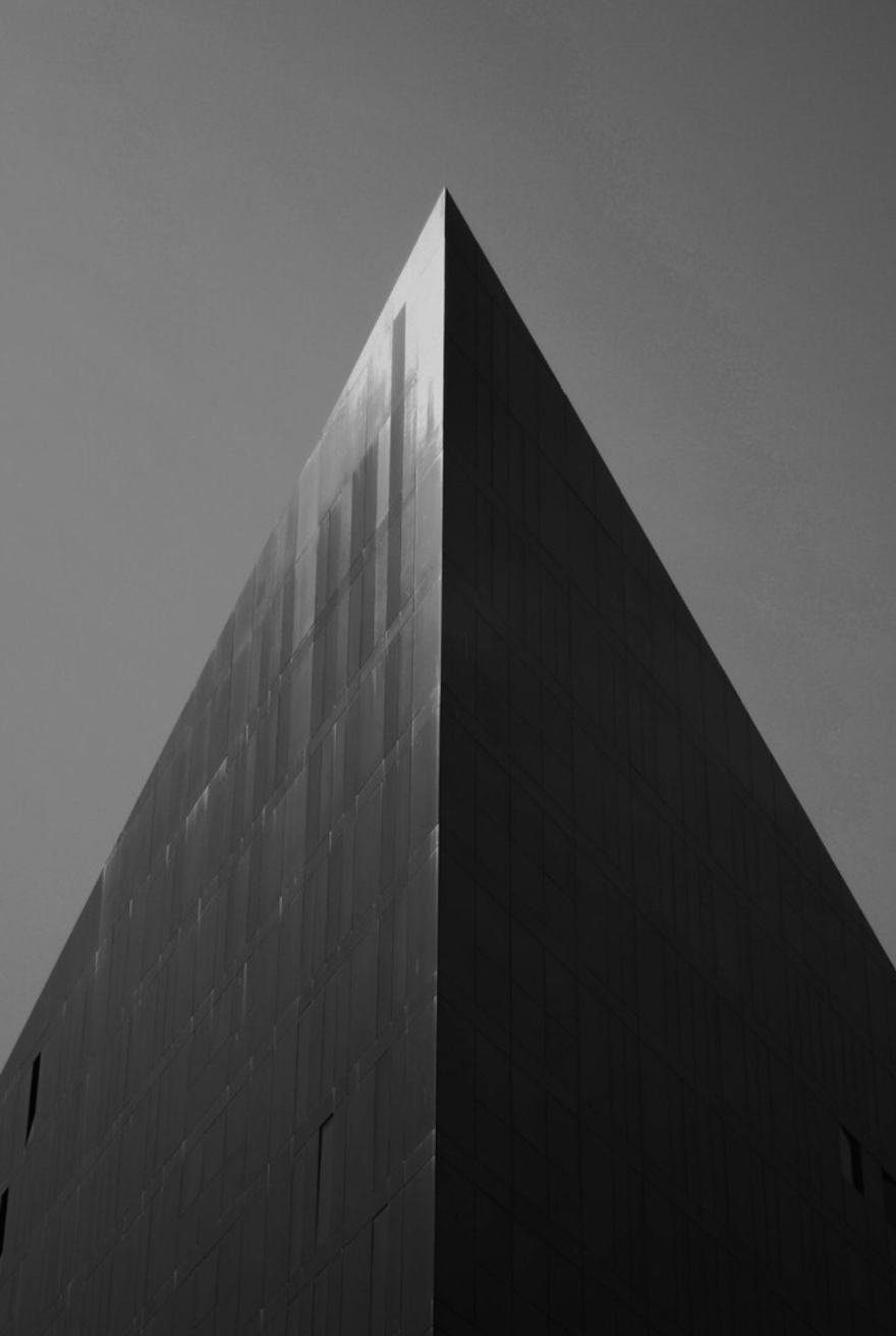
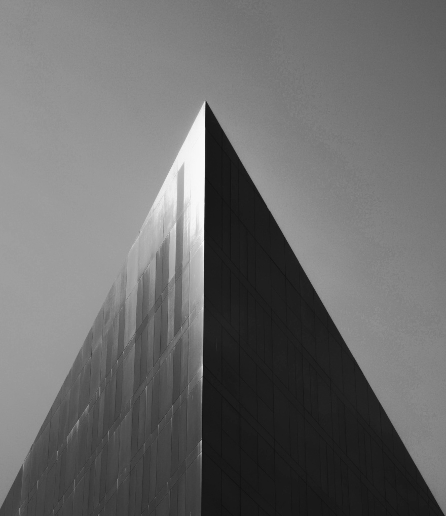
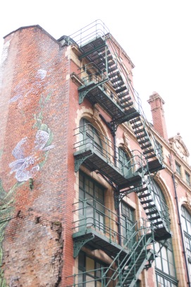
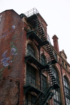
I also looked at the reception theory, The Reception theory is the theory that media products are concealed with ideas from the people who make them. For my architecture photography I wanted to use a low angle shot when photographing the building. The reason I wanted to do this because this makes the building look bigger when you are looking up at it, and this can have some emotion responses to it. Looking up on a building rather than looking down on one can make them look bigger, psychically and sociologically. When we look up at the building they makes us feel small, and this can make them intimidating and powerful compared to use .

gjj j.PNG

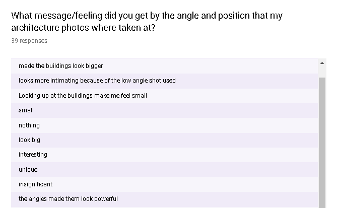
I applied this to my architecture photography and I wanted to know if my target audience will understand that and feel that way. To find this out, I made a questionnaire and added the question ‘What message/feeling did you get by the angle and position that my architecture photos where taken at? I asked this question because I wanted to see if I was successful with using this information I did on angles and positions and applying it to my work. From the results I can see a lot of people said that they felt small and the angle made them look bigger physically and sociologically, so I have been successful in applying my research to my architecture photography.

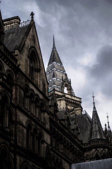
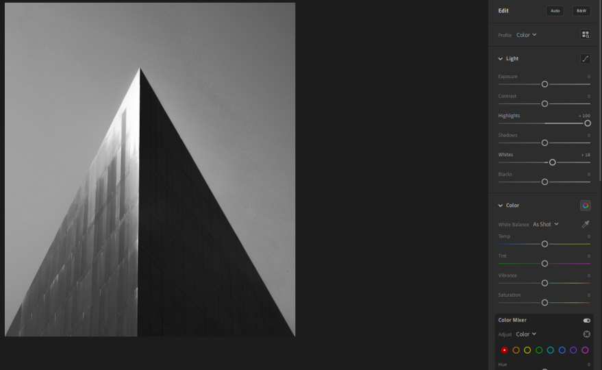
For most of my architecture photos I decided to make them black and white, I wanted to do this because I thought that it made them look more interesting and professional, because when I photo is made black and white it brings out the detail and the contrast. I wasn’t really going for a emotional response when doing this, I just wanted to see if by making them black and white I achieve making them look more interesting and more professional.

dfhhhf.PNG

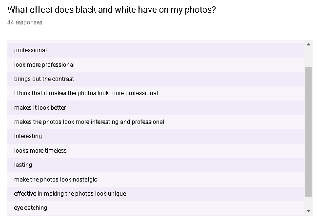
From the question ‘What effect does black and white have on my photos?’. I can see that I have been successful and was right to think that the black and white on my photos have made them look more professional and more interesting.


For my pre-production, I filled out a treatment. The treatment is a document that gives information about what I am producing. This treatment includes a lot of different information like the title, Overview of project, Genre, Target audience, summary of research, my product, constraints and contingency, timescale and budget. The treatment helped me because I always knew the important information about project.

The production schedule is important part of the planning because it helps you keep on track and stay on schedule, and on top of your work. Throughout my project, my production schedule actually started to change a bit, because I was developing my idea. On my original production schedule I actually put that I was taking 15 photos in each cities, this turned out not to be true because I ended up taking more photos in one cities than the other. A problem that I might of countered but luckily I didn’t was, not being able to shoot on the days that I planned to shoot on. To overcome this problem if I ever encountered it, I decided to add extra day after my proposed shooting day so I had some extra days if things didn’t work out, like the weather. From the copyright considerations, I made myself familiar of what it meant and what work was protected by copyright. This information helped because I didn’t know if I had to apply to get my work copyright protected or not

The legal and ethical constraints helped me out with my project because from this I was informed about what I was able to and the stuff that was legal, and the stuff that was illegal. This helped me when it came to shooting and presenting my work. My location recce was helpful because it helped me keep track of the information about that specific locations. This information included the electricity supply, permission, availability, address. When I ever needed to know this information, I looked back on my location recces.

The risk assessment was helpful because it helped me avoid certain risk when it came to shooting on locations. Some of these risks include Hit by car, this was important risk to consider because I am in a city, and in cites there is high amounts of cars around, so this risk was a good one to know about and keep in mind. Another risk was getting lost, I don’t live in any of these two cities that I went to shoot at, so I has to take precaution when going to these cities alone. I would always take my phone so I have a map so if I do get lost I can also find my way through the city. All of the risk that I mentioned helped me out when it came to shooting.

Calls sheets where important planning documents because when ever I would go to one of my final shoot I would make one of these and send it to my college teachers so they where informed about where I was. This is important because some of my shoots where is college hours and days. The call sheet includes information about the people involved, times, venue, list of equipment.

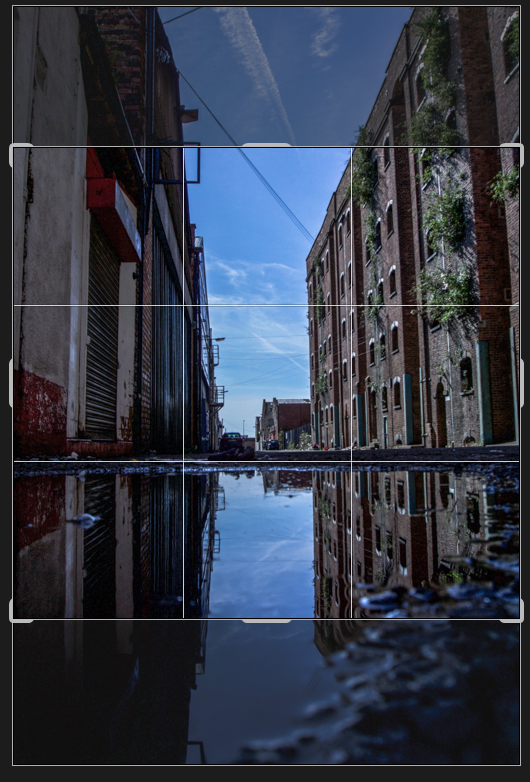
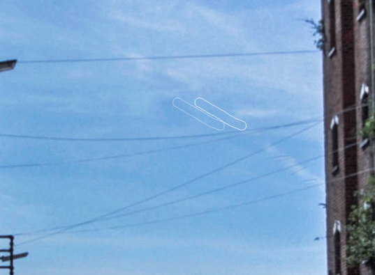
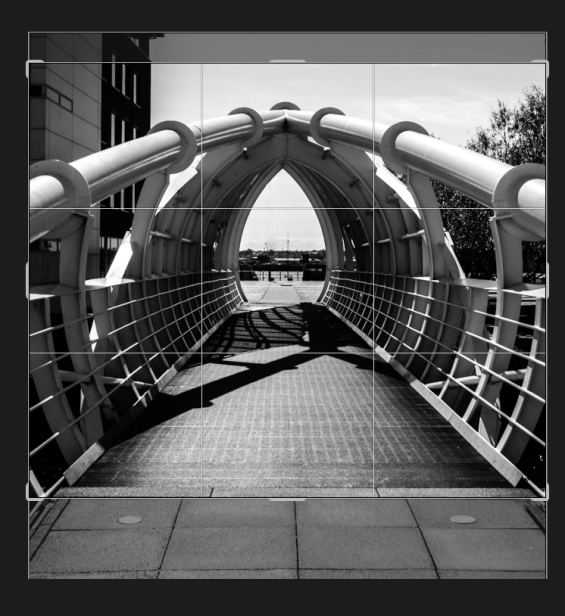
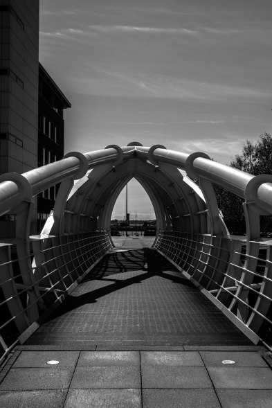
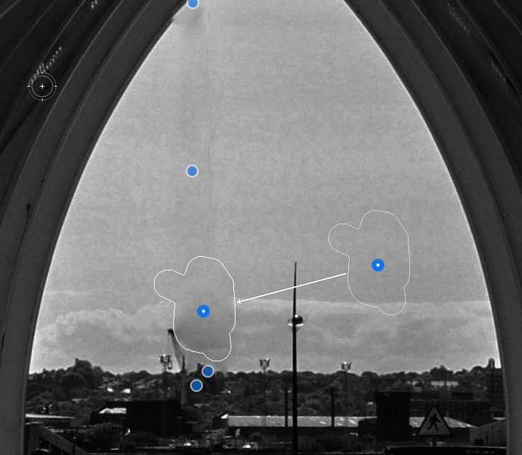
Over the course of this project I have learned and applied a lot of my research that I have done. A example of the production skills that I have learned is composition, from this research into composition I looked at leading line, symmetry and repetition. With this information, I went out to try to capture this my self.


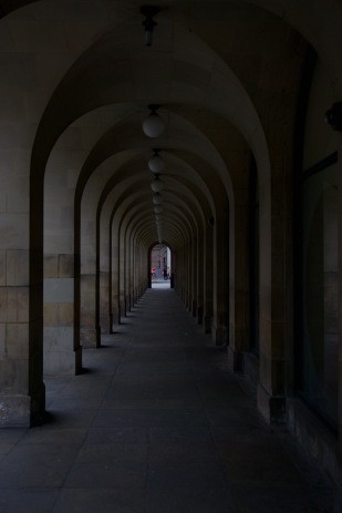
These are two shots that I took to demonstrate leading lines and symmetry, from these practice shots, I got better under standing of leading lines and symmetry , so when it came to my actual shoot, I knew what I was doing when it came to framing my shots for the leading lines and the symmetry.

Before I went to my proper shoots I wanted to understand the setting of the camera and what setting to use in certain situations. From this research I learned what shutter speed to use for different subject, what ISO to use in certain environments and what ISO gave the photos the most quality. I learned about the aperture, what it did, and what conditions to use different aperture, for example for sunny conditions you use f/16, for heavy overcast you use f/5.6. I also informed myself about the different  file formats you can shoots in.


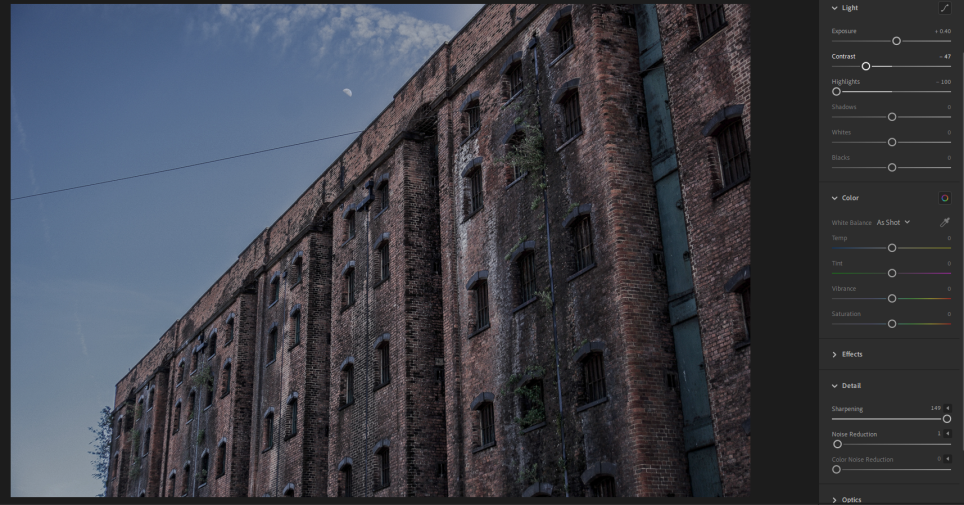
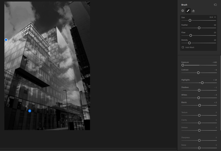
I properly got to understand these camera setting by actually going out on practice shoots and applying my knowledge on these setting and shooting subject. You can see that the photo on the left is a bit overexposed, so I then lowered the aperture so the building would be properly exposed.

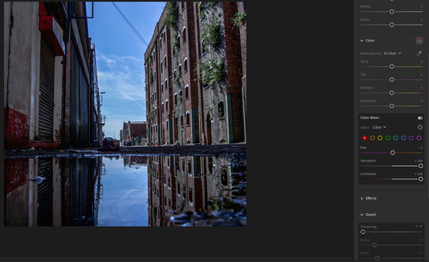
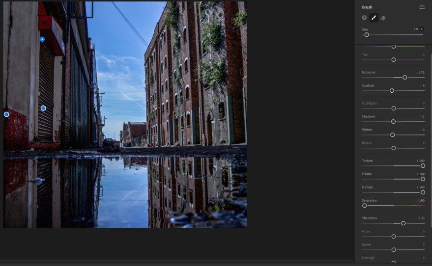
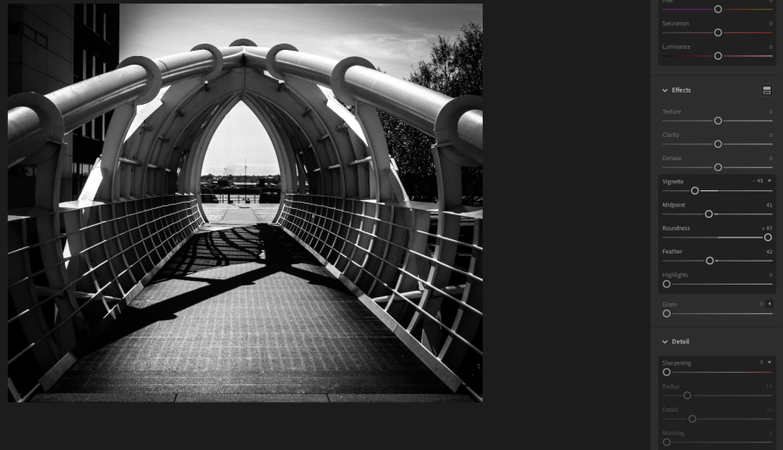
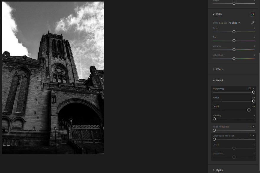
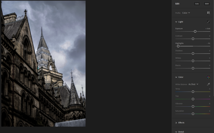
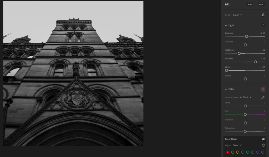
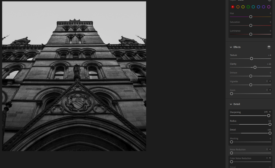
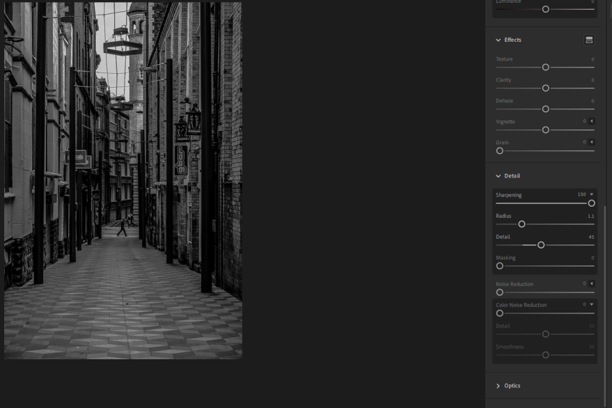
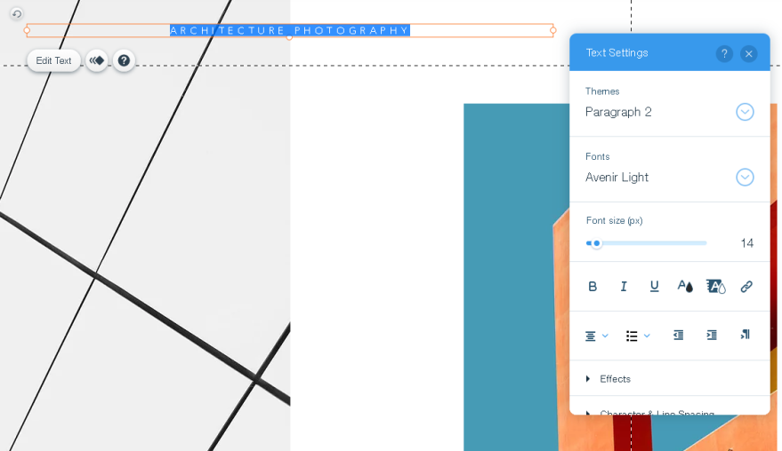
Because I was using Lightroom to edit my photos, I decided to make myself familiar with all the tools by going on Lightroom myself and finding out what all the different sliders did firsthand. I learned lots about the tools on Lightroom like Temperature and tint bar, Exposure and Contrast bar, Highlights and shadows bar, whites and blacks bar,clarity, vibrancy and saturation, and more. When it came to actually editing my photos on Lightroom, I was informed with the  different tools and what they did, so it was easier to edit and get to editing styles that I wanted.

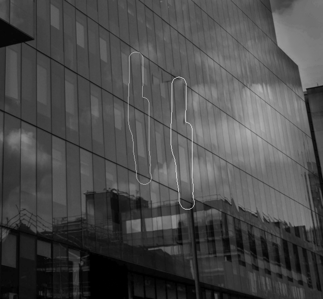
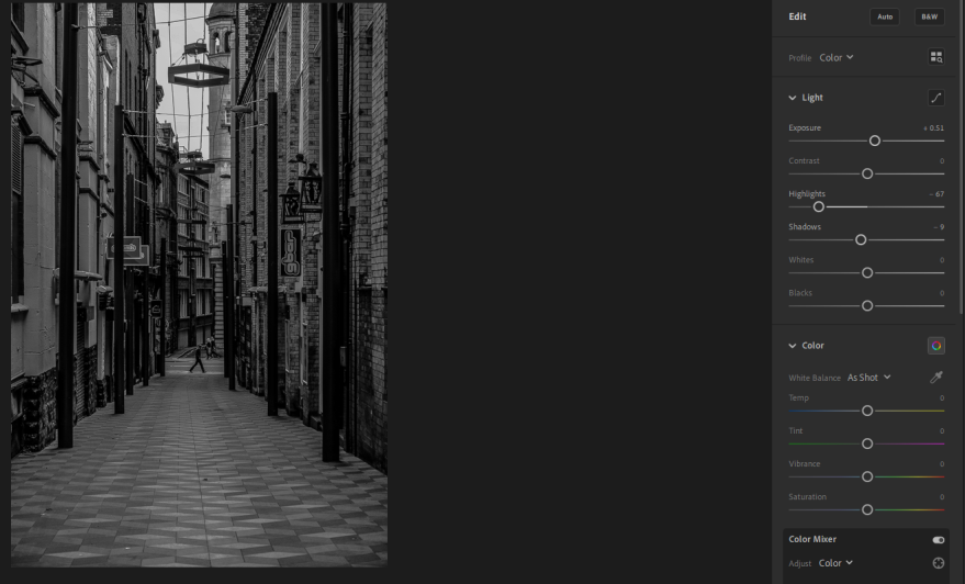
Another editing technique that I learned was the eraser tool in Lightroom and the content aware fill tool in Photoshop, these tools basically gives you the power to get rid of stuff in your work. Before actually using this tool on my final photos, I decided to get myself familiar with the tools so when it comes to the editing of the final photos I can do it easily and professionally.


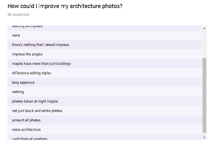
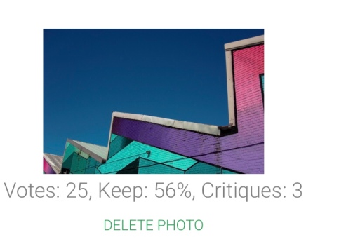
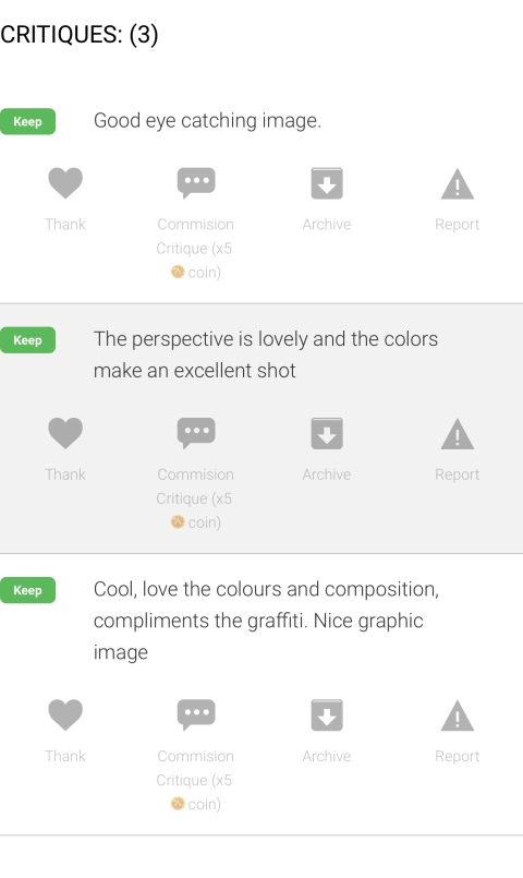
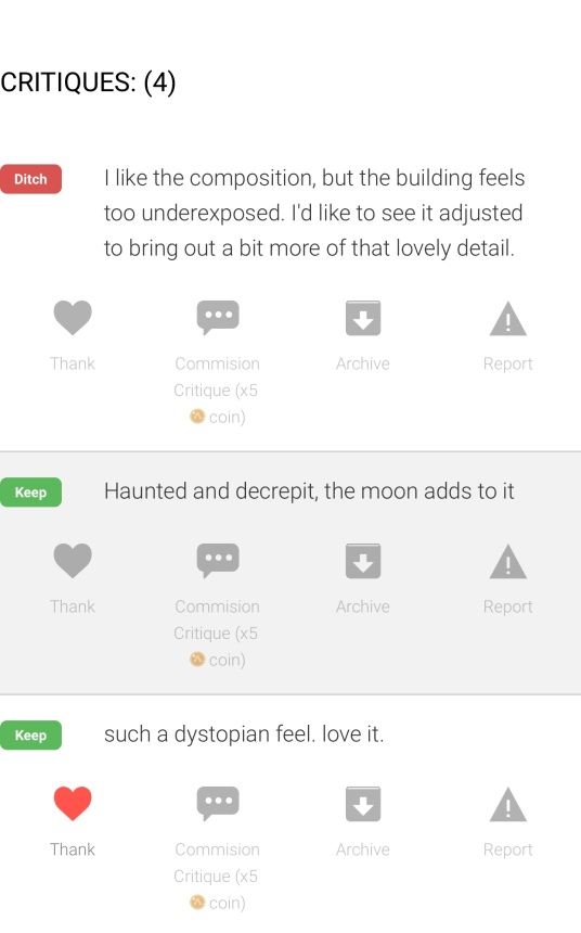
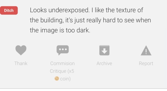
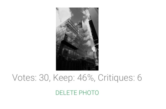
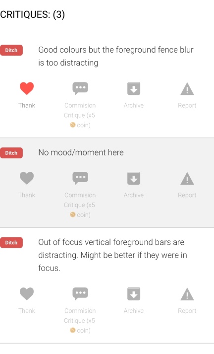
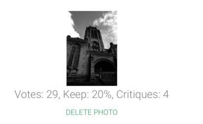
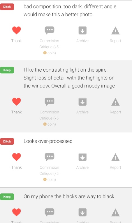
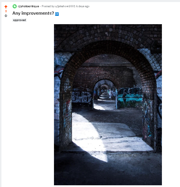
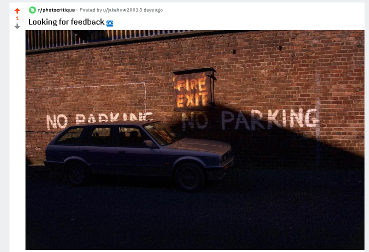
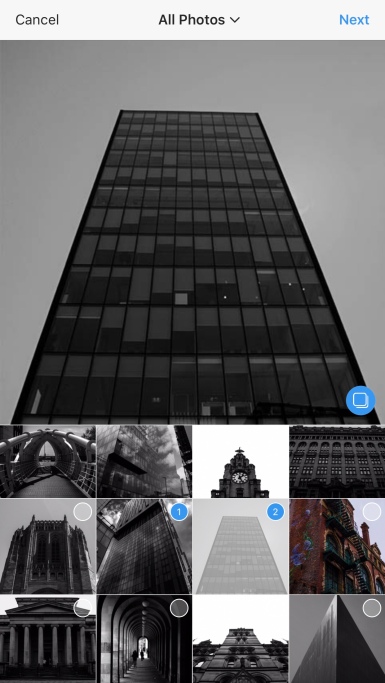
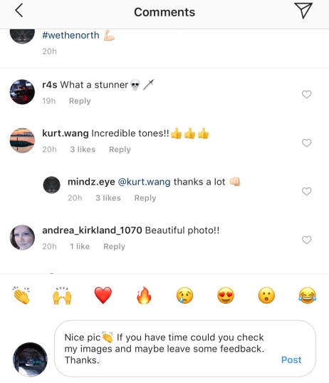
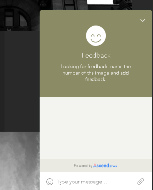
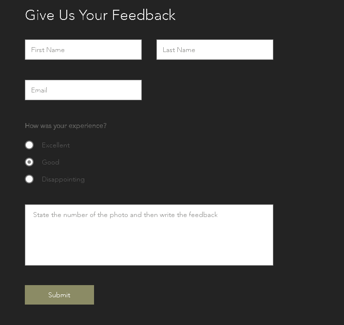
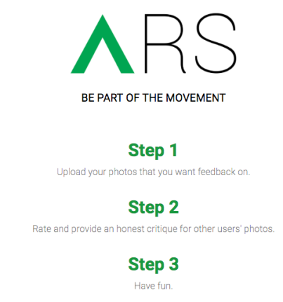
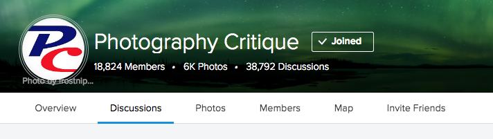
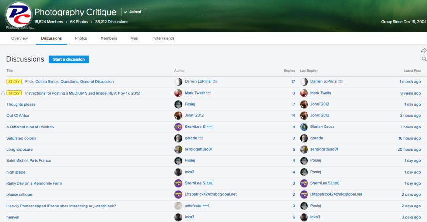
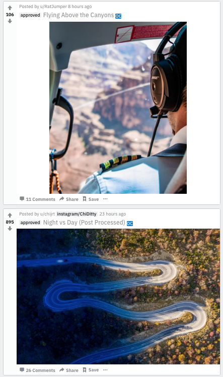
To gather feedback on my photos I decided to go to a range of different websites and platforms. The reason I decided to do this was, because I wanted to get feedback on as many photos as I could, I didn’t want to upload all my images to one website because there would be know way of getting feedback on all of them. The websites that I decided to use to gather feedback was, Reddit, Flickr, ARS Beta, and Photo.net.  Altogether from these different websites, I was able to get detailed feedback on 19 photos. For some of these photos, for most of these photos, I listened to the feedback and acted on it, by doing re-edits to my photos.


For my final reflection questionnaire I asked a couple of questions that would tell me if I have been successful in what I sought out to do.

ycgkcykg.PNG

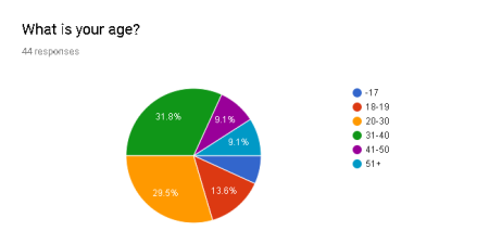
The first question that I asked was ‘What is your age?’. The reason I asked this question because I wanted to know if I was still connecting with my target audience. From these results I can see that my target audience is the two highest percentages on this graph, so I know I am still connecting with my target audience.

j,, n.PNG

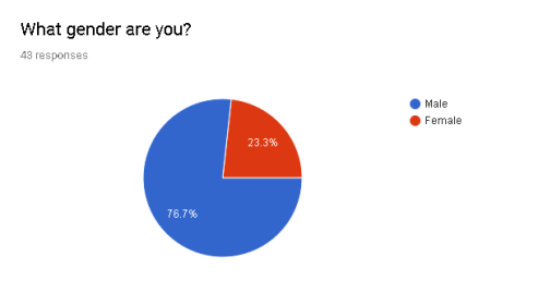
The reason that I asked ‘What gender are you?’, was because I wanted see male to female ration that I was getting was still male dominated. From these results you can see that it is, because this is sent out to Flickr as well as Instagram, there is going to be more males than females because more males use Flickr than females.


gykykx.PNG

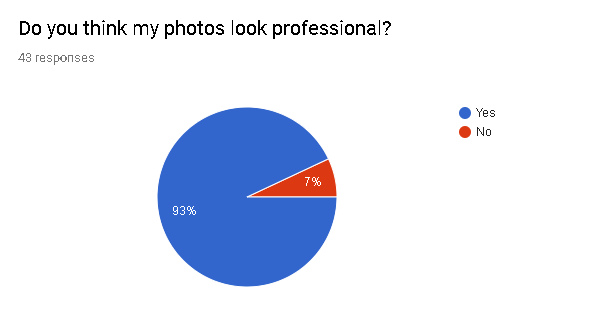
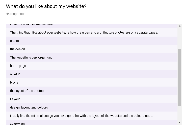
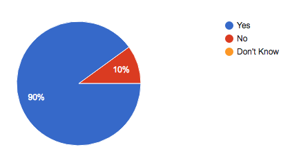
The reason that I asked this question was, because from the start I wanted to create professional looking photos, from these results I can see that I have been successful in producing professional looking image.

fyjkygk.PNG

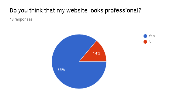
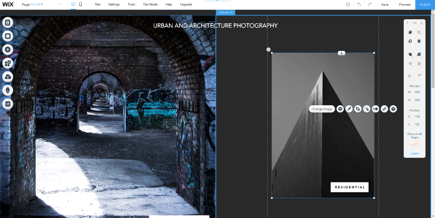
I also wanted a professional way of presenting my work, from these results, I can see that I have been successful in doing this.

ygkkg.PNG

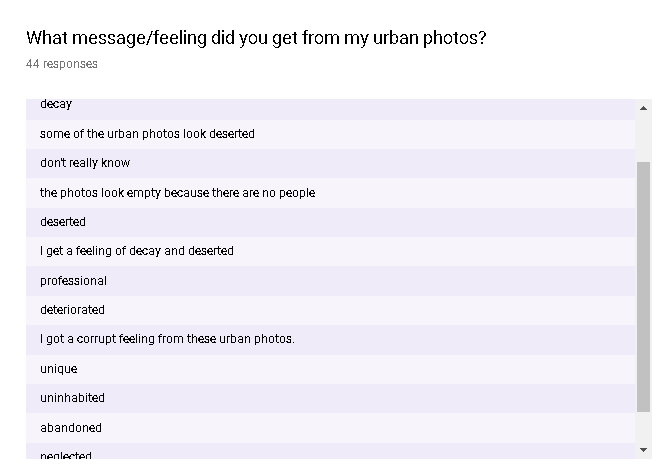
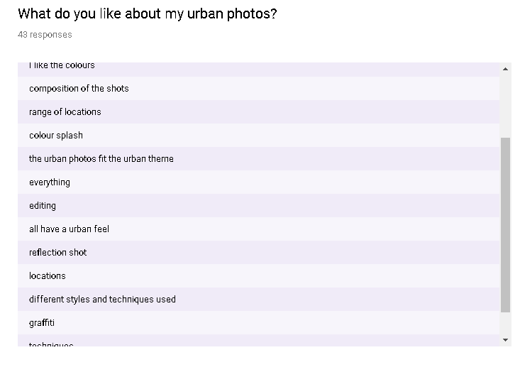
After developing my idea a bit more and finding out what I wanted from my urban photography, I wanted to get a feeling of decay and Deserted form my urban photos. From these results I can say that I have been successful in doing this because a lot of the answer talk about that.

dfhhhf.PNG

From the start I knew that I wanted professional looking photos, after a bit of research of looking at black and white images, I thought that the black and white of the photo made the photos look professional. I asked my target audience this, and agree with me as well.

gjj j.PNG

Another thing that I sought out to do after a bit of idea development was I wanted to use low angles to make the building seem bigger psychically and mentally. From these results I can see that I have been successful in doing this.


I think that I have done a good job producing what I set out to produce, this is because I created 30 professional looking photos, them all reflect the theme that they are in. I have presented them on professional and effective platforms. For my urban photos, I wanted to people to understand what I was going for which was making urban photos that look deserted and show decay in the scene. With my architecture photography, I have used the low angle when shooting the architecture to make them look big and intimidating and make the viewer feel small, and I have achieved that because of the feedback that I got. I wanted to make my architecture photos look professional by making most of them black and white, from the results I have achieved that. Looking at the schedule that I original put on my proposal, I haven’t followed it well, I started doing stuff a bit later than schedule. and some stuff a bit earlier so I got confused. If I was going to do this again I would of followed the schedule more seriously.


Reflection Questionnaire

For my final reflection, I decided to make a questionnaire that would tell me how successful I have been with what I went out to do. From this project I wanted to create 30 professional looking photos, I also wanted these 30 photos to reflect the theme I have chosen. For my 15 urban photos, I want to see if my target audience would consider my photos part of the urban theme of photography. For my 15 architecture photos, I wanted to see if my photos reflected that theme of photography. This questionnaire was put on my Flickr account and my Instagram, this was because  I wanted to reach my target audience which is 18-40, this is my target audience because that is the joined most popular age ranges on both of these social medias. I chosen both genders because yes, men do are more popular on these social medias, but females still take up a big percentage.

ycgkcykg.PNG

The first question that I asked on my questionnaire was ‘What is your age?’, the reason that I asked this question because I wanted to know what the age of the people who was answering my questionnaire was. The reason that I wanted to know this information because I wanted to know if I have been successful in reaching out to my audience. Not all the people who answer this questionnaire and all my questionnaires, because 18-40 is the most popular demographic between Instagram and Flickr, but is not the only age range that use these two social medias.

From these results I can see that the most popular two age ranges are 20-30 and 31-40, 20-30 with 29.5% and 31-40 with 31.8%. From the results to this question I can see that I have been successful with reaching my audience.


j,, n.PNG

The next question that I asked on my questionnaire was ‘What gender are you?’. The reason that I asked this question was because I wanted to know what percentage of the people who where answering my questionnaire was men and women.

From these results I can see that there are more males answering this than females. 76.7% of the people where male and 24.3% where females, so I think that I have been successful with my research that I did on my target audience.

fyjkygk.PNG

Next, I asked ‘Do you think that my website looks professional?’. The reason that I asked this question because I wanted to know if I was successful in making a professional website to present my photos on. Looking at the results to this question I can see that I have been successful in doing this because 86% said that it looks professional and only 14% said no.

jn,n ,.PNG

The next question that I asked was a follow up to my previous question, I asked ‘What do you like about my website?’. I asked this question because I wanted to know what people liked about my website.  From my results I can see that there are lots of different things that people like about my website like, the layout, colours and the overall design. So I think that I applied the information that I gathered from looking at professional photography websites.

gckykygc.PNG

I also wanted to know what people thought I could maybe improve about my website, so I asked ‘How could I improve my website, If any?’. From these results I can see that a lot of the people said that they couldn’t think of any improvements for my website. Most of the feedback that I got was about the colours used, information about myself and the photos. Also, on how I should add more photos to my website which isn’t really about the website it self. This information ins’t that helpful because the feedback ins’t in depth, but it is still feedback. When and if I start my photography career I will most certainly take this feedback in mind when making my website.


gykykx.PNG

The next question that I asked was ‘Do you think my photos look professional?’. I asked this question because I wanted to know if I was successful in producing professional looking photos. From these results I can see that I have been successful in making professional looking photos because 93% of the people who answered said they do look professional, and 7% said no.


ykkgk.PNG

For the next question, I asked ‘What do you like about my urban photos?’. The reason that I decided to ask this question I wanted to know what my target audience liked about my urban photos. From these results, the main things that people like about my photos is the locations that I chose, the editing, urban feel and the techniques used. From these results I can see that some of the research that I have done on the urban theme and editing has helped making my photos look professional.

lhvvhl.PNG

The next question that I asked was ‘How could I improve my urban photos?’. I asked this question because I wanted to know if there was anything that I could improve on my urban photos. From these results, I found that a lot of them where talking about how there is nothing to improve. Most of the feedback was talking about how I should have a varied amount of editing styles and techniques used, more photos, locations. From these results and for all the feedback responses for that matter, they are not that detailed. This makes it hard to respond and apply the feedback, so I have decided not the reply to this feedback because I have detailed feedback from other photographers from different photography critique websites.


lvhul.PNG

Like I did for my urban photos, I decided to ask ‘What do you like about my architecture photos?’. I asked this for the same reason ad I did for the urban photos. From these results I can see that a lot of people said that they liked, the editing, composition and the locations and architecture that I photographed. I like the feedback that I have gotten but the feedback is very brief so it wasn’t very helpful and detailed, so I chose not the act on it because I have already got some detailed feedback.

vlhul.PNG

The last question that I asked on this questionnaire was ‘How could I improve my architecture photos’. I decided to ask this question on my questionnaire because I wanted to know what would make my architecture photos better. From these results to this question, a lot of the people where saying that they can’t think of any improvements. Rounding up the feedback I got, a lot of the people said that I should have more architecture and photos, varied techniques and editing techniques. I appreciate this feedback but it isn’t detailed and is hard the understand and apply what they meant.


ygkkg.PNG

The next question I asked was ‘What message/feeling did you get from my urban photos?’. The reason I asked this question is because I wanted to know if the presented decay and deserted location in my photos. From the results I can see that I have been successful in that because lots of people have said how they feel a deserted,deteriorated, abandoned and decay feel. This was my intention for my urban photography and I have accomplished that.

dfhhhf.PNG

The next question that I asked was ‘What effect does black and white have on my photos?’. The reason I asked this question was because I wanted to see if I was successful in making my architecture photos look more professional, dramatic, and unique. From these results I can see that I have been successful in doing this because a lot of the results talk about, how it makes it more interesting, and professional.


gjj j.PNG

The last question that I asked was ‘What message/feeling did you get by the angle and position that my architecture photos where taken at?’. I asked this question because I wanted to know if I was successful in using the low angle to make people feel small and the building to feel big and intimidating. From these results I can see that I was successful in doing this, because a lot of the people said that it made them feel small and the building look big and powerful.


In conclusion I think that I have been successful in creating what I sought to create which was to create 30 professional looking photos that reflect and are a part of there theme, also, I wanted to present my photos to my target audience and present my photos on effective and appropriate platforms.


Feedback From Photo.net

The next website that I used to gather feedback on some of my photos was Photo.net. The reason I picked this website because while doing my research on different ways receiving feedback on photos, this website came up. On this website I posted to the ‘Seeking Critique’ forum, this forum is dedicated community who give feedback an who are looking for feedback.

yjjyjc.PNG

For the title of my post, I decided to just call it ‘Looking for any feedback’. I thought that this was a good title because they know that I want and need it. On photo.net there is also a option to add tags, for this post I added tags that where connected to the photo. I used a6000 because that’s the camera I used, I used reflection because there is a reflection in the photo.

xjtfjxfj.PNG

This was the first photo that I uploaded to the website, this photo was shot in Liverpool on a road full of deserted factories. I left this post on for a couple of days before I came back to collect the feedback.

xjtjtxfjt.PNG

This was the first comment that I got on this image. I am going to split this comment in to different section so I can address everything that he says. The first thing he talks about is how he like the reflection and how the building look like they are emerging out of the water. I agree with this comment, when I was shooting this photo I tried to get all of the bottom of the frame in the puddle. This ended not happening, because I wanted to try and get as close to the centre of the road without losing the puddle, so this is how far I could get with still most of the bottom of the frame full of the puddle.

One of the improvements that said I should do was to improve the colour correction on the red on the left side of the frame. I said I might need to correct this because the blurriness on that side actually suppresses the reds. I didn’t think that this was a big deal, but I can see how that could make the image better.

Another comment that he made was talking about the bent perspective and the lens distortion, and how is will make it better if you fix the distortion. I think that I did a good job of fixing the fish-eye effect, comparing it to the original image. I do agree that it might need a bit more correction .

xkk.PNG

Looking at the original raw file you can see that I improved is so much, looking at the building on the right, you can see how curved it looks. It might still need a bit more correction.

He also talks about how that there is nothing really happening it this photo, ‘lack of a story or some cue to further my imagination’. I do agree with this comment, but I can’t shoot whats not there, I could edit something in there but I don’t know what I would put and I don’t have the edit capabilities. For example, if I but a person there, that would bring all the attention to them and I don’t want that because that’s when it enters the street photography area.

He then goes onto talking about how he think that ‘the scene might be portrayed to focus on the eerie loneliness ‘. This is what I was going for so I am glad I have succeeded in doing that. Also he talks about how I need to correct the perspective and also how I might need to crop the image so it gives the reflection a infinite effect.


xjtfjxftj.PNG

The second comment that I got on this post was by Samstevenes. Like the other comments I am going to split it up into different sections so I can mention everything they said. He talks about how he disagrees with Supriyo comment about the distortion that In on the photo, he said that it add to the sense of unreal.He also said that he likes that I haven’t cropped the image so it doesn’t show the floor at the bottom, because Its a urban scene not a nature landscape scene.

He also talks about as a viewer he appreciates the contrast between both sides of the street,the buildings on the right are warehouse and the building on the left have more of a commercial feel.

One comment that I found interesting is that the metal doors have the potential the have a lot of texture and detail, I didn’t think of that and I agree that , that would improve the image. Like the first comment, he mentions that there should be something in the middle of frame to give the shot more of a story. He said that the car in the middle should be brought more into the scene and a more important aspect of the shot. I do agree with this, but I can’t control how close the car is away from the puddle, I could crop it but I don’t think that would improve the story of the shot.


jxtfjtfxj.PNG

The third comment that I got on this post was from dcstep, in this comment he talks about how I should crop the image. They said that I might want do a 2:1 crop so the water line is in the middle of the photo. He also talks about how there is no direction for this image, there is nothing happening. I do agree that there should be some kind of crop.


jyxgjy.PNG

The last comment that I got on this post was from ‘DavidTriplett’. In this comment he talks about how he like the distortion in the water’s surface and also that the out of focus stuff is distracting. He also talks about how I should probably crop a bit of the sky. He said that I should get rid of the contrails caused by planes because it is a distracting. He actually did a edit of his own to show me what he meant.

Because of the comments that I have received on this post, I have decided to do a re-edit of this photo.

tjsjr.PNG

The first thing that I did was to crop the image, I decided to crop the image because of the multiple comments a got about how I should. The comments said that the out of focus foreground is distracting so I decided to crop a bit of it out, so it isn’t as distracting. I also decided to crop a bit of the sky, because I got some comments talking about how there was too much sky.

jstjst.PNG

After cropping the image, I decided to edit the reds that are on this photo. I did this because I got a comment that said the reds needed colour correcting. I did this by going to the color mixer tap and then picking the colour I wanted to edit which was red. I then brought the saturation and the Luminance so the reds where brighter and more visible.

jtxtj.PNG

The next thing I did was to bring the detail out on the metal door, I did this because someone said that this would make the photo look better. I did this by using the brush tool and selecting the metal door, I then turned up the sharpness,clarity and the exposure so the detail was brought out.

dbbddb.PNG

tjjxjj.PNG

The last thing I did was to get rid of the trails in the sky, I decided to do this because someone mentioned that they where distracting. After doing this I also decided to get rid of the multiple power lines at the top of the shot. I did this by using the healing tool in Lightroom.

DSC05156-2 (1)-2.jpg

Looking at the second edit of this image, I prefer this edit because there isn’t any distracting ground in the foreground, I also like the crop at the top because there isn’t as much sky and I think this makes the image better.


The second image that I uploaded to Photo.net was this image of a bridge in Liverpool.

jytxj.PNG

For the title of this post I just decided to keep it short and straight to the point by calling it ‘Feedback’. I did this because this is what I want, feedback.

,u,yj.PNG

,c,c,,.PNG

The first comment that I got on this photo was dcstep who also commented on my first post. I will be splitting this comment into different section so I can mention everything he is saying.

The first thing talks about is the negative space that is at he top of the frame, he says that it is that it ‘Sucks energy out of the image for me’. I can see where he is coming from and a actually agree with this comment. I think that there is no need for that much sky because nothing is happening.

He also talk about how he would like to see the image cropped so only the tunnels is showing, not the sky at the top of the frame, also that he would like to see this image i landscape. I also think that this would improve the image because all of the attention will be on the bridge.

In another comments that he make he talks about is that the exposure is to dark  and it ‘conflicts with that what I think is the reality of the scene’.

He also talk about how the pole is distracting and how he would like if included added some bokeh. I agree with this comment but there is no way of me adding bokeh.


,c,c,ch,h,c,,.PNG

The next comment that I got on this post is from Supriyo who also commented on my first post. In this comments he said that he also doesn’t like that there is lots of sky and that I should probably crop the image to get rid of this sky

He also mentioned how cropping the image will take away from the fact that there is nothing in the centre of the bridge.

vvj jvj.vj.PNG

The last comment that I got on this post was by DavidTriplett who also commented on my first post. In this comment is basically agrees that there is too much sky and how it is too distracting, he also agrees that I should bring up the exposure up a bit.

In this comment he also says that the payoff at the end is disapointing because there is nothing there. He also said that the shot would look better if the bridge was off to one side rather than int he middle, also that maybe that I should add a vignette to focus more on the bridge.

tkjxfxfk.PNG

Because of the comments I received on this post, I decided to do a re-edit of this image but this time I will be fixing what was mentioned in the comments. I actaully already did a second edit of this photo because of the comments I received on ARS Beta so I decided to upload that edit into Lightroom and start editing that one.

The first thing that I did was to bring the exposure up and also the contrast because that was recommended in the a couple of my comments.

mxfmm.PNG

The next thing that I did was to add a vignette, I decided to do this because it was mentioned in one of my comment. The vignette will bring the detail to the detail on the bridge, it will also darken the areas which I am not focusing on like the building to the left.

ykxkyxk.PNG

The last thing that I did was to crop the image so it was a bit more tight so it was only focusing on the bridge not the sky of the pavement at the bottom of the frame.

DSC05079-2-2-2.jpg

Looking at this edit of the photo, I like it more because all the attention is on the bridge not the sky, I also like how the vignette darkens the edges bringing your attention towards the bridge.


Feedback From ARS Beta

For my feedback on my photos, I decided to use multiple different sites and platforms to get a range of different people who are on the different sites. Another big reason why a decided to pick multiple places to get feedback on my photos is because I knew if I uploaded all of my photos to one site I wouldn’t get feedback on a lot of them . Also the same people might be critiquing my photos and I want a range of people with different experiences to give me feedback.


The first website that I uploaded some of my photos too was ArsBeta.

DSC05031-2.jpg

The first the image that I uploaded on Arsbeta was this one of the building with the colourful graffiti. I left this post on for I couple of days to get the more feedback, after the fourth day of leaving the image on the website I realised that I wasn’t going to get any more than three responses. Comments on this website is not the only way of giving feedback, when people come across your photo they can decided between choosing Keep and Ditch. Picking Keep obviously means that they like the photo and they think you should keep it, Picking Ditch means they don’t like the image and they think that you should get rid of it. This kind of feedback isn’t as helpful as the comments but it is still feedback.

On this picture, 56% of the people who voted said that I should keep the photos. 25 people voted all together, I calculated the amount of people said keep by first finding what percent represents one person. 100 ÷ 25=4 , 56 ÷ 4=14, this means that 14 people voted that I should keep the photo, and the rest of the people, which is 11, voted that I should ditch the photo. I am going to keep this photo even though nearly half of the people said I should ditch it, because there is still people who appreciate the photo. There is always going to be people who don’t have the same taste as you.

The first  ‘Critique’ that I got on this photo was ‘ Good eye catching image.’. I definitely agree with this comment. The colours included on this photo really make it stand out. This photo is definitely my most vibrant photo out of my 30 photos, the reason I haven’t had more vibrant photo especially in my urban collection is because the research doesn’t reflect that. The urban photos that I have been looking at are more dark and gloomy. With that said, I still consider this a urban photo because of the graffiti, from my research I found that graffiti is a big theme of urban photography.

The next comment that I got on this photo was ‘The perspective is lovely and the colors make an excellent shot’. Like the other comment, I agree as well,when I was shooting the this building, I didn’t  want to get all of the building. I decided to get the top of the building so there was a lot negative space. The reason I wanted some negative space because I wanted a lot of the attention on the building. I also agree that the colour make a excellent shot because without them its just ordinary building.

The last comment that I got on this photo was ‘Cool, love the colours and composition, compliments the graffiti. Nice graphic image’. This comment is similar to the last one because this person I also saying that the perspective I have chosen compliments the graffiti. They also say that they like the colours which I agree with.

In conclusion, the perspective that I have chosen complement the graffiti, and also the colours is really what makes the shot.

DSC05175-2 (1).jpg

The next shot that I uploaded to this website was this one of a factory in Liverpool. Like the other post, and all of my posts, I left them on the website for a couple of days before I came to collect the date. This gives people time to comment on the post.

25% of all the 24  people who voted said that I should keep this image, 25%  of 24 is 6, so 6 people said that I should keep it. That means that 18 of the 24 people said that I should ditch this photo. From the comments I can see what peoples problem with this photo is.

The first comment that I received on this photo was ‘I like the composition, but the building feels too underexposed. I’d like to see it adjusted to bring out a bit more of that lovely detail’. I don’t actually agree with this comment, but I can see where they are coming from. The image is dark and a bit underexposed, this is what I was actually going for, because I think that the darkness makes the building look deserted. They are not actually saying they don’t like the original image but they just don’t like this edit.

The next comment that I got on this post was ‘Haunted and decrepit, the moon adds to it’. I am glad that someone noticed and acknowledged what I was going for, I was going for that urban feels with this photo. The darkness on the photo gives it a haunted feels. They also mention the moon which I didn’t mean to capture, but I am glad I did because like they said, it adds to it.

The third comment says ‘such a dystopian feel. love it.’. I also agree with this comment as well because the building look deserted and the editing done only boost this feeling. Urban locations are always safe, some areas are dangerous and frightening so I definitely agree with the dystopian feel.

Someone else also commented ‘Looks underexposed. I like the texture of the building, it’s just really hard to see when the image is too dark’. Like I said for the first comment, I don’t agree with it being to underexposed but It has been mentioned twice so there must be some truth in it.


edit 1.PNG

From the comments I decided to do a second edit of this photo, but this time correcting my mistakes I made with the first edit. I imported it into Lightroom, I then decided to increase the exposure so the the image is brighter so you can see more of the detail. I then went onto decrease the contrast so there wasn’t a big difference between the bright and dark part, making the image brighter. The last thing that I did was to increase the sharpening, this increase to detail, I decided to do this because the two comments said that there wasn’t enough detail in the image.


DSC05175-2 (1)-2.jpg

This is the what the image looks like now, looking at it now, I think that It actually looks better. I can now see what they where talking about with the detail. You can really see the detail at the right side of the building.


DSC04936-2.jpg

The next photo that I posted on this website was this one of the building in Manchester with the reflections. 46% of the 30 people who voted said I should keep this image, that’s about 14 people so that means that 16 people said I should ditch the image.

The first comment I got on this post said ‘subject building is lacking figure to ground’. I actually wasn’t aware of what figure to ground meant, but then I did a bit of research. Figure to ground is basically the contrast between your subject and the background.

BETA, A. and HERE, S. (2019). Street Photography Composition Lesson #2: Figure-to-ground. [online] ERIC KIM. Available at: https://erickimphotography.com/blog/2013/10/07/street-photography-composition-lesson-2-figure-to-ground/ [Accessed 5 Jun. 2019].

I can understand where they are coming from because in my case the building and the background do not have a big contrast between them. The building looks like it is part of the sky, it’s blending in with the sky. This is especially the case with clouds in the sky and the ones reflected onto the building.

The second comment that I got was ‘Love the reflection of the clouds on the building. and the gradient from top to bottom is amazing.This person likes the fact that there is clouds reflected onto the building even if it does disrupt the figure to ground.

After this I got a comment that says ‘pretty cool and good black and white photo. This comment isn’t as helpful as the other comments but I still appreciate this comment. I also think that this photo is good in black and white, the clouds reflected onto the building really contrast with the building,

The fourth comment I got was ‘Nice clouds reflections on building. Over all a bit dark at the bottom and i’d probably clone out the light post in the lower center’. This person also like the cloud reflections so that much be a good part of the image. They said that the image is a bit dark at the bottom, I personally don’t mind this but I guess it is wasted space if you can’t see the detail.

The next comment says ‘I like the perspective, but the toning could be better. The borders of the building kind of melt away into the sky, which takes away from the nice geometric’. This person has also mentioned how there isn’t a lot of figure to ground. I can see where they are coming from.

The last comment was just a small brief compliment which I appreciate but is doesn’t help me with improving the photo.


tnnsrn.PNG

Because of the feedback I got on this image I decided to do a re-edit, the main feedback I got on this photo said I do not have enough figure to ground. Because of these comments I decided to fix it the best I can. If I change the exposure or the contrast it going to change the whole photo and I don’t want that. I wanted a way to separate the building from the background when editing. The way I found to do this was to use the brush tool. With this you can mark what areas you want to edit, so I started to drag the brush tool across the sky. When I finished this, I then started to decrease the exposure so the sky started to going darken giving the image figure of ground. This is because there is a bigger contrast between the building and the sky.


mxmx.PNG

One of the comments said that the lamp post was distracting, Because of this comment I decided to get rid of it. I did this to the best of my ability using the brush tool, It’s very hard to do it in this instance because there are lots of lines and you have the join all of these line together.


DSC04936-2-2.jpg

This is the image after doing the re-edit and I think it looks better. You can see that there is more of a contrast between the sky and the ground and also there is no lamp post at the bottom of the photo.


DSC05079-2.jpg

30 people voted on this photo and 26% of them said I should keep this image, that about 8 people, that means that 22 people said I should ditch this photo. I don’t agree with getting rid of this photo but I will look at the comments to see if there is anything I can do to improve it.

The first comments says ‘I love it. The only thing that would make it better is something interesting at the end of the tunnel, preferably in silhouette. great job’. I don’t agree with this comment, because if I do add something at the end that what will get all of the attention, and I want all of the attention on the bridge.

The next comment says ‘ I don’t like the negative space at the top’. I agree with this comment because there isn’t anything happening at the top. So I will consider changing this when I do a re-edit.

Another comment that I got said ‘There are elements outside your control that adversely effect the image without the building on the left and the post in the background it would have a lovely symmetry’. I agree that this photo would look better if there wasn’t anything distracting you like the building to the left, but like they said its out of my control. If I tried to get rid of the building with the healing tool it wound’t work, because its too big and there are complicated areas that would be hard to remove.

The last comment that I got on this photo was ‘ The fact that the pole framed in the opening is off center is disturbing’. I agree with this comment because it is distracting.


shthsh.PNG

Because of the comments that I got, I decided to do a re-edit fixing and improving a couple of stuff. The first thing that I decided to do, was to crop the image, I did this because there was too much negative space.

zrhzhh.PNG

The next thing that I decided to do was to get rid of the pole in the centre of the shot that was distracting. I did this by using the healing tool in Lightroom.

DSC05079-2-2.jpg

This is the photo after the re-edit, I think this edit more because there isn’t as much negative space so no wasted space, also there is nothing in the middle of the shot distracting you.


DSC05040-2 copy.jpg

The next photo that I uploaded to this site was this one of the skate park. 31 people voted on this photo, 19% of them said that I should keep this image, that’s about 6 people, meaning that 25 people said I should ditch this photo.

The first comment says ‘Good colours but the foreground fence blur is tool distracting’. I think that the fence blur is a good addition but I agree that it is some what distracting.

The next comments says ‘No mood/ moment here’. I agree that there is nothing really happening but the main reason of this photo is to showcase, so I don’t think it necessary need something happening.

The last comment that I got on this photo was ‘Out of focus vertical foreground bars are distracting. Might  be better if they were in focus’. Like the other comment, I agree that the bars are distracting and if I went again I would have got them in focus.

Because there is no way of making the bars in focus in post production, I am going to have to leave the image. That’t my fault for not getting the bars in focus and not capturing a moment at the skate park, but you cant shoot whats not there.


frnndz.PNG

When I was shooting at this location I got a couple of photos, but the one I got was the best one out of all of them. This was one of the photos that I got, this would have been a good shot if the background was in focus.


DSC04800.jpg

For this photo of Liverpool cathedral, 29 people voted on it. 20% of the people said that I should keep this photo, that’s about 6 people meaning that 23 people said I should ditch this image.

The first comment that I got on this photo says ‘No detail in the building’. I can see what they are saying, there isn’t much distinction between the bricks. That is something that I should of consider when doing my first edit.

The next comment says ‘Composition is a little off; I don’t like how the arch is cut bottom right’. I do agree with this, when shooting this shot, I should of framed it better,unfortunately this is the only shot I got at this angle.

Another comment that I received was ‘Unremarkable’, I don’t agree with this comment but everyone has there opinion. This comment ins’t as helpful as the other ones because it’s a one word answer with no explanation about why the image is unremarkable.

The last comment that I received says ‘For me the dark areas lack a little detail’. This is similar to the first comment and like the first comment I agree with this. Especially in the dark areas of the photo, there is a lack of detail.


ztjtjjzt.PNG

Because of the comments I got on this photo, I decided to bring it back into Lightroom and do a re-edit. The thing that I did in the re-edit was to bring and increase the detail in photo, this is because I got multiple comments saying that the image is lacking detail. I increased the detail by going to the detail section and increasing the sharpening, radius and the detail.


arnnn.PNG

Looking at this second edit of the photo, you can see the detail in the bricks more and I think that this makes the photo more interesting and eye catching compared to my first edit version.


DSC04880.jpg

The last photo that I uploaded on this site was the photo of the Manchester city council building. 30 people voted on this photo, 33% of them voted that I should keep this image, that’s about 10, meaning that 20 people said that I should ditch this photo.

The first comment that I received says ‘Bad composition. too dark. different angle would make this a better photo. I don’t agree with the comment about the composition, I think that it looks. unfortunately I don’t have any other angles of this part of the building. I do agree that It might be a bit too dark.

The second comment that I got says ‘I like the contrasting light on the spire. Slight loss of detail with the highlights on the window. Overall a good moody image’. I like how he likes the contrast between the two part of the building because I also like this about the image. Looking at the window I can see what they are talking about the lack of detail. I didn’t notice that when I was editing.

Another comment that I got was ‘Looks over-processed’. Even though I don’t totally agree with this comment, there a bit of me that agrees with this, but I don’t think that’s a bad thing. I might of edited this image a bit too much.

The last comment that I got on this post was ‘On my phone the blacks are way to black’. This isn’t just on his phone, the dark and a bit too dark. I should of made the black a bit more brighter.


ernrj.PNG

I decided to re-edit this photo, and change and improve the image. The first thing that I changed was the exposure, I increased it so the image wasn’t as dark. I did this because a got two comments saying that the image was too dark. The last thing that I changed was the Highlights, I decreased this so the whites where not as bright. This resulted in the sky getting darker as also bringing the detail out in the window.


DSC04880-2.jpg

Looking at the second edit, it’s hard to see what I have changed, but even the small improvement still improve the photo.

Feedback From Flickr

To gather feedback on my photos I decided to upload a couple of them onto Flickr.

jtj.PNG

For my first post I decided to upload it to the Critique group on Flickr, I decided to choose this one because this is one of the best groups to get feedback on your photos.

The first image that I posted was this one of the Manchester city council building. For this poster I decided to change the title to ‘Feedback on photos’, the reason I chose this title because that’s what I want. I also added a bit in the description of the post saying ‘ For my college project I need to gather some feedback, constructive criticism and what you like about this image. Also if possible make sure that you also check my other images and do the same. All feedback is appreciated. Thanks’. The reason I chose to put this is in because I though if a said that it was for a college they where more likely to give feedback because they know I need it.

hzdhdh.PNG

The first comment that I actually got wasn’t feedback, it was someone saying that they can’t see the image. When uploading the image I did it wrong so know one could see, lucky the person who commented was a MOD on the group so they changed it for me. They link a page that gave me instructions on how to upload a image properly so that was helpful and help me overcome this problem that I encountered.

jxjjxj.PNG

The first comment that I got that included some feedback was from Boyd Crochet. In this comments he talks about how he doesn’t like how he can’t see the ground, and that he has a strong dislike for ungrounded architectural images. I don’t agree with this comment but I do wonder what the image would look like if the lower part of the building was showing.

He also talks about how he doesn’t like the very dark black and the bright whites, it make the it unpleasant. I agree that the contrast is a bit high.

Also he mention on how this looks like a lazy capture with aggressive processing. I agree that I might of done a lot of editing but I don’t agree that this is a lazy capture. I took time with finding this angle and finding the right composition. When looking in the viewfinder I tried to match the sides up so it was symmetrical.

yxjgjxy.PNG

The second comment that I got on this post is from dave dube. On this comment he mentioned that I have a lazy capture with aggressive processing. . Two people have already said it so there must be a little truth to it, maybe I could have taken more time on this shot.

He also mentions that the leading lines on this photo is not good and not effective. I do agree with this because the building leads to the near the centre of the shot where there is nothing.

jxygyxgj.PNG

Another comment that I got on this post was by Tara Stoddard. In this comment she says that I should crop the sky out so the leading lines lead to the top of the frame. Also how I should of lined the shot up better. I agree that I should crop the sky out and that I should of framed the shot a little better.

xjyjyx.PNG

The next comment that I got was another one from dave dube. He says that I should of lined the gable lines as a alternative to grounding the building. I do agree I should of made the shot more symmetrical.

xjygjxg.PNG

Another comment that I got was m.keeton626. In this comment they mention how the sky the isn’t interesting because it is completely blown out, even a bit of Gray would make it more interesting.

Another comment that he made was about how the photo isn’t symmetrical and how a should of made it symmetrical as possible. I agree that I should have done that. He said that I should look at some photos from Richard Hunter.

jtxjjxtfjjfxtj.PNG

Flickr. (2019). Richard Hunter. [online] Available at: https://www.flickr.com/photos/rarhunter/with/44337214332/ [Accessed 6 Jun. 2019].

After looking at a couple of Richard’s images I can see how important it is to have symmetric in this area of photography.


xjtfjxftj.PNG

The next comment that I got was another one by dave dube. In this comment he actually did a edit of my photo showing how he would of done it. On this image he has changed some of the tones. I actually like this edit because there isn’t as much negative space and not as much contrast.

xjftjtf.PNG

The last comment that I got on this post was from OttoKruse, the same person that fixed my photo so people could see it. In this he talks about how this is lacking figure to ground. he said that he is trying to find the ground to the image but he can find one because there isn’t one.

Because of the comments made on this photo I have decided to do a re-edit. Fixing and improving and couple of things that where mentioned.

rhdhzh.PNG

The first thing that I did was cropping the image, I cropped the top so there wasn’t as much sky and negative space. I did this because multiple comments where saying that the amount of sky was distracting, also because the leading lines on the building where leading near to the centre where there is nothing.

zthhztfh.PNG

After cropping the image I decided to increase the exposure a bit so it wasn’t as dark, I also brought down the whites and highlights so the sky wasn’t blown out.

mh mm.PNG

I also brought up the detail and the clarity because with the previous edit the detail wasn’t visible in the bricks.

DSC04621 (1)-2.jpg

This is what the image looks like after the second, with the applied feedback that I have got on this image. I prefer this edit of the photo because there isn’t as much negative space and also the sky isn’t as blown out as it was previously. Also, the detail in the brick is more visible now I have brought up the exposure and the sharpness.


kfukk.PNG

The next photo that I uploaded onto this group was this one of the side street with the guy walking by.

kckkck.PNG

The first comment that I got on this post was from Boyd Crochet. The first thing that he said was that I was uploading to many photos and I was not participating. This is one of the other reasons I decided to choose multiple platforms to gather feedback, so I didn’t look like I was asking for too much.

The first feedback he give me is about the brightness of the sky, the fact the sky is blown out brings attention to it and there is nothing there. I agree with this comment, my attention is drawn towards to sky and yes, there is nothing happening there.

He also mentioned that the the two other people at the other side of the street brings away from the loneliness of the photo. I agree that the image would look better if them two people weren’t there.

kukc jkckj.PNG

The next comment that I got on this post was by Tara Stoddard. She also talks about how the sky is distracting and how I should get rid of it.

She also talks about how it will help people if you give a background on what I was looking to capture. When I was shooting this, I was just trying to capture the building but by chance, someone walks past the frame.

uckkhk.PNG

The last comment that I got was by dave dube. He mentioned how I should work on my tones so you can get a better separation in the detail.

He also talks about the two people at the back and how the image would look better if they weren’t there. He suggested I get rid of them.

I decided to do a re-edit of this photo and fix and improve some stuff that has been mentioned in the comments that I have been made about this photo.

hrdhzdh.PNG

The first thing that I did was to increase the exposure a bit so you can see the detail in the darker areas. I also decreased the highlights so the sky ins’t as bright so not a lot of attention is brought to it.

rhzdhzh.PNG

The next thing that I did was increasing the detail by increasing the sharpening.

hzrzdh.PNG

The last thing that I did was to get rid of the two people on the other side of the street. I did this because I got multiple comments saying that they distract and bring attention away from the man walking in the middle of the frame. I did this by using the healing tool in Lightroom, this is the best I could do.

DSC04736-2-2.jpg

This is what the image looks like after I finished emending it. I prefer this edit because the two people at the back are not bringing the attention away from the main subject. I also like this edit better because your eyes I drawn to the sky at the top of the frame because I have turned the brightness down.


jyjjcg.PNG

The only post that got any comments on the ‘Photography Critique’ was this one of the fire escape.

For this post, I changed the title to ‘Feedback needed’. I thought if I named it this, I would look more desperate and show people I really needed them. I just said ‘Would appreciate any and all feedback. Thanks’ because I wanted them to know that I was thankful.

xjjxjfy.PNG

The first and only comment that I got on this post was by Melindros1152. In this comment he says that he likes how sharp and in focus the building is. He also talks about how the composition feels a bit unbalanced because the corner is being cut off.

He then goes on to talk about how the flowers ruins the photo a bit. I disagree with this comment because I think that the flowers in a great addition to the photo. The fading of the flower graffiti can represent  multiple things.


This comment was under one of my images that where in my gallery on Flickr, so it wasn’t from a group.

jxjxfj.PNG

I added a comment that said why I was doing this and what I wanted, which was constructive criticism.

jxfjfxjf.PNG

The first and only comment that I got on this image was from Sheila Sund. In this comment she talks about how she likes the minimalist style that I was going for. Also that she likes that the lines in the middle of the frame. She also mentioned that this image could be cropped so the sides where symmetrical.

She also talks about how I should brighten the sky so there is a bigger contrast between the building and the sky.

eggeg.PNG

Because of the comment that was made about my image I decided to do a re-edit. The first thing that I did was cropping the image. I cropped it so the side lined up so it was symmetrical.

ullv.PNG

The next thing that I did was I increased the highlights, this increase the contrast between the building and the sky.

DSC04981-2.jpg

This is what the image looks like when I finished the second edit. I like this edit better because it is symmetrical so on both sides, and also because there is a bigger contrast between the building and the sky.


Feedback From Reddit

The reason I decided to go on Reddit, is because from my research I found that Reddit is a good platform to receive feedback.


thhsht.PNG

The sub-reddit that I decided to upload some of  my images to was the r/photocritique, the reason I decided to join this sub-reddit was because this is dedicated to giving feedback. For the title, I named it ‘Looking for feedback on this photo, Be critical. Thanks’. The reason I named it this is because I want people to know what I want, which is feedback.

jtxj.PNG

I added a comment under the post to inform the people who see this, why I am doing this and what I want from this. I thought if they knew my situation they would be more likely to leave a comment.


ckgyk.PNG

The first comment that I got this post was from Marchman . In this comment he says that I could soften the image with some  clouds instead of the blank space.

I don’t agree with this comment, because I don’t want it to look soft, I like it the way it is.

kckck.PNG

The second comment that I got on this post was from cohpik. In this comment he says that I should frame both of the lines at both sides of the frame. He said that this will require a reshoot but I don’t it does, I can always crop the image so the sides lines line up.

The next thing that he says is that at first glance the image look like a minimalist art piece rather than a photo. I prefer the image to look like this because I was going for the minimalist style.

With the comments from Flickr, I already cropped the image so the lines meet up at the same point at each side making it symmetrical.


This was the only post that actually got comments on. In conclusion, I don’t think that reddit is the best place to gather feedback, compared to the other platforms I’ve use  anyway.

.zhdh.PNG

xjfjxj.PNG

I left both of these photos for a couple of days before I came back to collect the comments. At least I got feedback on one of my photos, I can force people to give me feedback.

Making A Instagram Account

https://www.instagram.com/jakeh1601/?hl=en


For my presentation of my photos, I have decided to make an Instagram account. The reason for me deciding to make an Instagram account is because of the research that I did on different platforms. A lot of platforms have I feature to add images and showcase them on your account, but they don’t mainly focus on this feature. Platforms like Facebook and Twitter have the feature to add images but these two platforms are also firstly and mainly communication social media. Instagram, on the other hand, is solely focused on uploading images and videos. On Instagram there is isn’t a feature to post a written message without adding an image and writing in the caption. Because this website is based on photos and videos, it is a very popular social media for photographers to upload photos.

When I finished signing up and creating my account I decided to change the information on my account.

I changed my profile picture to one of the urban photos that I shot in Manchester on the shoot, the reason for me choosing this image as my profile picture is because I think that this is one of my best photos and I think that it portrays a photography account. When people see this profile picture they will know that it is a photography account, this might affect if they click on it or don’t, so it has to good and intriguing. For my name, I just put ‘Jake H’, the reason that I didn’t put my full last name because there is no need to. If they want to direct a message to me they can use my first name.

There is also an option to add a website link, this is one of the benefits of having a business account. I copied my link to my wix website and pasted it into the website section. This is very good for getting views and exposure ob my website because when people visit my Instagram they have a link to my website. For my Bio, I said ‘Photography’ and also ‘Please leave feedback. The reason for me adding photography in my bio is because this Instagram page is solely focused on photography. The reason I put ‘ Please leave feedback’ in my bio, it so when people visit my Instagram they will see that I want them to leave feedback so they are more likely because they know I want some.


After adding and filling in the information of my Instagram account, I started to upload my photos onto my account. After finishing all of my shoots I ended up with my final 30 photos. I ran into a problem while deciding what images to upload, when I started to make this website I didn’t have enough time to upload all 30 photos on separate posts. This is because if I upload each photo in a different post, the first photos that I uploaded will become buried under all of the other posts. This is a problem because the earlier posts won’t get as much viewing and interactions. When someone goes on someone’s Instagram account, they only see the first six images. These first six images are very important because they act as a first impression of your Instagram account, if the first six images don’t look good they are less likely to scroll down and look at your other photos. Also when people go on Instagram, they are less likely to like older photos and more likely to like the newer photos. The solution to this problem is to add multiple images to each post, also by leaving the post for a couple of hours to a day when I upload more images so it gives the previous images time to get interactions.

After selecting what images I want to add to the post, I started to write the caption. For this caption, I just put the word ‘Manchester’ I didn’t want to add lots of information because I think that it isn’t needed because the photos speak for them selfs. I also started to add hashtags, hashtags are words with a # in front. When a hashtag is added, it is added to kind of gallery with all the other images that have that hashtag. Picking the right hashtags is also very important, you want to add hashtags that are connecting to your photos and also hashtags that are popular.  Looking at the #composition, this hashtag are very popular, this one has 19,400,316  posts with that specific hashtags. That means that there are lots of people doing the same so there is more chance of people seeing your post. Another very popular hashtag is #photographer with 134,449,878

After adding hashtags, I added to the location on my post. It is important to add the location because people could be searching for the locations that your post is under and find your photos there. This gets you more exposure to your posts.

Following people who post similar things to you is very important in networking your account. If you follow people who are similar to you they are likely to add you back and maybe interact with your post by liking and leaving comments. Also if you add people who are similar to you, when they see that they follow you they are more likely to follow you back. The more people you follow the more follows you will get back. Looking at the screenshot, you can see that I am following 326 people. From following 326 people I have gained 94 followers, that about 1/3 people follow back. To make it less obvious to people you are looking at your account that you are trying to gain followers from the method, you can always unfollow people and add different people so different people see your account.

I also started to comment on other photographers posts, I found photographers that post similar stuff to me and commented ‘Nice pic, If you have time could you check my images and maybe leave some feedback. Thanks’. The people who look at there post will see this comment and may be intrigued to check my account and might follow me and like my photos, also maybe leave some feedback.


When I created my Instagram account I wanted to customize it so it looked like a professional website. The first thing that I did was to change my account to a business account, the reason for me for this is because when you have a business account you can look at your stats. There are a lot of stats that you can look at, you can see the interactions that your account gets. You can also see my profile visits. Also, you can see the reach and the impressions your post get. The reach is ‘The number of unique accounts that have seen any of your posts’. The impressions are ‘The total number of times that all of your posts have been seen’.


Making a website

My Website – https://how16164236.wixsite.com/jakeh01

For my presentation part of my project, I decided to make a website for a place to present my work on. The reason I have decided to make a website rather than having a real-life exhibition is that the website is more popular and practical. A lot of people do go to exhibitions but even more, people visit websites, only people who are really interested in photography will go out of their way to go to a gallery. My target audiences focus on people who are interesting in photography but this doesn’t just include the people who have a real passion and interest for it, it also includes the people who are casual fans of photography. These more casual photography fans are less likely to go out of their house to visit a gallery. Website are more practical and more straightforward for both the viewer and the owner. Gallery cost money to set up for multiple reasons, you have to pay for the prints and also the venue that you are presenting them at, also there is limited space for photos. With a website you can put an unlimited amount of images and also you can make them easily and for free using website like Wix.com.

The website that I have used to create my site is Wix, the reason for this is that it is free unlike other services out there. Wix is also very easy to use, there is a option to pick a template instead of starting of from scratch. This feature makes it very easy to make a professional looking website. Before making my website I looked at other professional photography websites. Researching Photographer websites


one.PNG

The first thing that came up before I started to create the website was this page that asks me ‘What kind of website do you want to create?’. For this I clicked Photography, this is because the reason for me making a website is so a have a place to upload and showcase my images to a professional online area. The reason for this is when I pick one of these, they will suggest me some templates that are meant for photography website.


jdyjydjy.PNG

When I picked Photography this was the next page that came up, on this website you choose a template for your website. The template that I decided to pick was the ‘Architecture Photography’  template, the reason for this was that it had the style that wanted already made. I like this template because on the home page it has two images and when you click on one of them image it takes you to a different page dedicated to the style  that you clicked on. I am doing two different style for my project, urban and architecture and on the template the are two image on the home page and that the amount I need. I also like how it looks very minimal, there is only the title and the two images on the home page.


sjhrf.PNG

When I picked the template I had to change everything so it fitted the areas of photography I am doing. This template is called architecture photography so when I got on the website the title of the website didn’t fit idea. I clicked on the title and changed it to ‘URBAN AND ARCHITECTURE PHOTOGRAPHY’ because that it the two areas of photography I am doing.

qrgebe.PNG


After changing the title of the website I decided to change the colour scheme. I liked the white background with the black writing but I prefer the back background to white writing because I think this colour scheme will complement my images more. This is because for some of my photos the backgrounds are completely white so they will blend in with the background I that is something that I don’t want.

The reason for a dark background is because, for the photos with white background, they will stand out more than they would have with a white background.


nzxnn.PNG

After changing the colour of the website, I needed the change the default images that came with the template with my photos. To do this, I clicked on the image I wanted to change and clicked change image. When I did that it brought up a page where it showed all of the Wix default image and the my images. Because I didn’t have any image on Wix, I had to click on the button that says ‘+ Upload Media’, I then dragged the image that I wanted into this section.

MGYMGC.PNG

This is what the home page looked like when I replaced the default images with my images. The reason that I chose these two photo to represent two  different areas was because I personally think that these are the two best in each category. When I look at the left image the first thing that I think of is urban and decay locations, this is because of the graffiti on the walls and brick archways. When I look at the right image I think of architecture because of the unique shape and the black and white that is usually associated with architecture photography.


GCXFJT.PNG

After changing the images I had to change the titles that where on the images that indicate what area of photography it is. This was easy to do, I clicked on it and then changed it .


Capture.PNG

After finishing the home page for now, I moved onto to page that would be the architecture page. Because I had a template, this page was already filled up with Wix default images. I then had to get rid of them my clicking on manage media and deleting them, when I deleted them I started to import my architecture photos.  I didn’t have to change the layout of the image because when I imported them, they where as I wanted them. After finishing the architecture page, I then did the same to the urban page.


mxmyx.PNG

The next thing that I needed to do it to make the titles on the image interactive so when someone clicks on it, it takes them to the corresponding page. I did this by clicking on the title and then clicking on the link symbol. I then selected what page I wanted to link it two. I also picked ‘Current window’, this means when someone clicks on it, it doesn’t open a new tab it just uses the current  window you are using. I then did this for the other image.

tjzztj.PNG


Another thing that I wanted to change was the heading, the original setting on the header which is the bar at the top of the website which usually has the title, had it so when I scrolled down the page the header would come down to, making the viewing space smaller.

I changed this from ‘Scroll with site’ to ‘Disappears’ so when I scrolled down the site the header would disappear so I had more area to see the images.


mxmm.PNG

I also decided to have some buttons on my headers so there is a alternative way of getting to the two different categories. I also needed to add these buttons, especially the Home button because I had a problem where I was on one of the areas and I could get back to the home page, so I added a Home button along with the Urban and Architecture buttons. I did this by adding text to the page and adding links so it changes to the corresponding page.


ztmmz.PNG

After adding the headers I wanted to add icons that where hyperlinked so it takes people to the website the icon represents.  I did this for my Instagram and Flickr accounts, this was easy to do. I clicked on the Add icon at the left and then went to the Social section and picked the Instagram logo.

xmmm.PNG


ykcgkyc.PNG

After adding the icon to my header, I needed to add a link to it. I went over to my Instagram account and copied the link so when people click it, it will take them to my Instagram. I also did this for Flickr, I came across I problem when trying to do this. There was a Instagram logo but not a Flickr, to overcome this I had to go on Google and search for the Flickr logo. When I found the right one, I imported it into my website and added the link so it was linked to my account. The reason for me adding these icons is because, when people visit my site they can also visit my other socials, growing my following on both socials.

Flickr, Logo, Brand, Yahoo, Internet, Images, Pictures

Pixabay.com. (2019). Free Image on Pixabay – Flickr, Logo, Brand, Yahoo. [online] Available at: https://pixabay.com/vectors/flickr-logo-brand-yahoo-internet-881367/ [Accessed 22 May. 2019].


zrhzhrdh.PNGtjxjj.PNG


One of the things that I wanted on the website was a way for people to leave feedback on my photos. Because of this I decided to add Wix Chat to my website. Wix chat is a chat box that comes up and gives you the option to leave feedback. I added this by going to Wix app market and clicking on the Wix chat. When I first added it to my site is wasn’t customised to my preferences. When I first add the chat it said ‘Hi there. I’m available to answer your question’, that not why added I added the chat, I wanted to use it as a place to give feedback on my images. I decided to change the text that come up when you click the chat ‘Looking for feedback, name the number of the image and add feedback’. For each of my images I changed the name of them to number so it is easier to specify what image you are talking about. I also changed the title of the chat from ‘Let’s Chat!’ to ‘Feedback’ so you know what this chat is used for.


tzmxztmx.PNG

I also wanted another way to add another way to give feedback, this way is more of a professional and personal way of giving feedback. This feedback section is at the bottom of all three pages, you have to add your name and email so I am able to reply to you. Also there is a section that lets people tells me how there experience was on the website. At the bottom I have a comment box, in this box it says ‘State the number of the photo and then write feedback’. This is the same as the chat because that is the best way to write is so there is no confusion about what photo you are giving feedback on.

znnznt.PNG

I added this feedback section by going onto the Wix app market and adding Wix Forms. When you click on Wix Forms, it comes up with this section where you can pick what type of form you want. I wanted feedback so that it what I selected. After this I added the form to the bottom of each page.


zdhhzh.PNG


When I finished my website I published it so anyone could visit my site. When I first went on my site after publishing it, it was called ‘My site’. I wanted to change this because I wanted my name in it so people would know who the website is owned by. I changed the site name to ‘Jakeh2001’. I also changed the site address (URL) to  https://how16164236.wixsite.com/jakeh01 . I wanted my name in the URL so when people look at it they will know that it is my website. There was also a way to have a URL without wixsite, this is good because even though Wix is a proffesional website creator, it still looks very amuatur and unporfessional when wixsite is in the URL. The shorter the better, but for this you have to upgrade from a free account to a monthly payment membership.


kxfk.PNG


,yc,c,,.PNG


xzfntyjnmx.PNG

Looking at my website now, I can say that I really like it and I think that it fits the simple minimalist style that I was going for. When you look at the website design, you can see that nothing looks out of place, everything on the website fits in perfectly. There is not to much on the pages and also not to little on the page, everything on the page serves a purpose and need to me there.

Where to gather feedback

The reason I am researching different ways to get feedback, this is because I need to know what I did right and what I need to improve. Does my research that I have done about different aspects of photography reflect on my final 30 photos? I have decided to look at multiple different ways because I need a couple of websites to upload my images too. I can’t just upload 30 photos to a website and expect them to all get a decent amount of feedback. If I share the 30 photos across a couple of websites, I am more likely to get feedback.

ARS 

The first platform that I found that allows you to give criticism and feedback and also receive criticism. It is also a very easy website to use, you just make a profile and then upload the photos that you want feedback on, and then you just wait for the feedback.

Screen Shot 2019-06-04 at 10.53.42.png


Also when you give feedback it is completely anonymous so you don’t have to worry about receiving any hate for the harsh feedback you might have given. The fact that this website is very easy to join because it is a public website and it is free, this increases the chances of trolls joining the website and not giving helpful feedback or no feedback at all. Also because it is anonymous when you post, the people leaving these useless comments don’t care because they don’t know who they are This website is made by a photographer for photographers because this website isn’t as popular as other photography feedback website, the small number of people are more likely to be really into photography looking to help and give feedback on other people work.


Aldred, J. (2019). There is now a website that lets you get (and give!) honest feedback on photographs. [online] DIY Photography. Available at: https://www.diyphotography.net/there-is-now-a-website-that-lets-you-get-and-give-honest-feedback-on-photographs/ [Accessed 20 May. 2019].


DPReview. (2019). ARS is a new online platform for honest, anonymous photo critiques. [online] Available at: https://www.dpreview.com/news/5774607830/ars-anonymous-photo-rating-platform-offers-photographers-honest-feedback [Accessed 20 May. 2019].


Flickr

Flickr is an image sharing platform, it is similar to Instagram but it is used and based for photographers who are looking for a more serious platform to upload their photos too and get feedback. You can gather feedback by just uploading photos to your gallery but a better way to gather feedback is to join groups that are meant for people to give and receive feedback on their photos.


Screen Shot 2019-06-04 at 11.04.50.png

Two of the most popular groups on Flickr that are dedicated to giving feedback. The most popular critique group of Flickr is called ‘Photography Critique’, this group had 18,824 members and growing. The reality is that most of the people are not active anymore or just don’t choose to give feedback but there is still a lot of people giving feedback. On this group, 6K photos have been uploaded, so that means 37 thousand images have been uploaded, looking for feedback. So there are lots of other people looking for feedback on their photos.  Discussions I post that you write that gives people insight about the shot and what feedback you need.

Screen Shot 2019-06-04 at 12.04.27.png

Looking at the discussions in the ‘Photography Critique’, I can see that there are lots of posts posted in the last couple of days. Some post from 3 hours ago have more replies from posts from 3 days ago, I don’t know why this is but I am thinking it might be random. Another thing that might affect the engagement rate of your post in the title.  There are lots of posts but that is not necessarily a good thing because the more posts there are, the less chance of people picking yours.


Screen Shot 2019-06-04 at 11.05.55.png

Another popular group is ‘Critique, this group doesn’t have as many members as the previous but 9,476 people is still a lot of a group. This group has 37.4K photos uploaded and 16,705 discussions.


Screen Shot 2019-06-04 at 12.03.28.png

Looking at the discussions on the ‘Critique’ group I can see that there are fewer posts posted daily. There’s a range of 1-4 discussions posted a day, that means that there are fewer posts to look through, so there is a higher chance of someone commenting on my post and giving me feedback. Also, these posts get a lot of replies as well, one post from 1 day ago has 19 replies and a post from 7 days ago has 21 replies. This means that there are plenty of people looking to give feedback on your photos.

Geuss, M. (2019). How and where to get feedback on your photos. [online] Macworld. Available at: https://www.macworld.com/article/1161689/how_and_where_to_get_feedback_on_your_photos.html [Accessed 20 May. 2019].


Photo.net

Photo.net is a forum that is dedicating for helping people improve their photography skill by writing articles and by giving feedback. This website isn’t as popular as other photography platforms but it is still a good place to receive feedback. The fact that it is smaller could be looked like a good thing because there are fewer people posting so more people should see your posts and comment on them. Photo.net has also been around for a long time, it was created in 1993 so it had been around for 26 years. Some of the people have been around since the start, this is good because over the years these people have been dedicated to giving feedback on people work.

Screen Shot 2019-06-04 at 12.41.56.png

Since 1993, photo.net has 61,887,737,655 impressions this means how many people who have visited the website over the last 26 years. 12,377,547,531 views on every post ever on the website. 8,675,469 is the amount of every comment on the website, also 2,742,066 people have liked the post. 287,201 people have favorited people images. 5,143,780 photos have been uploaded to Photo.net. If a divide the number of comments by the number of photos posted you get 1.68, so on average, the number of comments on one post is around 1-2. It’s obvious that posts have more than 1-2 comments.

Screen Shot 2019-06-04 at 12.53.17.png

The forum that focusing on feedback on people photos is called ‘Seeking Critique’, you can see by the numbers of discussions and messages that it isn’t as popular as the ‘No Words’ with 30,301 discussions and 511,776 messages. But from looking at the replies on the post, the fact that there aren’t as many posts is a good thing. It is also better that it is a smaller forum because there are them dedicated few that want to help by giving feedback.

Screen Shot 2019-06-04 at 12.53.36.png

Looking at the recent posts, I can see that all of the posts posted, get a decent amount of feedback. Posts from less than a week ago have 7,12,16 replies. These replies are full of feedback from people who know what they are talking about and are experienced with giving feedback. This is a better website to receive feedback rather than a platform like Instagram, a lot of the people who give feedback are not qualified to do so, and the feedback they do give is not helpful. A lot of the feedback you get on Instagram are small comments like ‘Nice pic’ or ‘great work’, these comments are nice but they are not feedback. They’re not telling me what is good about the photo and what I need to improve.

Geuss, M. (2019). How and where to get feedback on your photos. [online] Macworld. Available at: https://www.macworld.com/article/1161689/how_and_where_to_get_feedback_on_your_photos.html [Accessed 20 May. 2019].


Reddit

Reddit is a forum, it is a place where you can post stuff. Reddit is broken up into lots of different groups, also known as ‘Subreddits’. There are more than a million of this subreddit, each one of these focuses and is dedicated to different things. Each on these subreddits has there communities that are interested in what it is about. There are subreddits from gaming to sports, fitness to science, and also the subreddit I am interested in, the r/PhotoCritique.

MakeUseOf. (2019). 8 Places to Get Feedback on Your Photos. [online] Available at: https://www.makeuseof.com/tag/8-places-get-feedback-photos/ [Accessed 20 May. 2019].

Screen Shot 2019-06-04 at 13.57.17.png


The r/photocritique subreddit has 476k member, some of these people are just waiting for you to post so they can leave honest feedback. Looking at the bio of this subreddit, I can see that this is the group that I want and need to join to get feedback on my images. The bio basically says that this group is full of passionate photographers and their main goal of this subreddit is to help all photographers by giving them helpful honest feedback.

Screen Shot 2019-06-04 at 14.03.01.png

Reddit.com. (2019). Photo Critique. [online] Available at: https://www.reddit.com/r/photocritique/ [Accessed 20 May. 2019].

The layout of a subreddit is really simple, all of the posts have an upvote and downvote system. If you have a high amount of upvotes your images is going to be close to the top, so when someone goes on this subreddit they are likely to see your post. If your post gets downvoted your post goes down the feed so there is a less chance that people are going to see your post. Looking at the comments on these two examples you can see that there are a good amount of comments for being posted less than a day ago. The comment on these post are detailed and give helpful criticism.


Google Form

Google Forms is an app that is part of google drive, forms allow you to create surveys and send them to people to answer the question you set. This is a good way of gathering feedback because you can send it to anyone at any time. This is especially good for me because I am at in a room full of people who are in my target audience, all I need to do is send it to their address and they can start filling it out.

En.wikipedia.org. (2019). Google Forms. [online] Available at: https://en.wikipedia.org/wiki/Google_Forms [Accessed 20 May. 2019].


Screen Shot 2019-06-04 at 14.16.56.png

It is very easy to make a survey, there are different kinds of question you can ask, this is good because you can choose how they answer. I multiple choice question would be for I question that has straight forwards answered like Yes or No, eg, do you like this photo. I checkboxes format is good more choosing questions like, what five photos do you like out of these 10 photos. Short and Paragraph format question is very good for getting feedback, an example question is, what do you like about this photo and what would you improve.

Screen Shot 2019-06-04 at 14.23.07.png

When you have finished creating the survey, you select the people you want to receive the survey. You add the subject of the survey so people know what it is about before they open it, you can also add a small message as well.


Screen Shot 2019-06-04 at 14.26.58.png

When people have filled in the survey you can check the responses, the responses are visualized in very easy to follow formats. This makes it easy to see the percentage of the people who selected that answer.