For my feedback on my photos, I decided to use multiple different sites and platforms to get a range of different people who are on the different sites. Another big reason why a decided to pick multiple places to get feedback on my photos is because I knew if I uploaded all of my photos to one site I wouldn’t get feedback on a lot of them . Also the same people might be critiquing my photos and I want a range of people with different experiences to give me feedback.
The first website that I uploaded some of my photos too was ArsBeta.
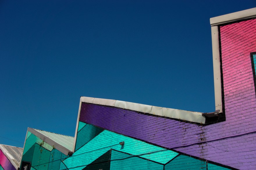


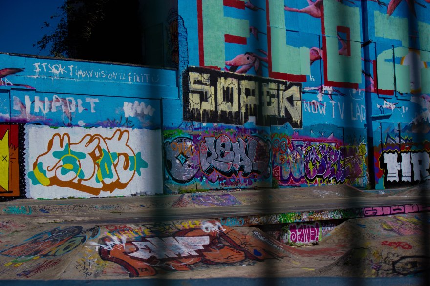
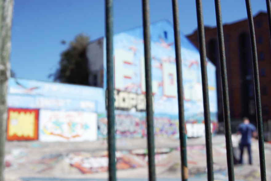
The first the image that I uploaded on Arsbeta was this one of the building with the colourful graffiti. I left this post on for I couple of days to get the more feedback, after the fourth day of leaving the image on the website I realised that I wasn’t going to get any more than three responses. Comments on this website is not the only way of giving feedback, when people come across your photo they can decided between choosing Keep and Ditch. Picking Keep obviously means that they like the photo and they think you should keep it, Picking Ditch means they don’t like the image and they think that you should get rid of it. This kind of feedback isn’t as helpful as the comments but it is still feedback.
On this picture, 56% of the people who voted said that I should keep the photos. 25 people voted all together, I calculated the amount of people said keep by first finding what percent represents one person. 100 ÷ 25=4 , 56 ÷ 4=14, this means that 14 people voted that I should keep the photo, and the rest of the people, which is 11, voted that I should ditch the photo. I am going to keep this photo even though nearly half of the people said I should ditch it, because there is still people who appreciate the photo. There is always going to be people who don’t have the same taste as you.
The first ‘Critique’ that I got on this photo was ‘ Good eye catching image.’. I definitely agree with this comment. The colours included on this photo really make it stand out. This photo is definitely my most vibrant photo out of my 30 photos, the reason I haven’t had more vibrant photo especially in my urban collection is because the research doesn’t reflect that. The urban photos that I have been looking at are more dark and gloomy. With that said, I still consider this a urban photo because of the graffiti, from my research I found that graffiti is a big theme of urban photography.
The next comment that I got on this photo was ‘The perspective is lovely and the colors make an excellent shot’. Like the other comment, I agree as well,when I was shooting the this building, I didn’t want to get all of the building. I decided to get the top of the building so there was a lot negative space. The reason I wanted some negative space because I wanted a lot of the attention on the building. I also agree that the colour make a excellent shot because without them its just ordinary building.
The last comment that I got on this photo was ‘Cool, love the colours and composition, compliments the graffiti. Nice graphic image’. This comment is similar to the last one because this person I also saying that the perspective I have chosen compliments the graffiti. They also say that they like the colours which I agree with.
In conclusion, the perspective that I have chosen complement the graffiti, and also the colours is really what makes the shot.
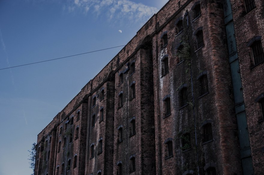


The next shot that I uploaded to this website was this one of a factory in Liverpool. Like the other post, and all of my posts, I left them on the website for a couple of days before I came to collect the date. This gives people time to comment on the post.
25% of all the 24 people who voted said that I should keep this image, 25% of 24 is 6, so 6 people said that I should keep it. That means that 18 of the 24 people said that I should ditch this photo. From the comments I can see what peoples problem with this photo is.
The first comment that I received on this photo was ‘I like the composition, but the building feels too underexposed. I’d like to see it adjusted to bring out a bit more of that lovely detail’. I don’t actually agree with this comment, but I can see where they are coming from. The image is dark and a bit underexposed, this is what I was actually going for, because I think that the darkness makes the building look deserted. They are not actually saying they don’t like the original image but they just don’t like this edit.
The next comment that I got on this post was ‘Haunted and decrepit, the moon adds to it’. I am glad that someone noticed and acknowledged what I was going for, I was going for that urban feels with this photo. The darkness on the photo gives it a haunted feels. They also mention the moon which I didn’t mean to capture, but I am glad I did because like they said, it adds to it.
The third comment says ‘such a dystopian feel. love it.’. I also agree with this comment as well because the building look deserted and the editing done only boost this feeling. Urban locations are always safe, some areas are dangerous and frightening so I definitely agree with the dystopian feel.
Someone else also commented ‘Looks underexposed. I like the texture of the building, it’s just really hard to see when the image is too dark’. Like I said for the first comment, I don’t agree with it being to underexposed but It has been mentioned twice so there must be some truth in it.
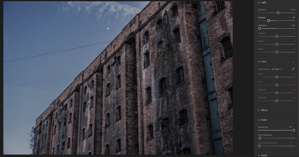
From the comments I decided to do a second edit of this photo, but this time correcting my mistakes I made with the first edit. I imported it into Lightroom, I then decided to increase the exposure so the the image is brighter so you can see more of the detail. I then went onto decrease the contrast so there wasn’t a big difference between the bright and dark part, making the image brighter. The last thing that I did was to increase the sharpening, this increase to detail, I decided to do this because the two comments said that there wasn’t enough detail in the image.
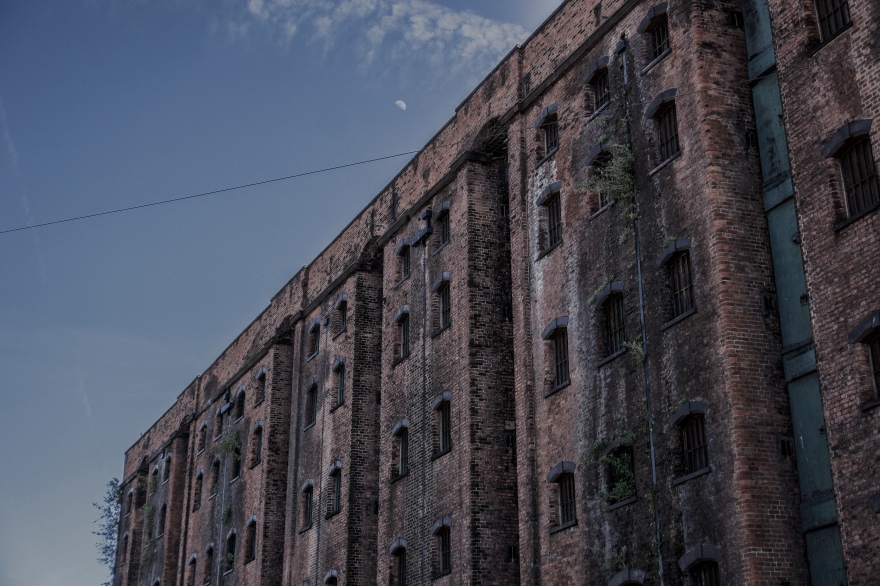
This is the what the image looks like now, looking at it now, I think that It actually looks better. I can now see what they where talking about with the detail. You can really see the detail at the right side of the building.


The next photo that I posted on this website was this one of the building in Manchester with the reflections. 46% of the 30 people who voted said I should keep this image, that’s about 14 people so that means that 16 people said I should ditch the image.
The first comment I got on this post said ‘subject building is lacking figure to ground’. I actually wasn’t aware of what figure to ground meant, but then I did a bit of research. Figure to ground is basically the contrast between your subject and the background.
BETA, A. and HERE, S. (2019). Street Photography Composition Lesson #2: Figure-to-ground. [online] ERIC KIM. Available at: https://erickimphotography.com/blog/2013/10/07/street-photography-composition-lesson-2-figure-to-ground/ [Accessed 5 Jun. 2019].
I can understand where they are coming from because in my case the building and the background do not have a big contrast between them. The building looks like it is part of the sky, it’s blending in with the sky. This is especially the case with clouds in the sky and the ones reflected onto the building.
The second comment that I got was ‘Love the reflection of the clouds on the building. and the gradient from top to bottom is amazing.This person likes the fact that there is clouds reflected onto the building even if it does disrupt the figure to ground.
After this I got a comment that says ‘pretty cool and good black and white photo. This comment isn’t as helpful as the other comments but I still appreciate this comment. I also think that this photo is good in black and white, the clouds reflected onto the building really contrast with the building,
The fourth comment I got was ‘Nice clouds reflections on building. Over all a bit dark at the bottom and i’d probably clone out the light post in the lower center’. This person also like the cloud reflections so that much be a good part of the image. They said that the image is a bit dark at the bottom, I personally don’t mind this but I guess it is wasted space if you can’t see the detail.
The next comment says ‘I like the perspective, but the toning could be better. The borders of the building kind of melt away into the sky, which takes away from the nice geometric’. This person has also mentioned how there isn’t a lot of figure to ground. I can see where they are coming from.
The last comment was just a small brief compliment which I appreciate but is doesn’t help me with improving the photo.
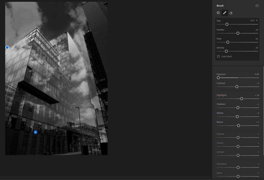
Because of the feedback I got on this image I decided to do a re-edit, the main feedback I got on this photo said I do not have enough figure to ground. Because of these comments I decided to fix it the best I can. If I change the exposure or the contrast it going to change the whole photo and I don’t want that. I wanted a way to separate the building from the background when editing. The way I found to do this was to use the brush tool. With this you can mark what areas you want to edit, so I started to drag the brush tool across the sky. When I finished this, I then started to decrease the exposure so the sky started to going darken giving the image figure of ground. This is because there is a bigger contrast between the building and the sky.
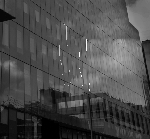
One of the comments said that the lamp post was distracting, Because of this comment I decided to get rid of it. I did this to the best of my ability using the brush tool, It’s very hard to do it in this instance because there are lots of lines and you have the join all of these line together.
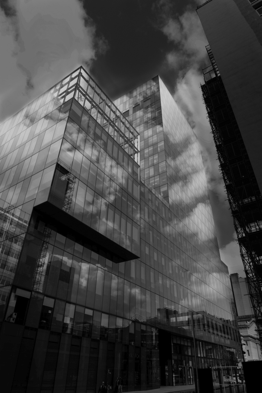
This is the image after doing the re-edit and I think it looks better. You can see that there is more of a contrast between the sky and the ground and also there is no lamp post at the bottom of the photo.
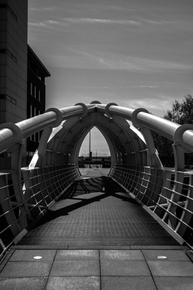


30 people voted on this photo and 26% of them said I should keep this image, that about 8 people, that means that 22 people said I should ditch this photo. I don’t agree with getting rid of this photo but I will look at the comments to see if there is anything I can do to improve it.
The first comments says ‘I love it. The only thing that would make it better is something interesting at the end of the tunnel, preferably in silhouette. great job’. I don’t agree with this comment, because if I do add something at the end that what will get all of the attention, and I want all of the attention on the bridge.
The next comment says ‘ I don’t like the negative space at the top’. I agree with this comment because there isn’t anything happening at the top. So I will consider changing this when I do a re-edit.
Another comment that I got said ‘There are elements outside your control that adversely effect the image without the building on the left and the post in the background it would have a lovely symmetry’. I agree that this photo would look better if there wasn’t anything distracting you like the building to the left, but like they said its out of my control. If I tried to get rid of the building with the healing tool it wound’t work, because its too big and there are complicated areas that would be hard to remove.
The last comment that I got on this photo was ‘ The fact that the pole framed in the opening is off center is disturbing’. I agree with this comment because it is distracting.
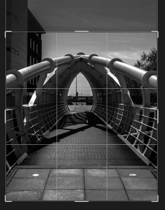
Because of the comments that I got, I decided to do a re-edit fixing and improving a couple of stuff. The first thing that I decided to do, was to crop the image, I did this because there was too much negative space.
The next thing that I decided to do was to get rid of the pole in the centre of the shot that was distracting. I did this by using the healing tool in Lightroom.

This is the photo after the re-edit, I think this edit more because there isn’t as much negative space so no wasted space, also there is nothing in the middle of the shot distracting you.


The next photo that I uploaded to this site was this one of the skate park. 31 people voted on this photo, 19% of them said that I should keep this image, that’s about 6 people, meaning that 25 people said I should ditch this photo.
The first comment says ‘Good colours but the foreground fence blur is tool distracting’. I think that the fence blur is a good addition but I agree that it is some what distracting.
The next comments says ‘No mood/ moment here’. I agree that there is nothing really happening but the main reason of this photo is to showcase, so I don’t think it necessary need something happening.
The last comment that I got on this photo was ‘Out of focus vertical foreground bars are distracting. Might be better if they were in focus’. Like the other comment, I agree that the bars are distracting and if I went again I would have got them in focus.
Because there is no way of making the bars in focus in post production, I am going to have to leave the image. That’t my fault for not getting the bars in focus and not capturing a moment at the skate park, but you cant shoot whats not there.
When I was shooting at this location I got a couple of photos, but the one I got was the best one out of all of them. This was one of the photos that I got, this would have been a good shot if the background was in focus.


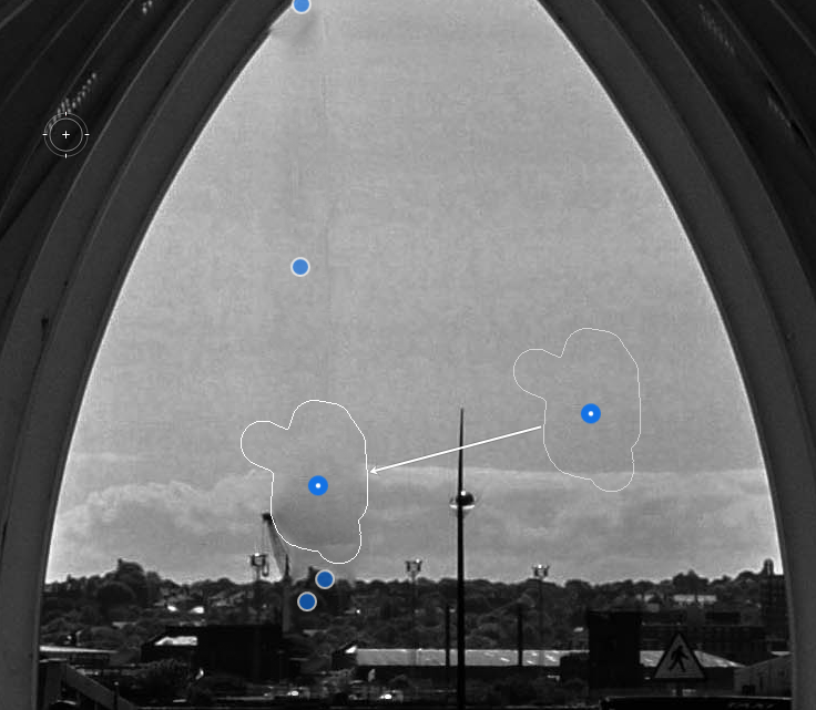
For this photo of Liverpool cathedral, 29 people voted on it. 20% of the people said that I should keep this photo, that’s about 6 people meaning that 23 people said I should ditch this image.
The first comment that I got on this photo says ‘No detail in the building’. I can see what they are saying, there isn’t much distinction between the bricks. That is something that I should of consider when doing my first edit.
The next comment says ‘Composition is a little off; I don’t like how the arch is cut bottom right’. I do agree with this, when shooting this shot, I should of framed it better,unfortunately this is the only shot I got at this angle.
Another comment that I received was ‘Unremarkable’, I don’t agree with this comment but everyone has there opinion. This comment ins’t as helpful as the other ones because it’s a one word answer with no explanation about why the image is unremarkable.
The last comment that I received says ‘For me the dark areas lack a little detail’. This is similar to the first comment and like the first comment I agree with this. Especially in the dark areas of the photo, there is a lack of detail.
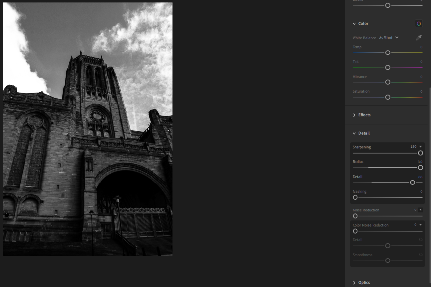
Because of the comments I got on this photo, I decided to bring it back into Lightroom and do a re-edit. The thing that I did in the re-edit was to bring and increase the detail in photo, this is because I got multiple comments saying that the image is lacking detail. I increased the detail by going to the detail section and increasing the sharpening, radius and the detail.

Looking at this second edit of the photo, you can see the detail in the bricks more and I think that this makes the photo more interesting and eye catching compared to my first edit version.
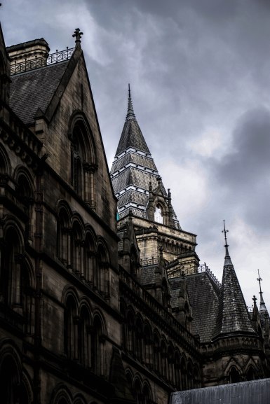


The last photo that I uploaded on this site was the photo of the Manchester city council building. 30 people voted on this photo, 33% of them voted that I should keep this image, that’s about 10, meaning that 20 people said that I should ditch this photo.
The first comment that I received says ‘Bad composition. too dark. different angle would make this a better photo. I don’t agree with the comment about the composition, I think that it looks. unfortunately I don’t have any other angles of this part of the building. I do agree that It might be a bit too dark.
The second comment that I got says ‘I like the contrasting light on the spire. Slight loss of detail with the highlights on the window. Overall a good moody image’. I like how he likes the contrast between the two part of the building because I also like this about the image. Looking at the window I can see what they are talking about the lack of detail. I didn’t notice that when I was editing.
Another comment that I got was ‘Looks over-processed’. Even though I don’t totally agree with this comment, there a bit of me that agrees with this, but I don’t think that’s a bad thing. I might of edited this image a bit too much.
The last comment that I got on this post was ‘On my phone the blacks are way to black’. This isn’t just on his phone, the dark and a bit too dark. I should of made the black a bit more brighter.
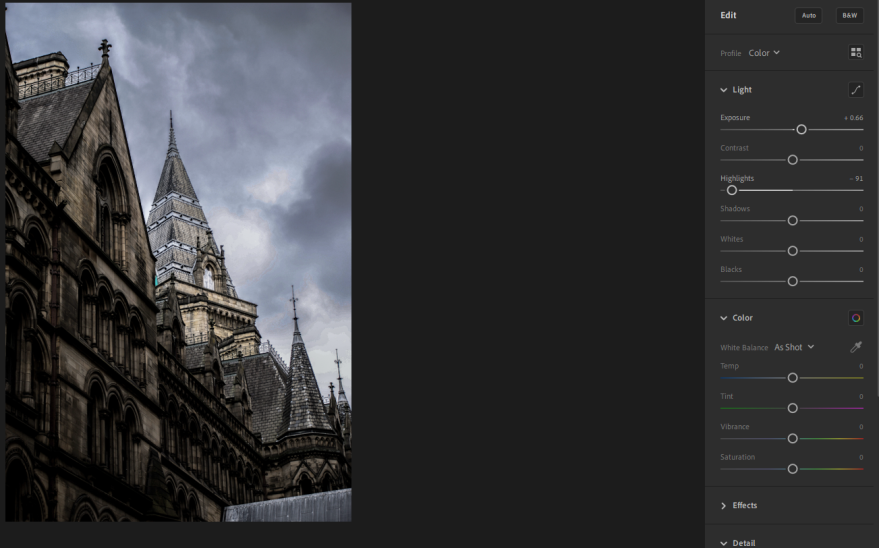
I decided to re-edit this photo, and change and improve the image. The first thing that I changed was the exposure, I increased it so the image wasn’t as dark. I did this because a got two comments saying that the image was too dark. The last thing that I changed was the Highlights, I decreased this so the whites where not as bright. This resulted in the sky getting darker as also bringing the detail out in the window.
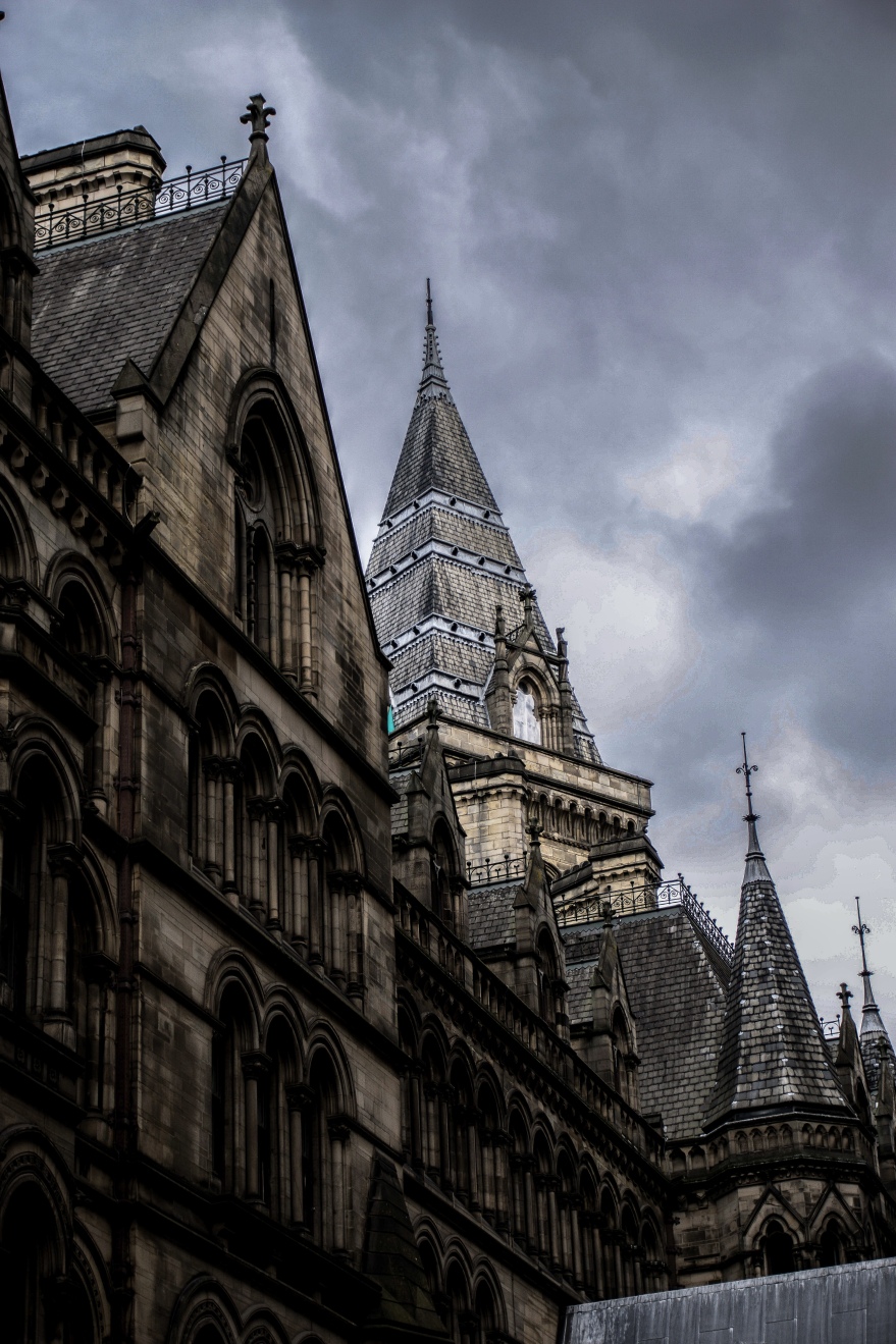
Looking at the second edit, it’s hard to see what I have changed, but even the small improvement still improve the photo.
