The next website that I used to gather feedback on some of my photos was Photo.net. The reason I picked this website because while doing my research on different ways receiving feedback on photos, this website came up. On this website I posted to the ‘Seeking Critique’ forum, this forum is dedicated community who give feedback an who are looking for feedback.
For the title of my post, I decided to just call it ‘Looking for any feedback’. I thought that this was a good title because they know that I want and need it. On photo.net there is also a option to add tags, for this post I added tags that where connected to the photo. I used a6000 because that’s the camera I used, I used reflection because there is a reflection in the photo.
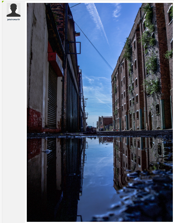
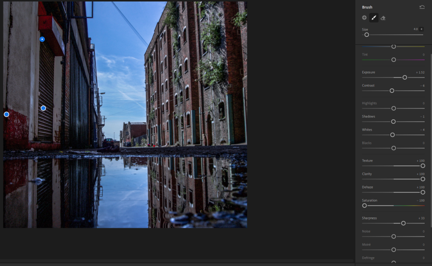
This was the first photo that I uploaded to the website, this photo was shot in Liverpool on a road full of deserted factories. I left this post on for a couple of days before I came back to collect the feedback.

This was the first comment that I got on this image. I am going to split this comment in to different section so I can address everything that he says. The first thing he talks about is how he like the reflection and how the building look like they are emerging out of the water. I agree with this comment, when I was shooting this photo I tried to get all of the bottom of the frame in the puddle. This ended not happening, because I wanted to try and get as close to the centre of the road without losing the puddle, so this is how far I could get with still most of the bottom of the frame full of the puddle.
One of the improvements that said I should do was to improve the colour correction on the red on the left side of the frame. I said I might need to correct this because the blurriness on that side actually suppresses the reds. I didn’t think that this was a big deal, but I can see how that could make the image better.
Another comment that he made was talking about the bent perspective and the lens distortion, and how is will make it better if you fix the distortion. I think that I did a good job of fixing the fish-eye effect, comparing it to the original image. I do agree that it might need a bit more correction .
Looking at the original raw file you can see that I improved is so much, looking at the building on the right, you can see how curved it looks. It might still need a bit more correction.
He also talks about how that there is nothing really happening it this photo, ‘lack of a story or some cue to further my imagination’. I do agree with this comment, but I can’t shoot whats not there, I could edit something in there but I don’t know what I would put and I don’t have the edit capabilities. For example, if I but a person there, that would bring all the attention to them and I don’t want that because that’s when it enters the street photography area.
He then goes onto talking about how he think that ‘the scene might be portrayed to focus on the eerie loneliness ‘. This is what I was going for so I am glad I have succeeded in doing that. Also he talks about how I need to correct the perspective and also how I might need to crop the image so it gives the reflection a infinite effect.
The second comment that I got on this post was by Samstevenes. Like the other comments I am going to split it up into different sections so I can mention everything they said. He talks about how he disagrees with Supriyo comment about the distortion that In on the photo, he said that it add to the sense of unreal.He also said that he likes that I haven’t cropped the image so it doesn’t show the floor at the bottom, because Its a urban scene not a nature landscape scene.
He also talks about as a viewer he appreciates the contrast between both sides of the street,the buildings on the right are warehouse and the building on the left have more of a commercial feel.
One comment that I found interesting is that the metal doors have the potential the have a lot of texture and detail, I didn’t think of that and I agree that , that would improve the image. Like the first comment, he mentions that there should be something in the middle of frame to give the shot more of a story. He said that the car in the middle should be brought more into the scene and a more important aspect of the shot. I do agree with this, but I can’t control how close the car is away from the puddle, I could crop it but I don’t think that would improve the story of the shot.
The third comment that I got on this post was from dcstep, in this comment he talks about how I should crop the image. They said that I might want do a 2:1 crop so the water line is in the middle of the photo. He also talks about how there is no direction for this image, there is nothing happening. I do agree that there should be some kind of crop.
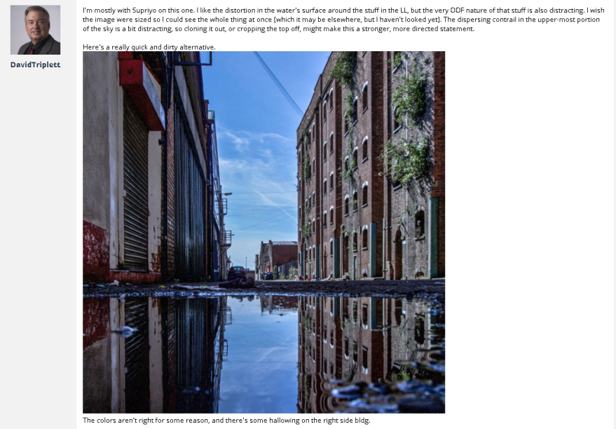
The last comment that I got on this post was from ‘DavidTriplett’. In this comment he talks about how he like the distortion in the water’s surface and also that the out of focus stuff is distracting. He also talks about how I should probably crop a bit of the sky. He said that I should get rid of the contrails caused by planes because it is a distracting. He actually did a edit of his own to show me what he meant.
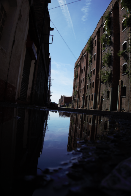
Because of the comments that I have received on this post, I have decided to do a re-edit of this photo.
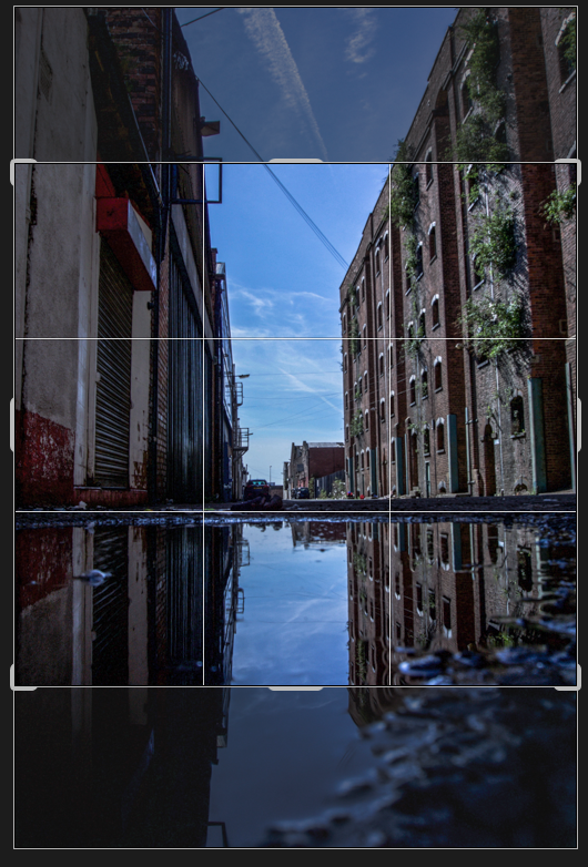
The first thing that I did was to crop the image, I decided to crop the image because of the multiple comments a got about how I should. The comments said that the out of focus foreground is distracting so I decided to crop a bit of it out, so it isn’t as distracting. I also decided to crop a bit of the sky, because I got some comments talking about how there was too much sky.
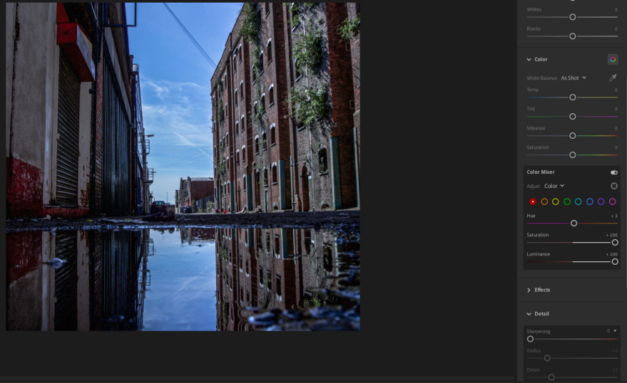
After cropping the image, I decided to edit the reds that are on this photo. I did this because I got a comment that said the reds needed colour correcting. I did this by going to the color mixer tap and then picking the colour I wanted to edit which was red. I then brought the saturation and the Luminance so the reds where brighter and more visible.
The next thing I did was to bring the detail out on the metal door, I did this because someone said that this would make the photo look better. I did this by using the brush tool and selecting the metal door, I then turned up the sharpness,clarity and the exposure so the detail was brought out.
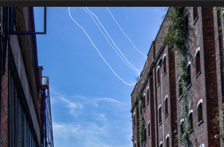
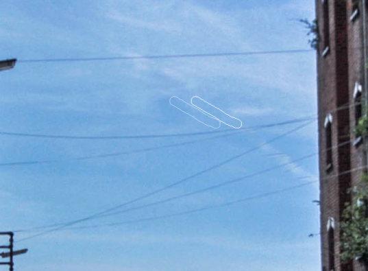
The last thing I did was to get rid of the trails in the sky, I decided to do this because someone mentioned that they where distracting. After doing this I also decided to get rid of the multiple power lines at the top of the shot. I did this by using the healing tool in Lightroom.
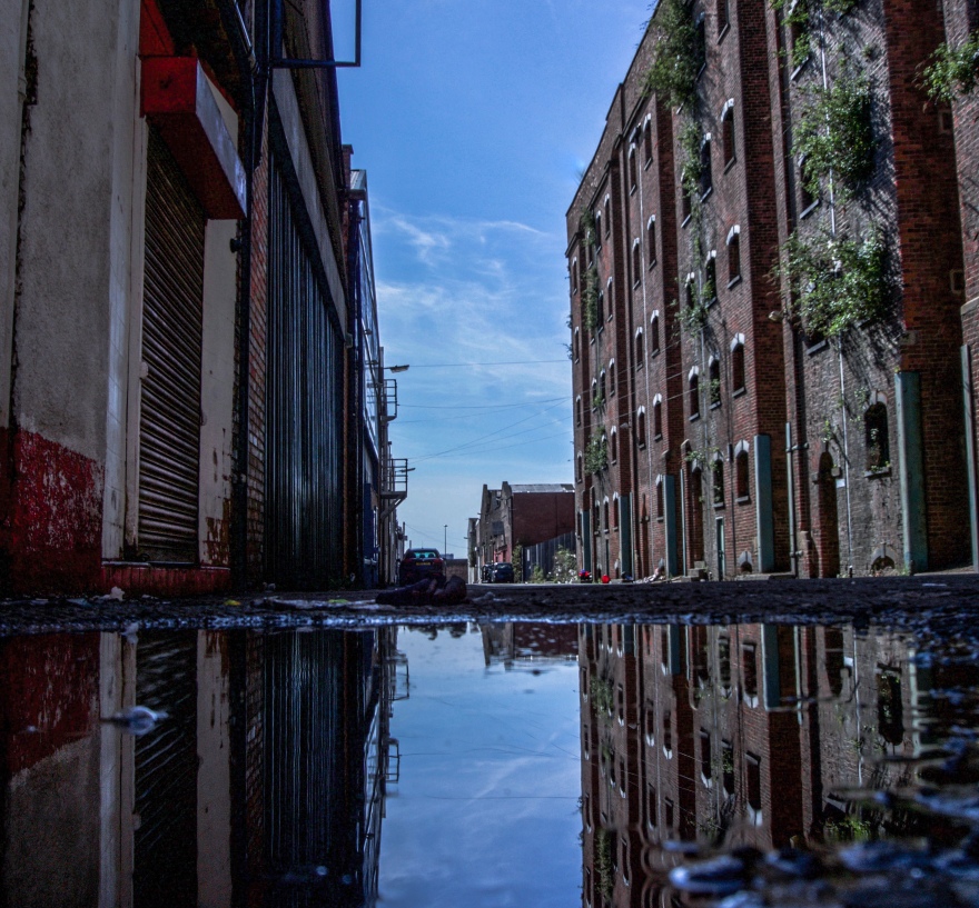
Looking at the second edit of this image, I prefer this edit because there isn’t any distracting ground in the foreground, I also like the crop at the top because there isn’t as much sky and I think this makes the image better.
The second image that I uploaded to Photo.net was this image of a bridge in Liverpool.

For the title of this post I just decided to keep it short and straight to the point by calling it ‘Feedback’. I did this because this is what I want, feedback.
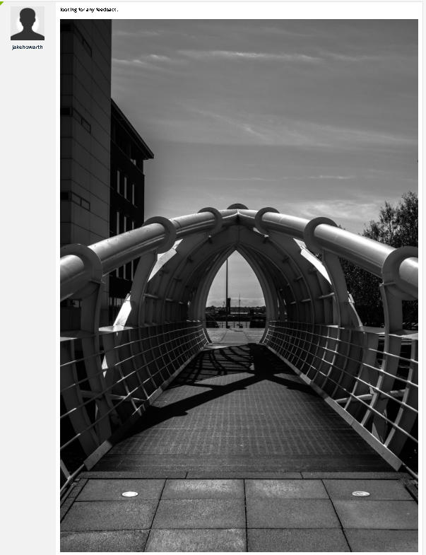
The first comment that I got on this photo was dcstep who also commented on my first post. I will be splitting this comment into different section so I can mention everything he is saying.
The first thing talks about is the negative space that is at he top of the frame, he says that it is that it ‘Sucks energy out of the image for me’. I can see where he is coming from and a actually agree with this comment. I think that there is no need for that much sky because nothing is happening.
He also talk about how he would like to see the image cropped so only the tunnels is showing, not the sky at the top of the frame, also that he would like to see this image i landscape. I also think that this would improve the image because all of the attention will be on the bridge.
In another comments that he make he talks about is that the exposure is to dark and it ‘conflicts with that what I think is the reality of the scene’.
He also talk about how the pole is distracting and how he would like if included added some bokeh. I agree with this comment but there is no way of me adding bokeh.
The next comment that I got on this post is from Supriyo who also commented on my first post. In this comments he said that he also doesn’t like that there is lots of sky and that I should probably crop the image to get rid of this sky
He also mentioned how cropping the image will take away from the fact that there is nothing in the centre of the bridge.
The last comment that I got on this post was by DavidTriplett who also commented on my first post. In this comment is basically agrees that there is too much sky and how it is too distracting, he also agrees that I should bring up the exposure up a bit.
In this comment he also says that the payoff at the end is disapointing because there is nothing there. He also said that the shot would look better if the bridge was off to one side rather than int he middle, also that maybe that I should add a vignette to focus more on the bridge.
Because of the comments I received on this post, I decided to do a re-edit of this image but this time I will be fixing what was mentioned in the comments. I actaully already did a second edit of this photo because of the comments I received on ARS Beta so I decided to upload that edit into Lightroom and start editing that one.
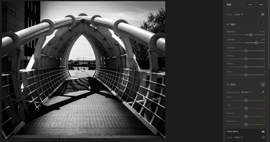
The first thing that I did was to bring the exposure up and also the contrast because that was recommended in the a couple of my comments.
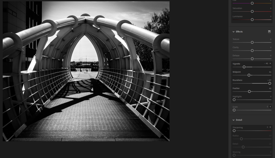
The next thing that I did was to add a vignette, I decided to do this because it was mentioned in one of my comment. The vignette will bring the detail to the detail on the bridge, it will also darken the areas which I am not focusing on like the building to the left.
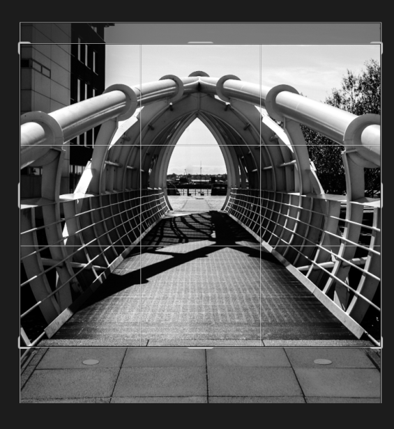
The last thing that I did was to crop the image so it was a bit more tight so it was only focusing on the bridge not the sky of the pavement at the bottom of the frame.
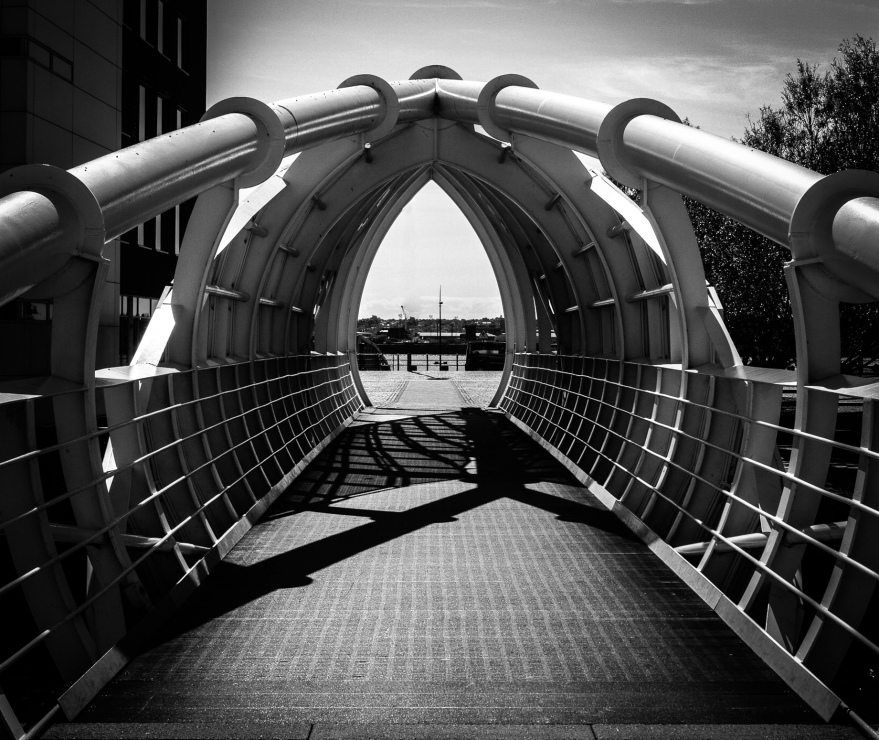
Looking at this edit of the photo, I like it more because all the attention is on the bridge not the sky, I also like how the vignette darkens the edges bringing your attention towards the bridge.
